
The aim of this lecture is to help copywriters and store owners create a contact page that provides useful contact information about the company through a warm and positive way. It also provides steps on what exact information to add into the contact page so to save both the customer’s and your own time.
Every aspect of one’s store site is devoted to cultivating a relationship between themselves and their visitors, the Contact page should be no exception.
You wonder how a simple Contact page can be that important? You’ll find out if you keep reading but first let’s see what a decent Contact page looks like.
Good vs Bad Contact Page
Before we present you the true importance of a good Contact page, let’s analyze some examples and make the difference between poor and awesome Contact pages.
Example #1
The contact page of Camp Cove Swim has nothing more than three e-mail addresses. Can it be more basic and worse than that? Probably not.
There’s only one way of contact offered (by e-mail). There’s NO warm welcoming note, NO phone number, NO address, NOTHING.
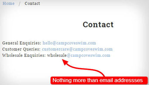
Generally speaking, even if a Contact page has just a line saying ‘Contact us here’ followed by a list of an address, phone number, fax, and e-mail address, it is still considered a really BAD one.
Example #2
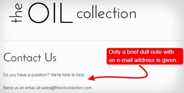
Just when we thought it couldn’t be worse, here’s The Oil Collection Contact page to prove us wrong. It has a brief but a bit dull note, though. The only thing it offers is one e-mail address with NO further details or reassurance whatsoever. You’ll find more on reassurance in the next section.
Example #3
Obviously, only the most basic sort of contact information is listed here as well (that would be phone, fax, e-mail, and mail). An example of this outdated Contact page can be found at Saucy Spice.

Even though it’s still considered to be a rather POOR example, at least it offers ways of communication offered unlike the previous two examples.
However, this is still far from what we aim at!
Example #4
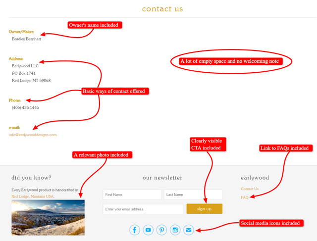
Although Earlywood included some more details in the Contact page, such as a photo, a CTA, a link to the FAQ page, the owner’s name, social media icons, and different ways of contact, it is still NOT even close to a really good example.
You’re not sure why?
It lacks a vivid and functional design. There’s also a lot of empty, white space on the page, and a friendly welcoming note is NOT included, as well.
Example #5
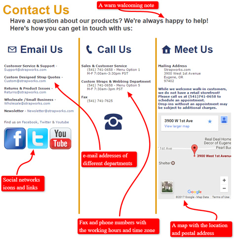
Strapworks is a sort of an acceptable example of a Contact page in terms of containing all the basic necessary information: a warm welcome note, e-mail addresses of different departments, fax and phone numbers with their availability time in the corresponding time zone, links and icons of social networks, and the postal address with a map of its location.
However, it could have some more appealing design, real photos/videos, and at least a link to the FAQ section or the most popular topics.
Example #6
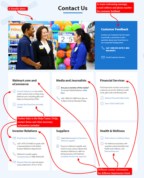
As for a better and more functional design, Walmart’s Contact page is an appropriate example.
As you can see below, it has a friendly photo of real people included, a welcoming message (which is a bit too formal, by the way), and a whole bunch of contact details neatly organized and categorized. It also provides a lot of valuable links to other useful pages, such as the Help Center, the FAQ page, contact forms and the like.
There’s no map with their location on this page. However, they’ve got a separate page named Our locations instead. They’ve also included some social media icons on their page.
It’s true that some things could have been done better or at least in a different way. Still, this can be considered a good example of a Contact page when compared to the previous ones.
Example #7
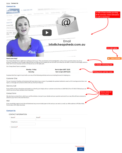
Finally, let’s see a really good quality example of a Contact page from CheapSheds. It starts with a personalized video message providing the customers with all the necessary contact information as well as reassurance.
It also points out the use of their FAQ page and Help Center, which are abundant with valuable information customers will certainly find helpful.
In addition, all the various means of contact are listed below the video, each of them being accompanied with a message encouraging customers to get in touch with the company.
In a nutshell, this is a well-crafted Contact page, although its design could perhaps be more eye-catching.
Having analyzed all these examples, do you still think just listing one’s phone number and e-mail address would suffice?
If so, think again!
What can you say about Contact pages you’ve made so far (if any)? Are they closer to the positive or the negative ones?
Take into consideration all the details we’re paying attention to in this lecture next time you make one’s Contact page!
You wonder why a copywriter should bother with this? The answer follows.
The Importance of a Good Contact Page
A good Contact page allows for further communication between you and your potential customers. In some cases, a good Contact page provides the final push to transform store visitors into store customers.
A new customer will want to ask questions. In many cases, these questions could actually be answered by information that is readily available on the store website. Then, it might be tempting to think of a Contact page as a waste of time, but we can assure you that it is NOT.
How come? Let’s see!
When a customer asks a question, it’s not so much information they need but reassurance. They want to get a better feel for how responsive you are to their needs.
Thus, Contact page is actually what offers a chance for a customer to ‘kick the tyres’.
What does that actually mean?
It means customers call or e-mail an online store just to see whether they’ll get a quick answer or it will take ages to the store to respond.
In other words, it gives customers an idea as to whether their dealing with that online store will be trouble-free. It’s a bit like knocking on the door and asking if anyone’s home.
For instance, imagine you’re a customer looking at an online store website and you’ve just found a product you’d like to buy. However, you’re probably thinking to yourself:
‘The price is good and I’d really like to buy this but I don’t know who these people are. I can see they’ve got some contact information and even a friendly photo but it could all be fake. How do I know they’re going to be who they say they are and they’re going to do what they say they’re going to do?’
Well, here’s exactly where customers need a little bit of reassurance. So, it’s the right time to ‘kick the tyres’! Call to see if they’ll answer the phone i.e. if they’re there for you and real. A store’s professional reply is what provides reassurance!
Taking all this into consideration, we can say that the Contact page is NOT just an administrative page of something like ‘here’s our phone number’ but it’s also an emotional connection with the business which provides the needed reassurance.
Having a Contact page reassures them that you’re open to their needs. Promptly responding to their inquiries through the Contact page makes them feel more connected to you.
By validating their opinion and providing them with reassurance, you’re establishing yourself as a trustworthy source and increasing the possibility that a casual viewer will become a loyal customer.
Since you’re now aware of the importance of a good Contact page and you can distinguish between awful and excellent examples, we’re going to discuss the necessary information that should be a part of every first-rate Contact page.
Write a Short Warm Welcome
Your Contact page is an attempt to start and sustain a conversation between the store and the customers. They’ve come to your Contact page with the intention of making contact and you should make that contact warm and welcoming.
Start the conversation first by making them feel welcome. Encourage them to contact you with a few sentences to welcome them and make them feel that you want them to make contact with you.
The text of your welcome doesn’t have to be elaborate or long. A few simple sentences will work fine. What’s important is the tone. Choose your words in a way that makes it sound like you are really interested in why the viewer wants to connect with you.
Here are some examples of website Contact pages with nicely written short welcomes.
Example #1
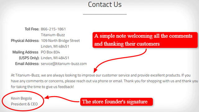
The welcome note of Titanium-Buzz is short and simple. It invites the viewer to send in their questions and comments, and thanks them for their feedback. The personal touch (the message is signed by the store founder) provides assurance that all the customers’ concerns will be read and considered. It also helps make the message seem warm and welcoming.
Example #2
The note Cow and Co used to have on their Contact page was very short and basic but still very welcoming. Just one line that lets the viewer know that contact is welcome can color the entire message.

Example #3
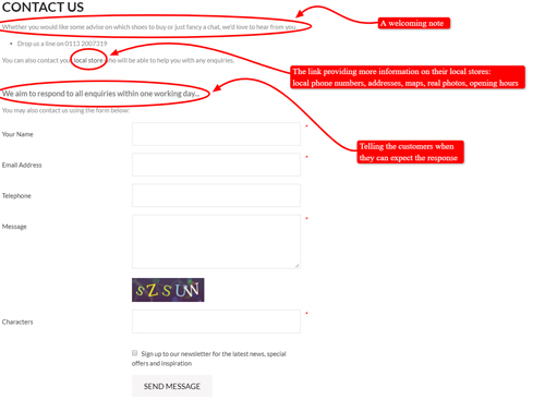
Shoon also has another short and sweet one. The takeaway here is, they provide the viewers with a time frame for when they will receive a response. This helps reassure viewers that you are there for them.
In addition, they’ve included the link to their local stores with some more detailed information (local phone numbers, addresses, maps, real store photos, opening hours) for further reassurance.
It also encourages viewers to connect through the ‘friendlier’ social media mediums of Facebook, Twitter, Instagram, Pinterest, YouTube, or Google+.
Example #4
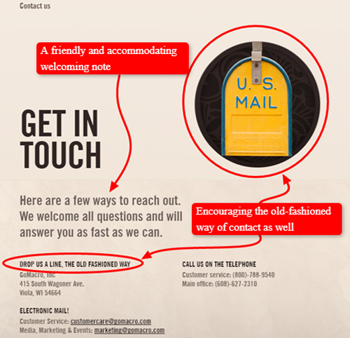
The Contact page and welcome message at Go Macro are cute and fun. The use of an old-timey image of a mailbox matches nicely with their entreaty to contact them ‘the old-fashioned way’ and gives the entire page a quirky ‘personality’.
The welcome makes sure that the viewer knows there are many ways to communicate with the store which makes them sound accommodating and friendly. While they don’t provide a definite time frame for a response, the cheery wording can be all the reassurance customers need to encourage them to reach out.
Example #5
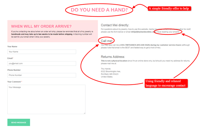
The welcome note for Tiny Hands is also short and to the point. Once again, it’s the tone of the note that sets it apart. It’s light and friendly, assuring the viewers that their questions are welcome and that they will be accommodated. The use of emotive language engages with the customer and creates that real personalised service.
Example #6
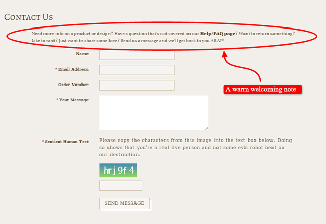
Here’s another similar one from One Horse Shy. A warm friendly note welcoming all kinds of concerns customers may have.
Example #7
Cielo Pill Holders provides reassurance by telling the customers its primary goal is to make them happy and by convincing them that all their ideas on how the company can improve are highly welcome.

Now, when we’ve provided enough examples to support our statement that making customers feel welcome must NOT be neglected, let’s see what else should we pay special attention to when making our Contact page.
List the ways they can contact you
It’s important to show that you can be contacted in multiple ways because people will have a preference i.e. the way of reaching you they’re most comfortable with.
Thus, you can include all the following ways customers can contact you but you can also say what your preference is.
For instance, you can say: ‘We respond very quickly to e-mail because we’re then able to keep track of our discussions.’ Or you can say something like: ‘We answer our phone between these business hours. If you need our help outside those hours, please send us an e-mail.’
In the following subsections, there are various ways of contact that can and should be included in a good Contact page.
Include All Your Phone Numbers
Many people still prefer to hear a human voice. Having one or two phone numbers listed in your Contact Page will encourage them to make contact.
Even if you have a free call number it’s still a good idea to list a local number. These days, a lot of people have ‘all you can eat’ mobile phone plans which allow them to pay a set fee for unlimited calls.
However, there is a catch. In Australia, there is a cost for telephoning a 1300 or 1800 number. Customers can use the local number if they are overseas, or have an ‘all you can eat’ cell phone plan.
Make sure you include an area code and an international dialling number, even if you believe you are just a local business. You never know when a customer has bought an item from you and then travelled overseas with it, or just wants to call you from a non-local area.
If you have a fax number, it would also be a good idea to list it. You never know just what will be the most comfortable medium for your customer to reach you.
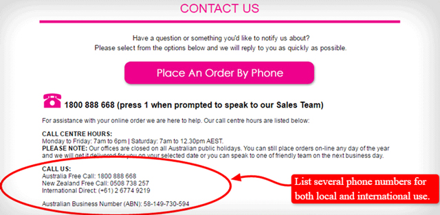
A more elaborate example of phone numbers listings would be something like that on the Contact page of the Pretty Petals Network. They also let the customers know under what circumstances it’s best to use the phone numbers.
Include an E-mail Address
Some people may find it more convenient to send in their questions via e-mail. This option is especially important if the customer is making their inquiries at ‘odd hours’ when there might not be someone around to answer the phone.
Make sure to add a sentence or two assuring them that you will get back to them. Something as simple as ‘we’ll get back to you within a day/couple of hours’, can be enough to reassure them that you will be responsive to their needs.
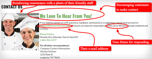
Here’s an example of how the iPerfectKitchen did it.
Note: this page may look differently now or may even be non-existent.
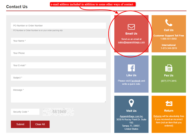
Apparelnbags has also included the e-mail address in addition to their local and international phone numbers, fax number, postal address, contact form, and social address in addition to their local and international phone numbers, fax number, postal address, contact form, and social media links.
This is what their Contact page used to look like.
Include a Postal Address
You never know, some people are still more comfortable using post, especially if their inquiries are not that urgent.
Here’s how Fab encourages the use of the snail mail.

Also, remember the Go Macro example mentioned above.
Furthermore, Gazebos Australia went a step further and provided a photo of the actual warehouse where they ship all the gazebos from next to their postal address, local phone number, and the e-mail address. Here’s what it looks like.

We are going to talk more about the benefits of adding real photos to a Contact page in the section Add the store location(s) below.
Include a Contact Form
A contact form is basically a set of questions that can be filled out on the website. The contact form is automatically sent to your e-mail when it is sent out. A contact form is a way to simplify the inquiry process and makes everything easier and more organized.
Using a contact form can reduce spam and can also help you better capture the exact information you want from your customers.
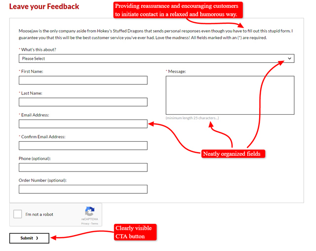
Here’s an example Moosejaw’s contact form, which provides reassurance and encourages customers to get in touch with them using a humorous, friendly, and personable welcoming note. The fields are also neatly organized with a clearly visible CTA button. You can learn more about CTA in our lecture Call-to-Action.
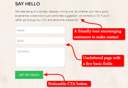
Here’s another example of including a contact form in a Contact page by Teabox. Their use of friendly, informal tone encourages customers to initiate contact. The page is not cluttered but contains only three basic fields in combination with an easily noticeable and inviting CTA button.
It’s really wise to use a CTA (Call-to-Action) that allows the customers to contact you easily. Also, make sure they’re obvious and clickable, saying something like ‘e-mail us’ or ‘chat now’ or ‘get in touch’ like in this example.
Add Social Media Links
Encourage your customers to connect with you or learn more through various social media sites. Give a list of all the ways they can connect with you via social media. Also, make sure you respond to any messages you receive.
Here’s an example of how Moosejaw included the icons of their active social networks (Twitter, Facebook, Pinterest, Instagram, YouTube, and Flickr) in their website.

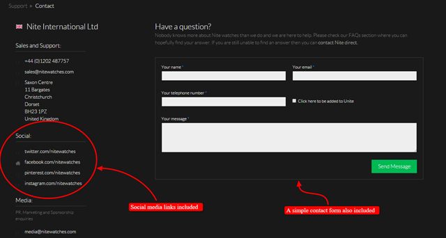
Nitewatches has also included some social media links in their Contact page, in addition to a simple contact form, a welcoming message, and the other contact information.
Simplicity Sofas have nice and easily noticeable social media icons included in their Contact page, as well. This way they’re inviting customers to keep in touch with them via some of the most popular social networks they’re active in.

Apart from including as many different means of contact as possible, let’s see what other information is smart to add to our Contact page and why.
Include the Opening Hours and Holiday Times
Prompt responses to their queries are something that many customers value and by giving them a time frame in which they can expect an answer, you can manage their expectations.
Including the store opening hours helps set expectations for when a customer will get a response.
However, be clear about which time zone you’re in. People won’t often know it just from looking at the postcode whether you’re the eastern or western time zone, and Australia is a very wide country.
You should also include holiday times. Including holiday times is especially important around stressful shopping days such as Christmas, Easter, or Mother’s Day
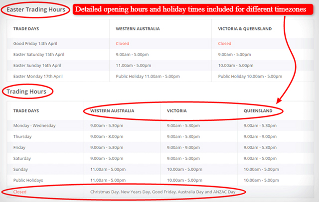
Kitchenwarehouse provides simple tables with very detailed information on opening hours and holiday times within different time zones in Australia.
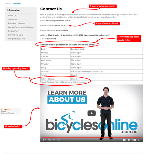
The Contact page of Bicycles Online also lists both their store opening hours and holiday operating hours clearly. What’s more, apart from their warm welcoming note, they’ve included a short video in their Contact page.
Add the Store Location(s)
If an eCommerce store has an actual store location that people can go and visit, make sure to add it to the Contact page. While online shopping is gaining a considerable market share, many customers still just use an online store to do research before heading towards the actual store location.
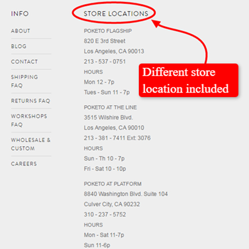
Poketo’s Contact page is a simple and clear example of how one’s store locations should be added to their Contact page. Take note that, aside from listing its stores, it also lists the appropriate contact details and opening times for each location.
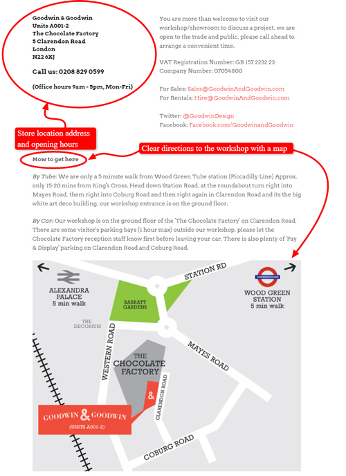
Goodwin + Goodwin just has one location for their workshop but they make sure that the interested people know how to get there, including directions for commuting or driving there and a map.
An example given earlier in this lecture, Shoon, does not include the store locations in the Contact page but it provides the link with all the necessary detailed information about their local stores within the page. Here’s a part of it.
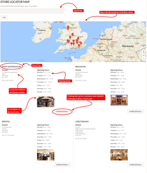
Adding a store location, combined with the directions, a Google map image, and some real photos (e.g. of the warehouse, of someone working, even a stock photo of a person sitting at a desk doing some computer work, or any other photo) is a smart thing to include in your Contact page because it just gives that feeling that it’s a real place.
Moreover, it gives people that sort of solid feeling telling them not only that you’re real but you’re happy to contact them.
Keep in mind it’s a bit like the Why buy from us page where you can marry text with images to reinforce your message.
You still wonder why you would include a store location and detailed directions to it even though you know the customers are not necessarily going to come and visit you?
Besides providing reassurance for customers, this type of information really helps Google to assess that you’re a real business. Since Google loves that content, it also helps you boost your search engine rankings.
You get the point now, right?
Present Your Staff and the Company
As we’ve already mentioned above, it would definitely be smart to consider having some real photos of the friendly staff or a nice video presentation of the company on your Contact page.
Here are some examples to illustrate how this can be done.
Kitchen Warehouse included the photos of their Customer service team in the Contact page among all the other valuable information. It’s easier to provide the necessary reassurance when the customers see their friendly smiling faces ready and willing to help everyone who contacts them, isn’t it?

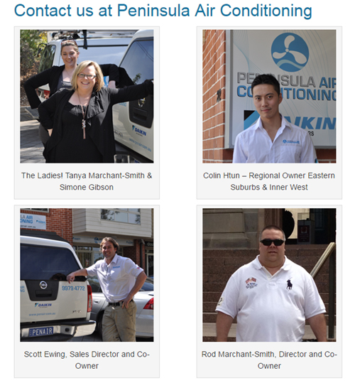
Peninsula Air Conditioning also has the photos of their friendly-looking team members at the very beginning of their Contact page, in addition to the map with their locations, a contact form, and the other possible ways of contacting them.
Bee Friendly Skin Care decided to put the videos in the Contact page to present their company and give reasons to the customers why to buy from them.

Also remember a great example of CheapSheds we’ve mentioned earlier in this lecture.
Details like real photos and videos are valuable because they add a dose of personality to the page. Have we mentioned that content like this boosts your search engine rankings? I bet we have!
Add a Part of an FAQ Section or a Link to It
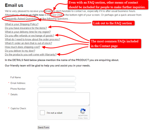
There will always be some customers who visit the Contact page because they really just need a quick answer to their questions. Figure out some of the most common FAQs that visitors to the store have and post a list of these – and their answers – on the Contact page.
However, do NOT add the full FAQ section to your Contact page.
What you can do is make the FAQ section a separate page on a store website and link out to it from the Contact page and vice versa. Assure the viewers that if they don’t find the answers to their questions in the FAQ section, they can always contact you for further inquiries or assistance.
Not sure what you’re trying to achieve by doing this? Here’s what it’s all about.
Perhaps customers couldn’t find your FAQ or Delivery or Shipping page and they need some information from you. If you include a part of your FAQ section here (remember to choose only the most commonly asked questions), they’ll be able to get that information as soon as they come to your Contact page.
In this way, you’re trying to reduce that burden on your team by answering the customers’ questions in advance, even before they e-mail or phone you and take up your time.
Let’s see how this can be done.
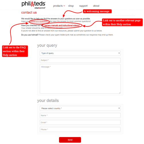
For instance, the contact page of phil&teds greets visitors warmly and encourages e-mail inquiries but it also redirects the visitor to the more detailed Help sections.
Whereas the Contact page for Gazebos Australia includes a FAQ section the viewer can look at before directing them to some other channels (contact form, live chat, e-mail) through which they can make additional inquiries.
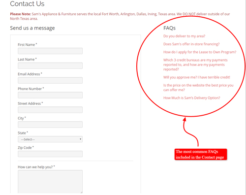
Here’s another similar example with the most common FAQs included in the earlier version of Contact page from Sam’s Appliance and Furniture online store.
Consider Adding a Live Chat
Adding a live chat is absolutely terrific because it allows you to have more interaction with visitors and answer their questions quickly.
A live chat provides website viewers with immediate access to help and will allow you to provide answers to queries right away. This responsiveness can help persuade a viewer to become a customer.
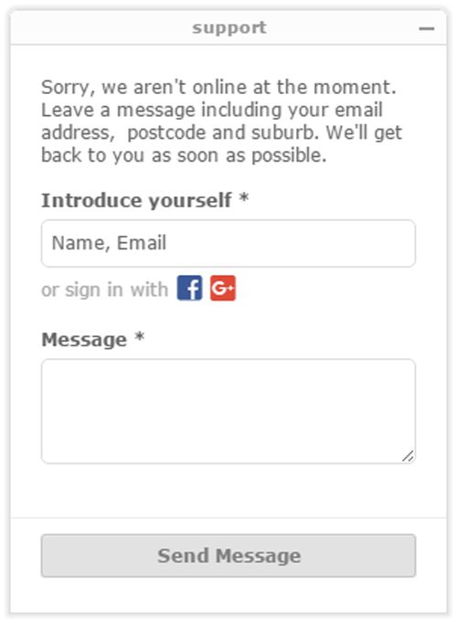
Here’s an example of a live chat box from Gazebos Australia.
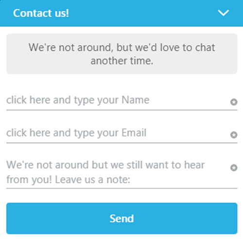
Here’s another example from Moomin online store.
A live chat can also save you time and phone expenses. Compared to answering a phone query, taking part in a chat conversation allows for multitasking. Also, a chat allows you to interact with several customers at once, unlike a phone line which can only handle one call at a time.
Additionally, these tools like e.g. Zendesk allow you to keep track of the customers’ messages, which can be very useful for finding out what the customers are asking about and what they’re looking at.
Not only can you collect information about your customers’ preferences but you can process those answers very quickly.
If there’s enough time or personnel available to monitor the live chat for the majority of the day, it can be an invaluable communication tool between a company and its customers.
To find out more, check out the following articles for various live chat providers, their advantages and disadvantages, as well as for further information on which chat can work for what business, how, when, and why to use live chats and other valuable information.
- https://www.crazyegg.com/blog/top-live-chat-software/
- live-chat-support-software-review.toptenreviews.com
- Wpcurv.com
- https://blog.kissmetrics.com/live-chat/
In Summary
Make sure to encourage visitors to your site to engage in a conversation with you by including the following in your contact page.
- A short message welcoming visitors to your site and encouraging them to make contact.
- Several ways those visitors can contact you (phone, e-mail, post, contact form, social media, live chat). You may choose all of these or only a few but, make sure what you chose are listed on your contact page.
- All your store locations, including all their opening hours.
- Apart of an FAQ section with frequently asked questions and the answers to them. Include the FAQs or a link to the FAQ page on your Contact page.
More information in your Contact page is better than less information because it will reduce the burden on your team for answering the questions.
In addition, it will help the search engines work out what you’re selling and what your business is about.
The most important thing of all is to make sure it’s a welcoming page.
Don’t forget it’s NOT only an administrative page but it’s also an emotional response for customers who are ‘kicking the tyres’.
Frequently Asked Questions
1. Which of the following statements are true?
a. A good Contact page is important because it allows for further communication between a store and its potential customers, thus possibly providing the final push to transform store visitors into store customers
b. When customers ask questions through a Contact page, they actually want reassurance from you, not necessarily information
c. Your prompt responses to customers’ inquiries through the Contact page actually help them to feel more connected to you
d. All of the above
2. When starting the conversation with customers on your Contact page, it’s important to make them feel welcome and to show them you’re really interested in why they want to connect with you by writing a welcome message.
a. True. Your text doesn’t have to be long, but the warm tone is important
b. False. You shouldn’t write anything but the contact info details
3. A Contact page is a waste of time because the questions customers usually ask could actually be answered by information that is readily available on the store website. Also, there’s no way a Contact page can help to make a casual viewer become a loyal customer.
a. True
b. False
4. What are the key elements included in every good Contact page?
a. A Company’s e-mail address and phone number(s)
b. A contact form
c. A company’s postal address
d. Social media links
e. All of the above
5. Is it a smart idea to include a store’s opening hours and real location(s) in its Contact page?
a. No, because we’re talking about online eCommerce stores which shouldn’t have real locations or opening hours
b. Yes, because opening hours help set expectations for when a customer will get a response. In addition, many customers still just use an e-Store to do research before heading towards the actual store location
6. Is it advisable to include the FAQ section on the Contact page?
a. It doesn’t matter at all
b. No, just redirect the visitors to the detailed FAQ section when they start making inquiries on the Contact page
c. Yes, it’s advisable to include the FAQ section or a link to it in the contact page and assure the visitors they can always contact you for further assistance if they cannot find the answers to their questions in the included FAQ section
7. Why should you consider adding a live chat to your Contact page?
a. Because you can answer your visitors’ questions quickly and they get access to your immediate assistance
b. Because it allows you to provide answers to queries right away and this responsiveness can help persuade a viewer to become a customer
c. Because it saves you time and phone expenses and it also allows for multitasking
d. All of the above, among many other advantages
8. The beltman.net is an example of an awesome Contact page.
a. True
b. False
