
The aim of this guide is to teach you, step-by-step, how to write an About page that stands out and represents who you are and what your eCommerce store is all about.
The first and most visited page on a website is usually the homepage. This is your best chance to leave a good first impression to anyone who will visit your eCommerce store.
But, if an eCommerce business wants to create a lasting impression of a business that is reliable and trustworthy, they need to have a good About page.
Therefore, if you want to be a eCommerce copywriter that can meet the needs and demands of your employer, you need to know how to organise a good About page.
That includes: telling the unique story of the eCommerce store you are writing about, establishing trust, using name0-dropping, highlighting your team, including contact info, a map of your customers, social media buttons, to name a few.
But, when you ask yourself – What should I write about? There are three questions your About page text needs to answer:
Three Key Questions a Good About Page Answers
The About page is usually the second most visited page on a website and it is probably the first one a customer will specifically seek out to read. Customers will visit your About page to learn more about the owner, and the business and – more importantly – make a decision on whether your store is a good place to buy from.
This is where you can showcase your unique story. It’s that part of you website where you get a chance to introduce yourself to your guests and establish a connection with them whether they are new or existing customers.
This is also an opportunity for you to answer questions that they could have for your business. Your About page should answer three basic questions for your potential customer.
- Who are you?
- What do you do?
- How can you fill my needs?
You don’t necessarily have to answer these questions in this order, but it’s crucial that you do it in such a way that captures the reader’s attention. You need to be interesting, comprehensive, but brief.
You can even ask your employer to take this short and fun quiz about their brand, so they can express their brand more precisely:
Big Brand System: Discover Your Brand Identity with this Free Brand Personality Quiz
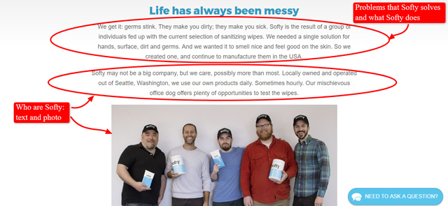
Here is how Softy dealt with their About page. It answers all of the three questions and sets the tone of a nice, warm, small and hard-working team. This is just a part of their About page, so you can see the text.
On the other hand, The Oil Collection could have done a better job at creating a good About page. The text is very short and it tells us a cute story about how the company came to be, but the page could have been a bit better and more content-rich. It would leave a much more professional impression.

When people shop online, their top worries are whether they will lose their money, whether the product will arrive, and whether the product will be as they expected it. These worries are usually what brings them to a store’s About page – to dismiss those worries by learning more about the business’ background and the people behind it.
Your About page is where your customers decide whether they should trust you or not with their purchase. That is why it’s not something you would want to take for granted on your online shop because this is that one page where you can offer your customers the reassurance that they are dealing with a real business run by professionals.
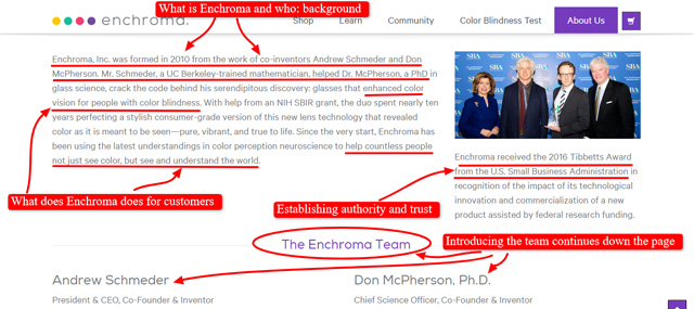
The About page of Enchroma that answers the three questions and also establishes trust by giving a brief history of the company, listing the awards and mentioning the team. You can follow the link to see the entire page, but here, we’ll shot a part of it.
Take a look at the About Us Page of Noodoll and you will see that they answer the three questions. There is also a nice video that shows exactly how the product is made. The first function is to show the process, which is fun, but the second is to establish trust by showing people that this eCommerce store is real and operating.
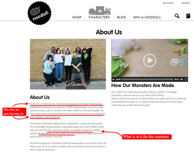
That it’s not just the text of an About page that can tell your visitor about the company, but the entire page itself. Its layout and design should reflect what your business is about.
Through its use of images, fonts and language choice, this example (Noodoll) presents as a quirky, cute and fun company.
These examples are very useful and you can learn a lot about them and get the general idea how a good About page looks like. If that’s the case, it is time to go into more details of About pages and thoroughly explain every element of it in the following topics.
If you want to see more examples – you can always follow Best About pages on Twitter and get a regular update on the latest trends when it comes to About page creation.
Keep in mind that they are NOT always eCommerce examples, but they are worth checking out.
Elements of a Successful About Page
As your About page answers the three important questions, you have to make sure that it is done in a proper way. What does that mean?
Well, you can give one-word answers to all of those questions, but that’s not what you should be doing. You should convey a reassuring message about a high-quality and reliable company that offers amazing and useful products. Take a look at some excellent examples and important elements of effective About pages.
When crafting a description, this is what you have to do:
1. Telling Your Store’s Unique Story
This is important because telling this type of story makes the eCommerce more relatable to the reader which results in better trust and increases chances of converting visitors into customers.
A good way to keep your customer reading and to establish a rapport is to tell them an interesting story about the owner and the eCommerce store. You can write an anecdote that shows a unique perspective of your company’s history. Small personal touches such as these make you relatable to potential customers.
Tell the customer who you are and what your company can do for them. Be friendly, positive and interesting.
You can also list the professional credentials of the store owner as the proprietor and the eCommerce business as a whole. Let them know the owner’s expertise in the business in order for you to gain your customers’ trust.
Take a look at the About Us Page of restaurateur Marie Catribs. This is a good example of using a personal anecdote to establish a rapport with the customer, so that they have a number of reasons why they should trust and buy from you.
In Chef Marie’s case, she shares a personal anecdote on how her family considered her a disaster in the kitchen. Then she goes on to tell us that she took necessary steps to learn about cooking in order to establish herself as a chef.

Marie’s story works. Take a moment to figure out why this story is a great addition to the About page. There are several important factors to this story.
1. It Is Relatable
When you use mental images that people recognize and are familiar with, you make the story relatable. Take a look at Marie’s story one more time: mother, grandmother, being messy, a hit of mischievous behavior. Everyone knows these things and can relate to them.
2. It Is Emotional
Sending out a message that contains a genuine emotion is very important. There is nothing quite relatable as an emotion. Make it a positive one. People like to feel good and they will associate your company with the emotion that you inspire in them.
Marie’s story is about her success and it carries a lovely, heart-warming emotion within it. So, when you think about Marie’s store, you associate it with all the good things: her effort, her charming starts and her success.
3. It Is Honest
So, you don’t have a blind Grandma behind whose back you could learn how to do your business. But, you must have something! Dig deep, talk to your employer and find that thing that happened to them in relation with their business that made you smile.
Don’t copy other people’s stories and definitely don’t make up events that didn’t happen. People can always tell. It is okay to add some flair to the already existing stories, as far as you stick to the core and it doesn’t bend it too much.
Perhaps Marie’s Grandma didn’t say those exact words. But, it really doesn’t matter, does it?
4. It Is Believable
If you have a story that is too good or too weird to be true – choose another one. It is very likely that it will not resonate with your customers.
So, your employer started the eCommerce store with the money they won playing lottery. Even if it is true, it doesn’t sound like it. Pick something that people don’t have hard time believing.
2. Finding Your Brand’s Voice
Finding your voice means establishing a distinct way of telling your customers about your store and your products. Every eCommerce store owner is unique, so make sure that uniqueness and personality are reflected in all aspects of their business.
This chart is mainly created for social media marketing, but it can help you when writing for a website, as well.
So, if you have a quirky store like Noodoll, you’ll also need to reflect that quirkiness in your website’s content, newsletters, blog posts, and other types of content your produce. The key is consistency, but you also need to be clear, distinct, and relevant.
You need to capture that feeling you have when you are thinking about your brand and put it into words. A good way to find your voice is to focus on the eCommerce store in question and try to describe it in three words. Those can be three adjectives or any kind of words. For example:
- Apple: innovative, unique, sleek design
- Lush: green, handmade, personal
- Mercedes Benz: elegant, superior, precise
If you are having trouble figuring out these descriptions, you can ask your existing clients to describe it for you in three words or phrases.
Creating a brand’s voice has been discussed in great depth by many experts. Here are some of the articles and resources that will help you a great deal:
- Entrepreneur: 5 Easy Exercises to Find Your Brand’s Voice
- SalesForce Blog: How to Find Your Brand Voice with Inspiration From Well-Known Companies
- SSPR: 3 Steps to Crafting Your Brand Voice
- Larsen: Creating the right brand voice
3. Using Name-Dropping to Establish Trust
You can establish the eCommerce store as trustworthy by promoting its associations/affiliations with other companies, big names in its industry, or any worthy third party. Many customers look for these associations or affiliations of eCommerce store owners to bigger names because they help build trust and good reputation.
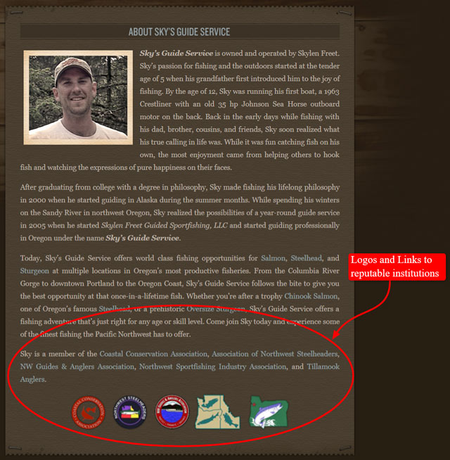
Take a look at the About page for Sky’s Guide Service. He tells us how he discovered sports fishing and how it inspired him to become a guide to share his passion. He then ends with listing his affiliations with several big associations in the sports fishing industry.
Just like with everything else, there is a good way and a bad way to name drop. There is a thin line between these two and you need to be very careful about it or it may backfire. Here are some tips that can help you do a great job.
Use relevant names – Establishing trust and authority is a great idea, but only if done right. Let’s say you design clothes and sell them online. It is a good idea to associate yourself with an authority from your field. Not just anybody – an authority.
Blend it into the content – There are two ways to go about this. You can either pepper the name dropping while writing about the owner’s experience or telling a story, or you can do it in a separate section.
Keep your identity – You can have too much of a good thing when it comes to name-dropping. Your About page should be about the eCommerce owner and store and not about all those other companies, authorities and names that you use.
Use buttons and logos – Following Sky’s example, make sure you use logos and buttons if they are available. People remember pictures much better than they remember the long names of the establishments.
One Yellow Tree: Visitors into Customers is a great article that contains excellent online and offline examples.
Marketing Nous: How to use name dropping and ego the right way – This article is mainly directed toward sales representatives, but it is included because it perfectly summarizes the psychology and the mechanisms behind name-dropping.
4. Highlighting Your Team
Always remember that your About page is meant to establish a rapport between your eCommerce store and the potential customers. Nothing builds a rapport better than making human connections.
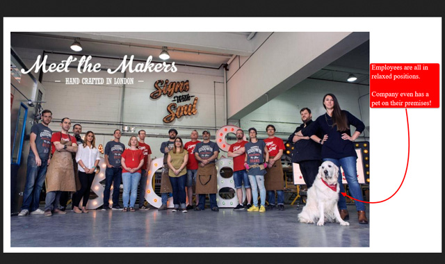
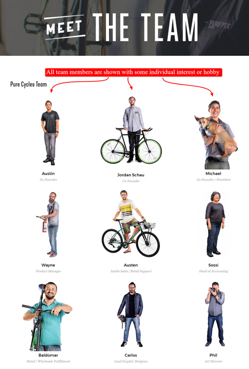
By introducing the entire team and including pictures, you are putting a ‘human face’ on that business. The goal is to make your entire company relatable to your customers because as humans, they’d like to know the people they are dealing with.
The About page of custom signs maker Goodwin and Goodwin has a good candid photo of their staff.
You may also consider adding contact details and short bios of the staff like they do at Pure Fix Cycles. Let that text be interesting and fun. Imagine you are introducing your friend to your other friends. Breathe life into the photos of the employees with these short, entertaining bios.
Very useful tips about this section of your About page can be found in the Miami SEO Company article 5 Ways to Create and Optimize Staff Pages That Bring in the Business.
There are many more excellent, creative and humorous examples of effective About pages that contain team information. You can find a lot of examples on the Pinterest boards:
Besides those, here are some excellent articles with a plethora of examples that can show you some amazing things you can do with your About page. Keep in mind that all those examples are in accordance with the website tone and voice, so what works for them may not always work for you.
However, you will definitely find a similar business that has ideas you can borrow and tailor to your specific eCommerce store.
- OnePageLove: 26 examples of Awesome Team Sections in Websites
- Smashing Magazine: Meet the Team Pages: Examples and Trends
- Amasty Blog: 30 Best Meet the Team Pages Examples and Trends
- IMPact: Best Team Pages: Check Out These 11 (and Why They’ll Win You Over)
5. Adding Testimonials and Reviews
Adding testimonials from satisfied customers or reviews of the products and services your employer offers adds credibility to your eCommerce store. It allows potential clients to see for themselves that other people are happy and satisfied with your products.
Be selective when it comes to including the testimonials to your About page. No. this doesn’t mean that you should hide what people are saying about the eCommerce store you are writing for. It merely means that you should present those that add some value and give potential customers a hint about that eCommerce business.
For example:
It was great.
This doesn’t say much other than the customer had a great experience. You need something that adds more details and makes the store stand out.
The product is precisely as on the website picture and it even arrived two days before we expected it too. This business is very responsive to emails and I had a lot of help picking my size. Would recommend it to friends.
This testimonial does a far better job at explaining what is so amazing about this business. This is the type of testimonial you want to include on your About page.
Keep it short – A testimonial just needs to be a few sentences or so, like this example from Woolerina.
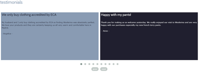
Overly lengthy testimonials are a bit boring to read. They also take up a lot of space on your page. It is better to have two shorter and straight to the point testimonials featured than a long one that goes into a lot of detail.
Add value with photos and videos – Be creative with your testimonials by adding photo’s of the customers and the products they bought in action. An example is CheapSheds which provides both pictures and videos of happy customers and their purchases.
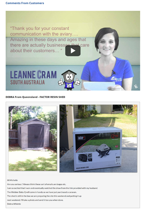
Pick the testimonials that emphasise on your values. Hopefully, you will end up with a lot of good reviews and testimonials to choose from. When this happens, pick those that express the benefits your product or service promises.
For example, if your employer runs an environmentally friendly business, pick the testimonials in which your clients explain how your product helped them be more energy efficient, reduce more waste or become more green in any way.
Don’t avoid testimonials that advise you to improve. There is a difference between the bad testimonials and those that are on a positive note, but point out an aspect of the business that can be improved.
This shows confidence and willingness to improve. Also, it improves the credibility of the testimonials. Nobody’s perfect, right? Well, it doesn’t make much sense for a company to have only perfect reviews then, does it?
Never use testimonials without permission. Even if the testimonial says all the best about the store and service, don’t feature it and use it unless you were given specific permission.
In most cases, you will get that permission if you ask for it and it is a sign of courtesy and respect. It’s not hard to ask and it is simply polite to do so.
Entrepreneur: How to Effectively Use Testimonials is not so much about examples as about cleverly extracted rules for testimonial choice and implementation.
Kissmetrics Blog: 4 Legal Tips for Using Customer Testimonials also contains amazing tips, but it also focuses on a legality of using testimonials.
Vandelay Design: Awesome Examples of Website Testimonials Done Right invites you to try to analyse the examples in them and figure out how you can implement the good sides in your own writing.
6. Adding Contact Information
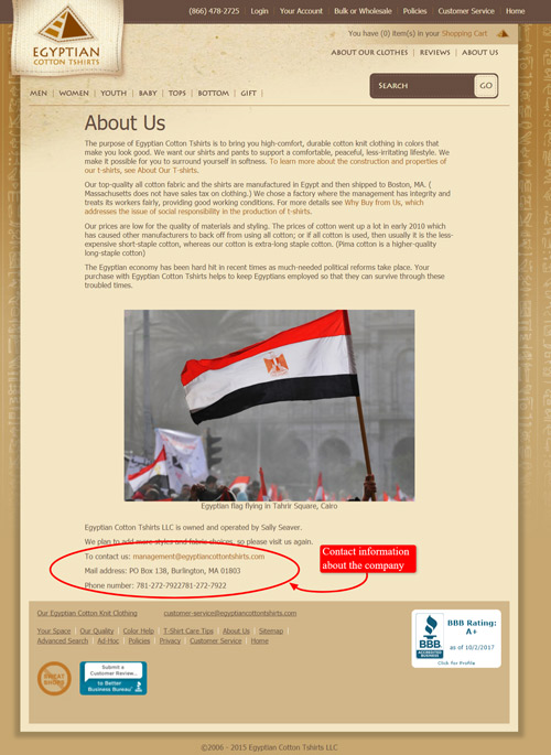
Your eCommerce store’s About page is the perfect place to include the contact information. Add the email, mobile and office telephone numbers, and physical address, so that customers and prospects are able to contact the store whenever necessary.
Below is the About page of Egyptian Cotton Shirts with email address, telephone number and physical address.
There are two major reasons why you should include as much contact information as possible on your website:
1. Building credibility while eCommerce has been around for some time now and people are no strangers to online shopping, there is still that notion of trusting your eyes more than websites. Being a bit wary of scams, people want to be assured that the shop really exists. That’s why you need an address, map, email, landline and everything else you may add.
2. Enabling potential clients to get in touch with the eCommerce store instantly. It takes so much effort to get a person to pick your business out of the vast sea of competition. eCommerce store owners invest time and money to do so. People land on your ecommerce website only to find out that they have no idea how to contact it. If it takes more than a click or two on their behalf, they are gone.
Therefore, make the contact details visible and easy to find. Here are some tips on how to go about the basic contact details on your website.
Physical address – there is nothing as ensuring that a business is real as a physical address. PO boxes don’t have that same power, but they can be used if there is no better option. Include an interactive map with it, so that it shows the precise location.
Email address – It is best to use an email address that has your website’s domain. Using email addresses as Gmail or Yahoo doesn’t seem very professional. Also, when you put your email address here, make it clickable for faster communication.
Contact form – Some eCommerce websites prefer using contact form to using an email. Contact form allows filtering messages by topic, since you can make the subject of the contact form a drop-menu with different suggested subjects. Also, using contact form can save you from a lot of spam emails.
Phone numbers – If possible, opt for a free number for the customers. If not, a direct land line will do.
Other means of communication – This includes social media profiles, Skype and other ways to communicate with the customers. While they are great, they require constant alert from your side. Add them only there is a member of the staff who will answer these inquiries at all times.
7. Using a Map to Show Real Customers
A live map of real-time sales shows customers that you are really there, alive and active. This also provides a live ‘social proof’ to both customers and prospects – giving your eCommerce store more credibility as a result.
An example is Gazebos Australia which provides a live sales map showing their customers’ real-time purchases.
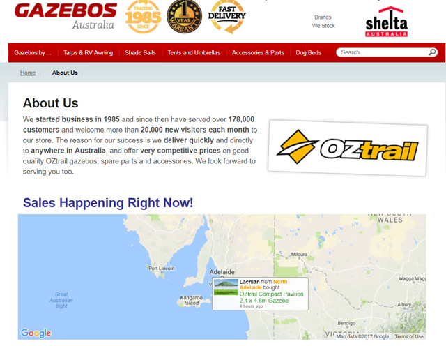
This type of presenting purchases creates the sense of urgency. Shopping is happening in this particular moment, so it can trigger the much mentioned fear of missing out.
How does this work?
When you are trying to pick a hotel abroad, you visit some of the booking websites that allow you to read a lot of testimonials and reviews. In most cases, you will take those reviews that were left by people who live near you the most seriously.
Why? Well, you probably share the similar expectations, background and habits. If they say the breakfast was just like home, you know what to hope for. If they say that the weather is too cold, you know what is considered cold in your area.
8. Adding Social Sharing
Social media is a powerful marketing tool for any eCommerce business. It enables customers to follow your social accounts and share their experiences with your site and/or products to their own social networks. Sharing on social media means more exposure for you as it also entails improvement in traffic.
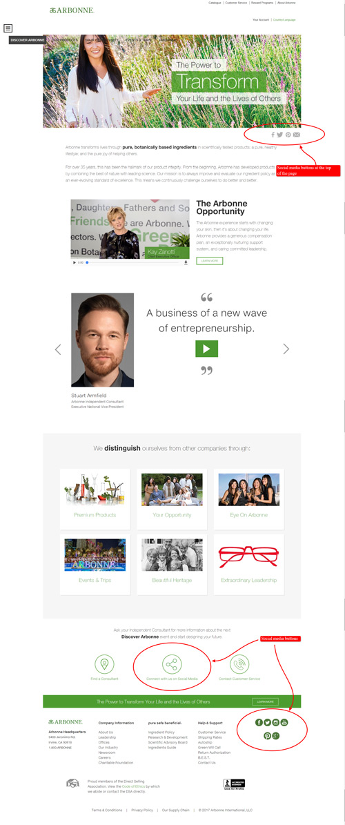
Arbonne About page has social media buttons right below the top, featured image. They are also placed at the bottom of the page.
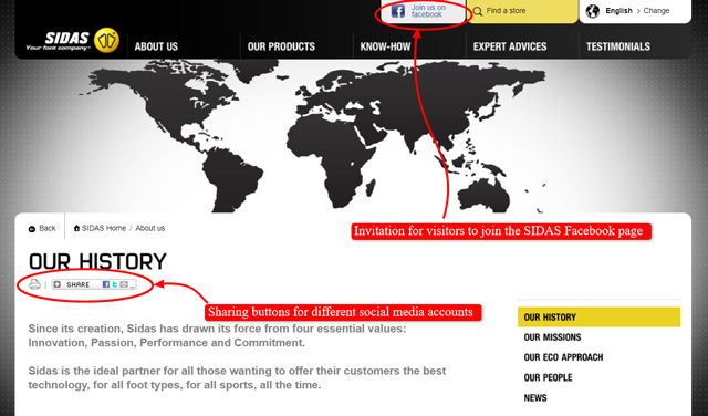
SIDAS has the usual social media buttons, but also a button that allows people to follow their Facebook page:
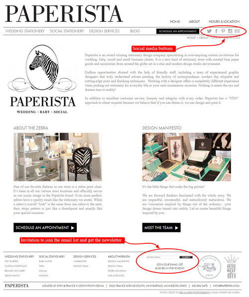
Specialty eCommerce store, Paperistas, is pretty straightforward by simply adding social media buttons on their About page that follow the color scheme and theme of the site. They also have an invitation for the visitors to join the email list.
Mashable: HOW TO: Add Social Sharing Buttons to Your Website gives several useful tips that will make your social media buttons more effective.
Jeff Bullas: 7 Questions You Need To Ask When Adding Social Media Buttons To Your Blog raises some very important questions when it comes to adding social media sharing and also gives great answers.
Eric W. Mobley: Social Media Share Buttons’ Impact on Website Performance explains how website traffic can be increased by a proper use of social sharing buttons. It also shows precious results of different tests concerning social media buttons.
Lemonstand: Does Your eCommerce Store Really Need Social Sharing Buttons? Offers more testing and interesting results.
In Summary
Writing up a perfect About page for a eCommerce store is important because that is the page that potential customers visit when they want to check the background of the eCommerce store.
While the Home Page creates the first impression, the About page forms the lasting impression and builds trust.
The About page is probably the right behind the Home page when it comes to the amount of time customers spend on your website. It is a core page in your store that will make a good impression on visitors. Focus on building rapport so you can convert visitors into customers.
Your About page needs to answer three questions that concern your customer:
- Who are you?
- What do you do?
- How can you fill my needs?
Also, there is more to your About page than just text. The layout and formatting need to match the eCommerce company’s style, product and overall brand.
The About page should be able to tell prospects and customers why a certain eCommerce store exist as a business and how it can help them solve their problems or satisfy their needs.
This page is more than just about history and current offerings, but it should also be a complete page that they can come back to if they: need help, want to share that page to their friends, or want to be sure of the expertise and credibility.
- Tell people what that particular eCommerce store is all about and what it can do for them. Tell the story sincerely, but provide professional background for credibility.
- Find and use your unique voice consistently.
- Mention relevant affiliations/associations.
- Mention the store team and introduce them using photos.
- Add testimonials or reviews from satisfied customers.
- Add a map of live sales for real-time social proof.
- Add all contact details, so customers can get in touch without leaving your About page.
- Add your social media buttons, so customers and prospects can follow you.
You will learn a lot about successful About pages by reading articles from authoritative websites, but also by looking at examples.
- WebDesignLedger: 21 Inspiring Examples of About Pages
- DesignSchool Canva: 50 Unique and Engaging About Us Pages to Inspire You
- Creative Market: 20 Creative & Useful “About” Pages
- TwelveSkip: 25 Best Examples Of About Me Pages
Frequently Asked Questions
1. What is the question your About page needs to answer?
a. Who are you?
b. What do you do?
c. How can you fill my need?
d. All of the above
2. Text is the only thing that is important on the About page.
a. True. You only need good text.
b. False. There are many more elements that help you build trust and rapport with your customers.
3. Finding a voice is important because…
a. It is fun to write this way.
b. It help your eCommerce store be more recognizable.
c. Everybody’s doing it.
4. Why should you include the map of your customers?
a. It build credibility as it makes buying customers look more “real”.
b. It helps potential customer owner figure out where his clients come from.
c. It helps eCommerce owner figure out where his client come from.
5. What is a great name to have on your About page, if you are in the IT industry?
a. New your Times
b. Prada
c. Google
6. When potential customers see photos and bios of the eCommerce staff, they will most likely…
a. Have a giggle
b. Skip it.
c. Find it easier to relate to the store.
7. About page is where your website visitors spend the most of their time.
a. False. People spend the most time on Home page, but about page is just as important.
b. True. That is the first page all visitors click
