
Your employer hired you to make their own life easier. Create a page that continues to save the much needed time for the eCommerce store owners and their staff by answering the same questions that are repeated all the time.
Make a good FAQ page.
This is the chance for copywriters to shine. In this lecture, we’ll teach you what actually an FAQ page is, how to help online store owners make one and why it’s not only helpful for their customers but also for the business itself.
So, apart from the importance of a great FAQ page, we’ll be discussing the appropriate organization, categorization, and layout of all the information that should be included in a first-rate FAQ page.
Ready to find out one of the ways to shine in the eyes of your employer and customers?
First, let’s start with some examples of good and bad FAQ pages, so that you can see what we’ll be talking about.
What Is an FAQ Page?
An FAQ or Frequently Asked Questions page is the place within your website your customers visit when they have some questions, problems, or even when they’re just doing in-depth research about your store/products/services.
As simple as that!
It’s a collection of all the relevant questions your (potential) customers have ever asked or might ask in the future.
However, it means the visitors are usually already frustrated with the issues they’re experiencing and it’s totally up to you whether they’ll leave your site in the same mood or quite the opposite – happy and satisfied because you offered some optimal, practical solutions to their problems.
Let’s just set the theoretical part aside and compare some poor and brilliant examples of FAQ pages to illustrate what we mean more vividly.
You wonder how we can distinguish good examples from the bad ones?
The main criteria for a good FAQ page that have to be satisfied are:
- The page has to focus on relevant information
- Its organization and design have to allow customers to find the information easily and quickly
Having understood this, we can look closely at the following examples and analyze them briefly.
Example #1 Stampd FAQ page
Here comes another rather poor example of an FAQ page.
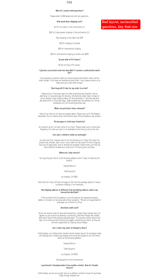
Due to very bad layout and tiny font size, the questions and answers are NOT readable. Furthermore, they’re just randomly listed instead of being categorized.
So, what can you learn from this?
Do NOT mix all the content (e.g. general questions, technical issues etc.) within your FAQ page because it confuses the customers and fails to serve their needs.
Example #2 Owletcare FAQ page
Now, compare the previous two examples to this one.
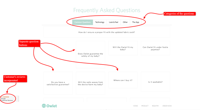
This neatly designed FAQ page consists of questions categorized according to the subjects. When you click on each of the categories, it presents question buttons you don’t even need to click on. It’s enough to just place a mouse on one of them and you’ll get your answer and/or some links to other pages if necessary. Check it out! (Note: This page looks different now.)
Can it be easier? Customers can just breeze through a page like this one!
Its simplistic design makes the visitors feel comfortable. Moreover, the answers are concise and straight-to-the-point, which shows they appreciate a customer’s precious time.
Example #3 NiteWatches FAQ page
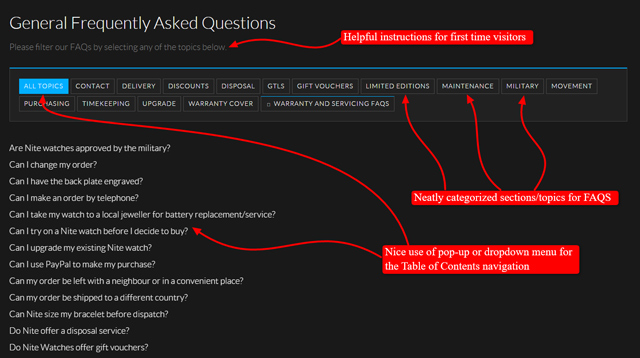
Here’s another elegantly designed and properly organized FAQ page.

This page has two main categories:
- General FAQs
- Warranty and servicing FAQs.
These are then divided into more subcategories which provide simple and short answers to the most common questions, with further links, videos and other relevant content.
There is also a good contrast between the background and the text, although some might find the choice of colors a bit unusual.
Example #4 CheapSheds FAQ page
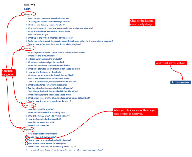
Don’t let the simple look deceive you! This FAQ page is absolutely brilliant! Just follow the link and explore it if you’re in doubt.
Its functional and minimalistic design makes it easy for customers to find the answers they need and saves space. It uses effective ways of conveying all the necessary and relevant information, emphasizing the human touch.
It means clicking on each question will take you to a lot of videos of real people providing you with step-by-step tutorials to help you figure out which steps to take in order to solve your problem. They also offer proper links to other pages you might need.
Moreover, the clear-cut layout does NOT overwhelm the reader, although the page is packed with valuable information.
The answers to the questions are simple and focused. In addition, they use this FAQ page as an educational tool giving the reader some supplementary content and comprehensive explanations, which leads to better rankings of the website in search engines.
So, what conclusions can we draw from the previous examples?
In a nutshell, if you want your customers to leave your FAQ page (and your store website) satisfied and to build trust, make sure they can access all the information they need effortlessly.
In other words, create a detailed, highly organized, readable FAQ page which can respond to the most common problems your customers may have. What’s more, design it in a stylish and welcoming way.
Do NOT just list all the questions randomly or overload the page with undesired information.
Let’s move a step further and see why this is important and how it can influence your eCommerce business.
Why a Store FAQ Page Matters
Such a page is a very pragmatic solution for anyone in the online business when it comes to managing customer service and interaction. It answers the most common questions being asked by the customers before they even get to ask them.
It Saves Time and Money
In order to help your employer(s) save time and money when running an online store but still keep the level of quality that customers and they themselves would expect, one of your tasks will probably be to create an FAQ page for their online store.
It saves a lot of time compared to manually answering emails, but it also saves money that would be spent on hiring someone to do the customer service.
It Boosts the Sales
Furthermore, a good FAQ page entices potential customers to buy products if the answers or information they are looking for are readily available such as shipping details or the type of couriers or delivery service being used.
It Helps Prevent Legal Issues
FAQ pages can also give important legal information to the customers that would otherwise be ignored. What we mean by legal information are things like policies, disclaimers, refunds, and so on.
This information can usually be found on separate pages, but they are often not visited as much as you would want the customers to do so.
It Boosts the Rankings
Did we mention that an FAQ page also helps an online store get better search engine results and rankings? That’s right!
Most search engines like Google don’t only take into account various keywords or key-phrases when calculating page rankings, but they also consider how valuable or helpful the information that comes along with the keywords really is.
Now, when you’ve realized the paramount importance of an FAQ page for eCommerce stores, let’s see how to create an outstanding FAQ page that works while you sleep.
Ask the Right Questions
The first step in making a good FAQ page is to ask the right questions. What this simply means is that you should put yourself in the customer’s shoes and think what questions you would ask yourself.
There are a lot of FAQs that come natural to online stores and there are more specific questions when it comes to the products one is selling. Of course, you should leave out the pretty obvious questions such as those about the price of an item and the like.
Shipping and Delivery Questions
One of the most frequently asked questions when it comes to online stores is related to the shipping and delivery information.
This is simply because the customers want to know if the product can be delivered to their location, if the delivery will ensure the safety of the product, or whether it can be delivered in a timely manner.
Here are the most asked shipping and delivery questions:
- How long will it take for me to receive my order?
- Do you deliver to (Insert Country Here) or Worldwide?
- Do you deliver door to door?
- Can you tell me the exact date of delivery?
- Will there be tracking available for my package?
- How much is the shipping cost and/or how is it calculated?
- What delivery service or courier do you use?
- Can I select a different delivery service or courier?
- How do you determine shipping and delivery costs?
- How can I avail of the Free Delivery service?
- If I purchase multiple items, do you put it in one package?
- Can I change my shipping information?
Refunds and Warranty Questions
Refunds are no fun, but every eCommerce store should be prepared for it. Thus, they should set and display their refund, returns, and warranty policies to the customers in the FAQ page.
Here are the most common questions asked about refunds and warranty:
- What is your returns or refunds policy?
- Do you have any warranty claims?
- Do your products come with any warranty?
- How do I return my purchase?
- Can I return the product if it was damaged upon arrival?
Product Specific Questions
Product specific questions are a harder topic to deal with and it is simply because every online store has different products and specifications that will probably get a lot of questions asked and need them answered.
A general rule of thumb for this is to ask questions that aren’t answered in the online store or product page itself. You can also add refunds or warranty questions here but only to specific products that might have different warranty or refund policies.
Here are a couple of example product specific questions that you might find helpful:
- Can I change or choose the color of the item?
- Where are the products made?
- What are the accessories included with the product?
- Are the products approved by the (FDA/Safety Regulations and Standards/etc.)?
- Is this product child-safe?
- What are the products made of?
- Do the products have any health or hazard issues that I should know?
- Is the product description as accurate as the store shows?
- Is the product water/rust resistant/proof?
General, Ordering, and Payment Questions
General questions are simply questions that customers usually ask regardless of what kind of product it is and excluding the other questions like delivery, refunds, warranty, and so on.
We’ve included the ordering and payment questions with the general ones because most people ask them as general questions rather than an entirely separate category. You can separate these categories if you wish to, of course.
Here are a couple of good examples of general, ordering, and payment questions you should ask for:
- How do I purchase your products through the online store?
- What type of payment options do you accept (Paypal, Credit Card, Debit card, etc.)?
- Are your payment options secured?
- Can you tell me more about the security of your payment options?
- How can I contact you directly?
- Can I order in bulk?
- Do you charge any tax on the products?
- Do you issue official receipts?
- Do you offer live chat support?
- What is your stock policy?
- What is your pricing policy?
- Do I need an account to make a purchase?
- Can I order via landline or mobile phone?
- Will I be paying any customs fees or duties?
- Are there any discounts for nonprofit organizations and charities?
Discount, Store Credits, and Promotion Code/Coupon Questions
These questions are probably not that common anymore. They are very specific and are used by certain online stores that actually offer these perks.
It is best to skip or leave these questions if an online store is just starting. However, here are a few examples you can use in the future.
- How do I use my gift certificate/coupon code/store credits?
- Are there any discount promotions available?
- Do you offer discounts to senior citizens?
- Up to when will these codes be valid?
- The discount codes/coupons aren’t working or why can’t I use the discount coupons/codes?
Just remember that the examples of the Frequently Asked Questions we have provided you with in this lecture do NOT cover all the specifics of different eCommerce stores.
Therefore, make sure you always keep thinking of the specific questions that your target customers most certainly will ask and include them in your FAQ page.
Having chosen and phrased the right questions for your FAQ page carefully, it’s time for you to categorize them properly and present them in a way that is organized, readable, and appealing to the customers.
In the following sections, you’ll find out how you can do it.
Organization and Format of an FAQ Page
A lot of online store owners usually have an FAQ page but more often than not they don’t have a well-organized FAQ page. A good FAQ page is easy to read, navigate, and use.
If you fail to make a good FAQ page you are risking for the customers to be confused thus discouraged from actually purchasing the products.
This is how you properly structure and organize an FAQ page so that customers don’t have a hard time finding the answers to their questions.
Structure and Navigation
The first thing you need to do is make sure that your FAQ page is easy to navigate so that the customers can easily and quickly find what they’re looking for.
To achieve this, make a Table of Contents and categorize the questions & answers properly.
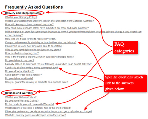
Adding a table of contents with links to the questions and answers is a sure-fire way to get to different parts of the page without having to scroll down aimlessly until you find what you’re looking for.
Below are a couple of great examples of table of contents in an FAQ page.
Example #1: NiteWatches FAQ Page
Example #2: Gazebos Australia FAQ Page
The addition of a search option or search bar is also recommended since it makes it a lot easier to find specific keywords or phrases that are relevant to the questions that the customers will be asking for. The example of The Ghostly Store below shows what a search bar in their FAQ page looks like.

You also want to structure the FAQ page neatly and properly so it is easy to read. This is the list of the things you want to AVOID on your page:
- Unnecessary images
- Font type, color and bullet points changes halfway through the page
- Inconsistent and illogical indentation
- Improper or unnecessary highlighting
Also make sure NOT to be redundant when forming questions or answers. Nobody wants to read the same thing over and over again.
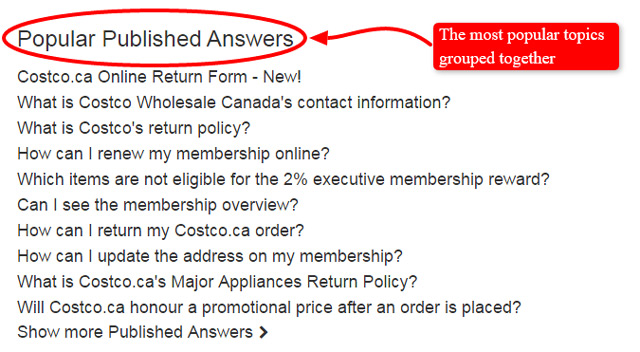
Another great idea is to have a popular topics or questions section so that the customers don’t have to look far to get their questions answered. Think of it as of ‘the most frequently asked questions’.
Here is an example of a popular topics section that is a part of the Walmart FAQ page layout:

Here’s another similar example that is a part of the Cosco FAQ page.
The next thing you should take care of when it comes to a good FAQ page organization is clear readability.
Readability
Readability is probably one of the most important visual aspects of any content on the Internet. People nowadays, more often than not, just skim and rarely read through everything.
With that in mind, you should format the content in a way that is easily readable to the customer and yourself as well.
- Use a big and clear font that is easy to read. Avoid any fancy fonts or multicolored/eye-straining colored ones
- Don’t use gigantic font sizes, just big enough to read
- Use appropriate line spacing, indentation, and margins
- Make sure to write around 2-3 sentences per paragraph. Do NOT make it look like a wall of text. You don’t want to intimidate your customers, so keep it short and sweet!
- Have clearly defined line or paragraph breaks
- Bold or highlight necessary words or phrases that you want to attract attention to
- Make sure that the font color and the background color of the page are in contrast to each other so that they’re easily distinguishable
Now when you know how to structure and organize your FAQ page in the best possible way, you are probably satisfied because you think there’s nothing else you can do to improve it.
Well, there is, actually.
No, this is not a joke. You don’t believe it?
Let us show you what else you can do to make your FAQ page even better.
Read the following sections to find out more about various other ways you can polish up your probably already very good FAQ page.
Add More Information
Most FAQ pages just use text as a means to answer questions. Fortunately, there are other ways to enrich them with different media such as videos, infographics, webpage plugins, and diagrams.
Videos or Screencasts
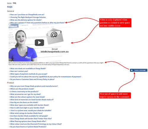
Having video answers to your FAQ pages is a great way to add more value to it. Not to mention it gives your customers more engagement.
Give your clients a chance to slow down from their skimming and watch a short video to get their questions answered.
However, you should take care of the following:
- Videos must be short and straight to the point.
- They should be uploaded to YouTube, Vimeo, or maybe an integrated video plugin which is easy to load and watch.
- A good idea is to have the videos embedded to the FAQ page instead of being opened to another window or tab so that the customer stays on the original online store page.
- Video answers should preferably have narration as well as a graphic guide when answering the questions.
Below is a great example of adding videos or screencasts to the FAQ page by CheapSheds:
Diagrams and Infographics
Using a straightforward and easy to read diagram or infographic is a great way to make your FAQ page more unique, interesting and informative for your customers.
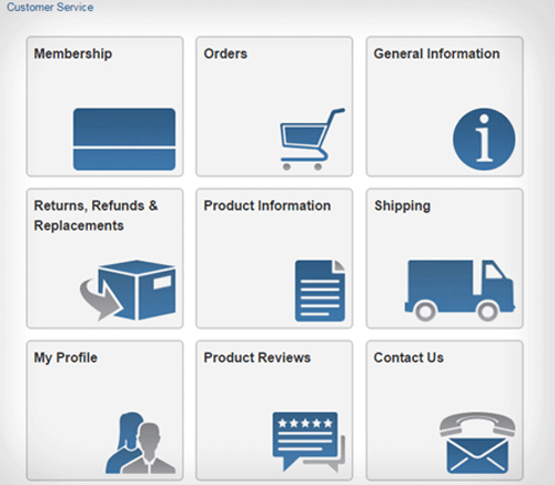
While infographics are used to present useful statistics, diagrams are useful for presenting visual step-by-step explanations.
Here is a diagram within Construction Gear Returns Center that answers the question how to return an item or a product:

Similarly, the following diagram within Costco Customer Service page conveniently illustrates the help topic categories, making the entire page far easier to navigate.
Plugins or Extension Software
You can also make use of different plugins or extensions for an online store webpage. These vary depending on what type of CMS or Content Management Software you will be using (Shopify, Bigcommerce, Woocommerce).
What some online stores do is – they integrate social media such as Twitter to help their customers’ questions be answered if the FAQ page doesn’t have the answer.
This acts as a live chat support with social media integration that is easy to use, convenient for the customers and helps building the community and social media presence.
Multiple Languages
Almost everyone selling products online is definitely looking to sell to international customers and that means many different languages to cater to.
Of course, English is probably everyone’s best bet when it comes to choosing the most widely used language in the world. On the other hand, it doesn’t hurt to have the option of finding answers and questions in one’s own native language.
This add-on is typically for more advanced online store owners who have already established online presence and are looking to expand their horizons to different locations or regions.
The languages they choose to cater to would depend on where they want to expand their online store.
Here is a good example of multiple languages option within Etsy Help page:

In Summary
Now we’re at the end of the lecture on how to make an excellent FAQ page, so let’s go over the final checklist to make sure you don’t miss anything important when making your own FAQ page for an online store.
- Ask the right questions. Make sure you know the audience and the online store and add the right questions that are most likely to be posed to your business.
- Properly organize and format your FAQ page so that it is easy to read and navigate through.
- Don’t be afraid to add other media and tools to your FAQ page such as interactive and engaging videos, diagrams and infographics, multilingual support, and even various plugins and social media integration.
- Last but not least tip is to keep updating the FAQ as the online store grows and progresses.
Frequently Asked Questions
1. Is it advisable to add as much valuable content (images, videos, text) to the Help Center page?
a. No. It doesn’t matter at all.
b. Yes. All the mentioned content makes it more visually appealing and boosts the store page in the search engines.
2. Semantic search is used ONLY for Internet searches.
a. Yes. That is its only use.
b. No. Some apps allow you to use this type of search to deal with large email inboxes.
3. Email management software is…
a. Pointless. You have to read all those emails anyway.
b. Precious when it comes to categorization of the incoming messages.
4. Flexzfitness is an example of an eCommerce online store with a very well-organised Help Centre.
a. True.
b. False.
5. Email communication is a thing of past.
a. Yes. Everybody texts these days.
b. No. Most business still get many emails every day.
