The aim of this guide is to help you create an interesting, successful and easy to understand Why Buy From Us page. A good Why Buy From Us page should help clear any lingering doubts in a customer’s mind that buying from you is difficult, inconvenient and not worth their time.
Your Why Buy From Us page is your final pitch to your prospective customers. If you did your work right, other pages on your website have already answered the questions of what you can provide them and why they can trust you. Your Why Buy From Us page is where you drive home the point that buying from you will be an experience they will not regret.
You Why Buy From Us page is another chance for you to establish yourself as trustworthy but – more importantly – this is where you emphasize how convenient and pleasant the experience of shopping with you can be for them.
Your Why Buy From Us should present the viewer with a list of reasons why shopping with you is to their benefit. Take care not to be boring by using positive and upbeat language and include interesting images to keep their attention. Above all, make sure the layout of your page is clear and easy to read.
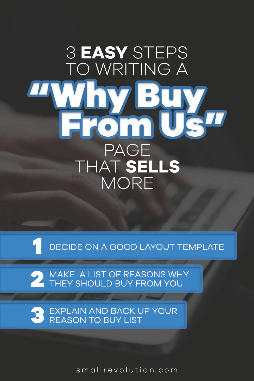
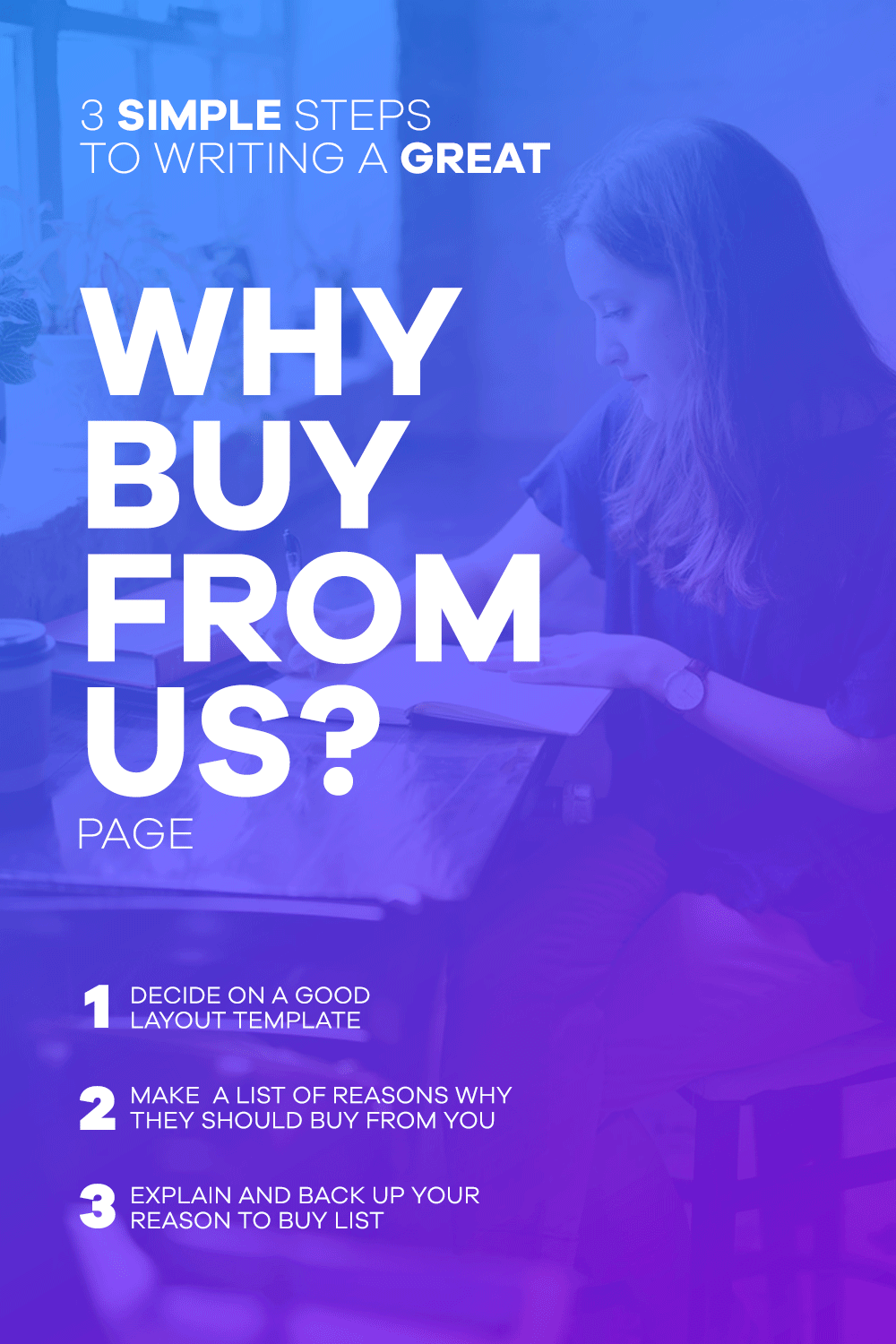
Step 1: Decide On A Good Layout Template
Your e-commerce store needs a distinctive look and feel that should carry on throughout the store – the Why Buy From Us Page should be no exception. If you already have a basic template or theme for your store, you should use it in your Why Buy From Us page.
Make sure the colors and fonts you decide to use for the page are clear and readable. You want people to be able to get answers to questions from your Why Buy From Us page so you need the information on the page to be clear.
Also, make sure that any and all links, graphics and videos you use should work and load quickly. You want people to find out what they need from your Why Buy From Us page, not leave in frustration.
Step 2: Make A List Of Reasons Why They Should Buy From You
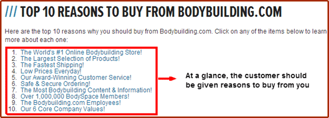
Enumerate in a few words or a sentence, the reasons why buying from your on-line store is an experience they will not regret. With a glance at this list, the customer should be able to tell why the shopping experience with you is superior to others.
One of the biggest draws of the on-line shopping experience is the convenience factor of being able to get something you need without leaving your home. However, one of the biggest misgivings people have about buying on line is, they might NOT get what they need.
The Why Buy From Us page is where you convince them that you will be able to deliver what they need quickly and conveniently.
If you provide quality control, shipping guarantees, shipping tracking, easy return and exchange programs, or money back guarantees – any program or policy to assure them that they will receive their order – list them down here.
If you have any special programs or promo’s for online shoppers – discounts for deliveries to certain areas or at certain times, volume order specials, tax exceptions – this is where you talk about them.
Other things you can list on your Why Buy From Us page:
- Payment options or partners
- Contact methods such as help lines or livechat – anyway they can get quick answers to pressing questions
- Industry or service awards
- Companies or organizations you’ve partnered with
Step 3: Explain And Back Up Your Reason To Buy List
Some people will need more than a list to be convinced. While you should start out with short yet descriptive reasons to buy from you in your list, you should be able to elaborate or defend these reasons further down your page.
Above all, try and make sure that you deliver the information in a way that is friendly and engaging. Your page might start with a list, but there’s no reason it should stay a list. Use videos, graphics, images and photo have to keep viewers attention. A dull, boring, badly written list of reasons is not what you’re about page should be.
Learn From Others
Here are some examples of good Why Buy From Us pages. The screenshots focus on elements that the pages used to keep their pages from being dull. You might want to incorporate similar elements for your own page.
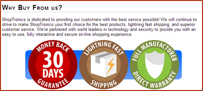
Shoptronics tells us how trustworthy they are and how reliable their deliveries are using graphics.
So does RecorderGear, using its page header. Aside from being creative and eye-catchy, RecorderGears header presents important info on contacting them and on their delivery guarantees front and center. A visitor can get the info quickly without having to search further, saving time.

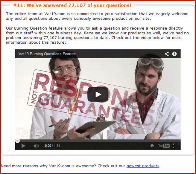
Vat19’s Why Buy From Us page gives a list of reasons to buy from them and elaborates on them using fun and friendly language, graphics and even several videos.
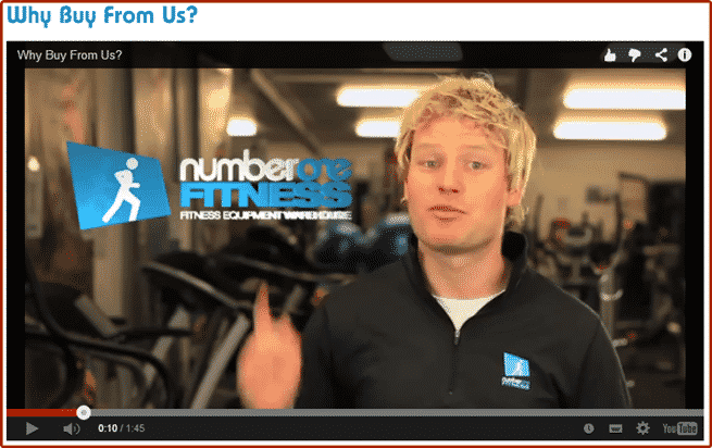
No.1 Fitness also uses a video. The only problem is that the video is the main content of the page and the medium by which the reasons to buy are listed. It’s still probably better to have a list and reasons in text, just in case the viewer has no time to watch a video or if their computer has difficulty playing videos.
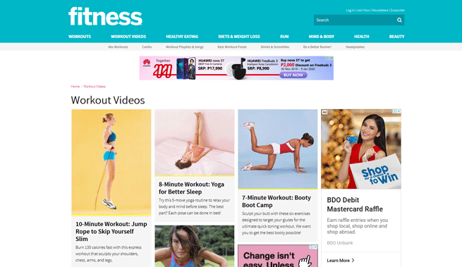
Much like Number 1 Fitness, fitnessmagazine also uses video as its main medium to transmit information but it also uses graphics to bring across some important points.
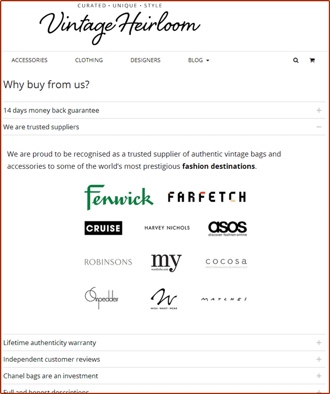
Vintage Heirloom keeps things interesting by keeping their list dynamic. You have to click on the list of different reasons before you get to the more detailed explanations.
Booktopia establishes its reputation by including graphics of the awards they’ve earned.

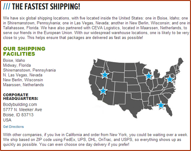
Bodybuilding.com emphasizes its promise of fast and efficient delivery by including a map with its shipping facilities and locations.
Final Checklist
- Choose a good layout template for your page. If you already have a theme for your store, use it.
- Choose fonts and colors that keep your page readable.
- List the reasons people should buy from your page.
- Explain the reasons people should buy from your page. Keep it interesting yet informative.
- Make sure that all and any links or special features of your about page work.
Shareable Images
Photo by Tirachard Kumtanom


