Websites which contain solely from blocks of texts are non-existent in the 21st century. Whether you work for an eCommerce company, create product pages, blogs or some other form of content for websites – you will need to pick, process, and name different images.
Preparing an image for using on a website means you need to find a good image first. In most cases, you will be given the image from your employer, so there will not much to choose from. However, sometimes, there will be a variety of images for you to consider and here are some excellent tips to keep you on the right track.
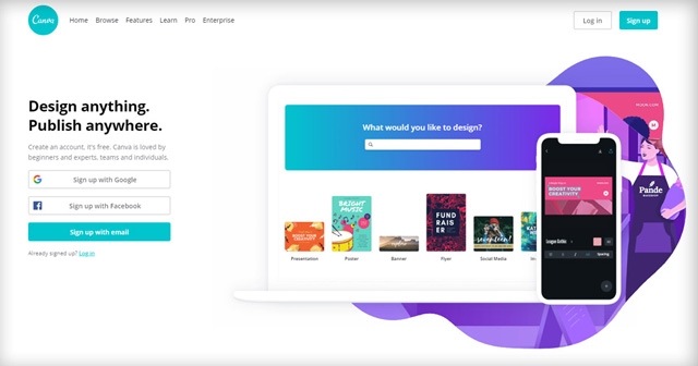
Canva: Boost your visual marketing results: 15 epic tips to choose images that sell

Choosing the Image
If you need your image for blog posts and similar purposes, you will have to choose between a paid and free photos. If you choose a paid image, all you need to do is make sure it is the right choice for what you need.
If you need to find an appropriate free image, there is a bit more to it. You will have to mind the copyright and attribution.
Let’s start with your choice of image. Here are some articles that can help you with your decisions:
- InVision: 8 tips on choosing the right photos for your design
- The Content Strategist: 5 Tips for Choosing Images That’ll Make Your Content Engagement Skyrocket
- HubSpot: How to Select the Perfect Image for Your Next Blog Post
There are several ideas about the content of your images that you need to keep in mind, if you are choosing an image for a blog post, for example:
1: Image Needs to Be Positive
Keep in mind that positive images work better than negative images. For example, an image of a happy person with a solution is better than a sad person with a problem. Here is why.
There is such a thing as emotional contagion. A team of scientists from the Cornell University conducted research about emotional contagion. In short, it showed that people who were exposed to more positive content on Facebook felt positive emotions.
Consequently, if you pick positive images for your blog post, it will influence the mood of your readers and you want them happy. If your images and texts put your readers in a good mood, they are less likely to scroll down or bounce off your website.
Let’s say you are about to enter visit a website that deals with women’s clothing, jewellery, accessories, and hats.
Which of these two photos is more likely to make you stay?
The first one is a photo of a smiling girl with a nice hat.

What about this image of a lady wearing a lovely hat, but looking a big gloomy and like she is about to cry?

This is not a positive image. Meaning – this is not an emotion that a person wants to “take with them”. Therefore, it is not something that you need to put on your website, unless you want your visitors bouncing away from it.
The image carries a certain emotion that people read and even associate with your website. Therefore, they do not want to see or feel negative emotions.
Consequently the first image featuring a smiling girl will always have more success in engaging website visitors than the one with a serious girl.
However, it is very easy to fall into a trap of choosing cliche images. Take a look at the photo you’ve chosen – if you feel like you’ve seen that same photo somewhere before – it’s a cliche.
That is why you need to be very careful when choosing positive images, because it’s easy to choose a cliche image when you want to cause positive emotions.
These can include: kittens in a basket, overly clean and happy coworkers in an office, a businessman giving everybody a thumb up and the like.
How to save yourself from a cliche?
It takes a bit of practice. It is necessary to train your eye. You will browse a lot of galleries and stock photo websites and soon enough, you will begin to see the patterns and to recognise what is a good photo and what makes a completely generic and overused photo.
Moreover, learn from others! There are some very experienced professionals that are happy to share their knowledge on this topic and show you how to spot a cliche image from a mile away.
Read these articles and they will get you on the right track. After that – it is all about practice.
- Stop Using Stock Photography Clichés
- How to Avoid the Stock Photo Cliche
- Don’t Fall in the Trap of Cliche Stock Photography
2: Image Needs to Feature Only One Concept
Your photo should have the subject matter in focus. It should have one idea. Otherwise, it will be confusing.
If you write about beach hats, your photo should have a beach hat in its focus. There can be some other things on that photo, but they should not ‘steal the spotlight’.

In this photo, you can see a hat. You can see that the hat is on a beach and that it is hanging from a chair. Obviously, there is a beach umbrella there, as well, but these things are not the focus of the photo.
Would you say this is a picture of a beach umbrella? Probably not.
It is still a picture of a hat. That is a concept of this image and it works well.
On the other hand, this would not be such a great example to use if you need an image of a hat.

There is a hat on this picture, of course. But, again – would you call this a picture of a hat?
You could call it a picture of a red towel, just the same. Even so, two chairs on a beach would be even more appropriate.
In other words – this photo has more than one concept.
When this is the case, like on the example above, you will most likely confuse your reader. That means your message is not clear enough and that’s a certain sign you haven’t chosen your image well.
You can use the following rule of thumb when you are trying to determine if a photo has one featured concept:
Ask yourself – what is that photo about? If there are two answers to that question – find a different photo.
3: Image Must Be Related to the Topic
If your image is not related to the topic, it will do more harm than good when it comes to complementing your text.
Instead of allowing your readers to focus on the topic of your content, you are confusing them by adding a different idea to the mixture.
This shifts the focus, waters down the impact of your idea and lowers the quality of your content. In other words, it does exactly the opposite of what you need.
Let’s get back to our beach hat example. Let’s say you are writing a blog piece about beach accessories and your focus on the hats.
An image like this would be quite appropriate:

On the other hand, the same text would not work so well if you chose the following photo. Try to guess why:

Is it about a beach? Yes. But, is that the same context? No.
There is a pair of sunglasses and a book, a camera and similar items. It’s a nice photo, but it is not what you need. These are just some items that you can take to the beach, but are those accessories? Where’s the hat?
It’s beach, all right, but an entirely different aspect of it. This photo is more about sending out a message about relaxed day on the beach and the beach atmosphere in general.
Therefore, instead of supporting your text and illustrating it, this photo steers your reader’s focus in an entirely different direction.
4: Image Must Be Clear
The image should provide a clear presentation of ideas that readers can easily catch or perceive. It should take one quick look at the image to know what it is about. Make it easy for the readers.
Why? You might not get a second chance.
Your readers will come to your website, take a quick glance, conclude that they have no idea what they are looking at and simply bounce.
A clear picture sends the message to the readers that the content of that page is just what they were looking for.
Let’s continue with our examples about beach hats and accessories.
You have written your blog post about different beach hats and people who look for such blog posts land on your page. They probably want to see something like this:

Your reader sees the picture and thinks:
Yes, this is obviously a beach hat, that’s precisely what I was looking for. Let’s give this text a go.
This happens because the picture is very clear and straightforward. It doesn’t take more than one look to see what it is about. You don’t have to think about it – it is that obvious!
That is the image you want for your website. That is the image that will let your readers know they are at the right place.
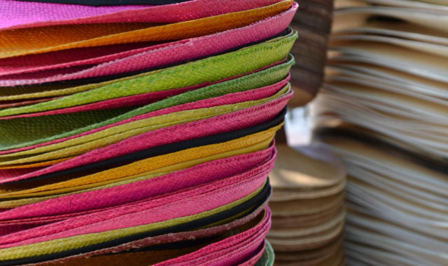
On the contrary, this would not be a good choice:

These are colourful straw hats. But, did you guess that or did you have to read on to discover what was in the photo?
While the photo is colourful and vivid, it is not clear. It is confusing and it just doesn’t work. Your readers will not give your text another chance and they will simply move on.
Therefore – if you have to think twice about what is on the photo – use a different photo.
5: Image must be engaging
Choose an image that tells a story, an image that speaks to you. If it speaks to you, it will probably speak to your readers, as well. Such engaging content will make your readers stay longer on your website.
Firstly, whenever possible, use an image with people in it. It has been shown that people react best to the images with other people in them. More precisely – people react well to faces.
If you want to go into even more detail, choose photos on which a person looks toward the camera. Here is an example:

You have a feeling that this woman is looking at you and smiling at you. Therefore, you are looking at her eyes and you are already engaged. It only takes a moment.
If you have the feeling that you are a part of some sort of interaction, no matter how small it may be, you already paid some attention. In other words – you got engaged. Images featuring people looking at the camera achieve that effect.
Compare the effect of this first image with this image that also features a young woman smiling, but she is looking away:

The image is still beautiful and positive, but it is far less likely to get you involved. The woman is looking away and she is looking at something else. You don’t know what. Therefore, you are not a part of that interaction.
More precisely – you are not engaged.
Secondly, people love images that show some sort of interaction. Here is an image of a granddad and his grandson. They are reading something together and you can clearly see that there is some sort of interaction between them.

This interaction is engaging. You see that something is happening and you want to see what. That’s why you are spending a bit of extra time looking at the photo. Namely, the photo engaged you.
Another way to choose an engaging photo is use a photo on which an action happens. This is a photo that will engage every cycling lover:

This image is fun! It’s got something interesting going on in it. It is active and lovely and you want to be a part of that action!
You associate the message of this image with the entire page and you are engaged with its contents.
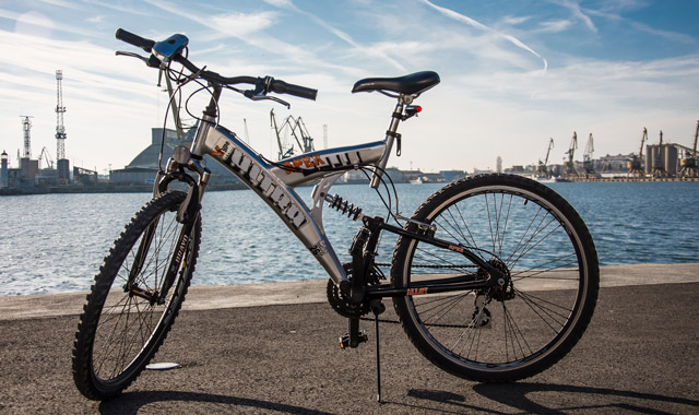
On the other hand, this is also an image of a bicycle that an eCommerce store might use for their purposes:

It is still a bicycle and it is still probably a very good one. But, it is just there! Nothing happens. Nothing there to make you want to spend an extra moment to learn more. It is just not that engaging.
6. Image must be authentic
Choose authentic images and avoid graphic images. Ask yourself – is this likely to happen in real life?
An image of a baby using a laptop is cute, but does that ever happen? No.
People in perfectly iron-pressed shirts, showing all their pearly whites for the camera? Not likely.
You don’t want to appear fake. Therefore, make sure that your images are realistic. That is also the reason why you should avoid graphics. They aren’t real, are they?
Take a look at these two photos, both of them showing two scientists that work in a laboratory. Which one is more authentic?

Obviously, the first photo is authentic, while the second one is not. You believe that the people from the first photo are really scientists, while people from the second photo are obviously models.
By using this kind of photo, you are diminishing the levels of trust that your potential customer has in your website. This is staged and highly unlikely. Who is to say that the rest of your website isn’t the same?
All those images that show you only a part of a person are also a bad choice when it comes to authenticity – handshakes, feet and hands of people on a race start, etc.

If you are using free resources for your images, your choice will sometimes be limited. Simply do your best.
When you choose your image, you need to make sure that you have the right to use it. If you paid for it, it is yours to use. If you are working with a free image, make sure that you attribute it properly.
