
Most online workers, especially those in the eCommerce industry need to know a thing or two about images. Yes – even if you are not a designer!
You will be a part of a team that creates content and almost all types of content include images in one form or another. That is why you need to learn some basics about how and why the images are important.
This lesson will help you understand this importance by teaching you the most relevant reasons why images make your content better.
Lines and lines, paragraphs and paragraphs, slabs and slabs of text are not that inviting for any reader. Adding an image here and there is essential if you want to illustrate your point, liven up your text, break the pattern and therefore make your writing more visually appealing.
In case of eCommerce, images are just as important as the text itself. You will have product images, images that make blog posts more interesting, infographics, promotional banners and many more.
The Internet is full of images. It’s easy to just go online and grab one. Well, think again.
Just because everyone has a set of eyes and a computer, it doesn’t mean that just anyone can find a good image. There are a few more nuances involved in choosing the best image for the job.
Your employer will be very glad if they know they can assign you a task that involves finding quality photos that work well in a certain context, are properly attributed and, overall, look aesthetically pleasing.
Images Form the First Impression
Let’s say, as a customer, you are browsing the Internet to find a nice, colourful umbrella to keep the sun off your back when you’re playing a few rounds of golf.
You are typing in your keywords and the following product page is in one of the tabs you opened from your search results.
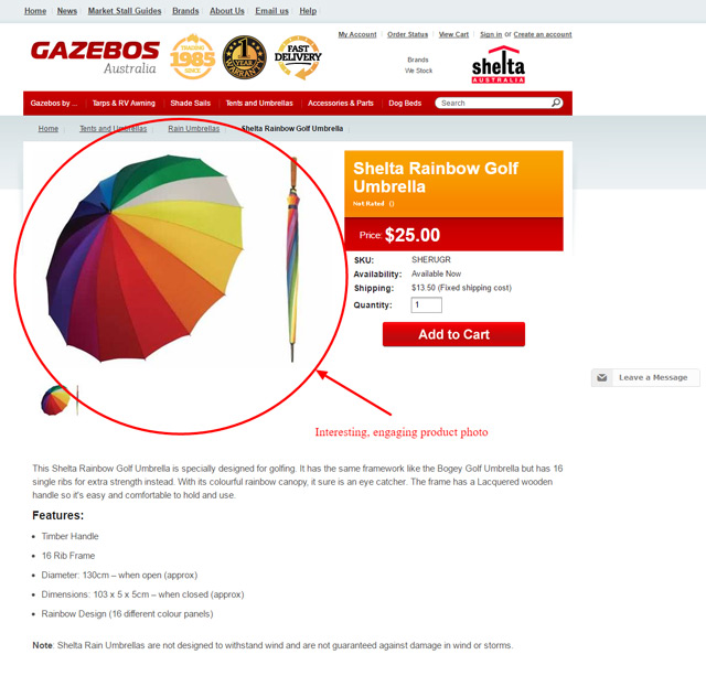
What is the first thing that you see on this screenshot? The text or the image? Image, of course!
Moreover, you get the impression that this offers precisely what you were looking for and you continue to read on.
This image just formed your first impression about the website, sending you the message that this is a valuable website, worth your while for further investigation.
Now, how about this example?
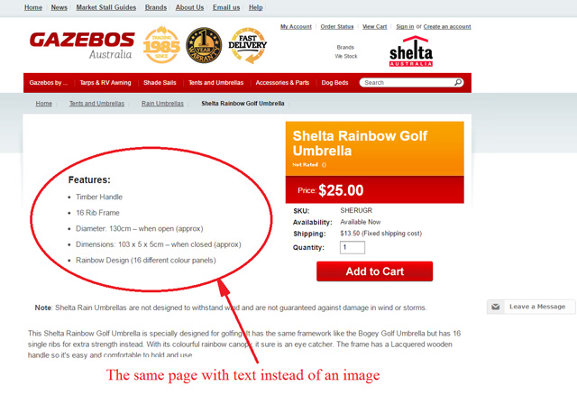
Not nearly as attractive as the example above, right?
Still, that is the same page, with just a little bit rearranged text and with the image cropped out.
That’s what happens with the majority of the content you post online – people see the image first and subconsciously decide if they are going to read your text first or just skip it.
If the image is well chosen – excellent! The first impression is formed and it’s a positive one. If it’s a blurry, negative or in any way bad image – you lost the chance to make a good first impression.
In other words, finding a good image for people to look at is most likely to decide if they love or hate your website.
Images Can Engage People Who Don’t Read the Entire Text
People read only if they have to. Many prefer to skim read.
If we go back to our example above, let’s say that 10 people are looking for umbrellas. Not even a half of them will spend time reading the entire contents of the page.
Most of the website visitors read only a couple of keywords and see the image. This doesn’t mean that you should not write a good description of your umbrellas, but it definitely means that you need a perfectly chosen picture to accompany the text.
A good image is engaging and it attracts those that want to read more, but it also attracts those that don’t want to read at all!
They are all your prospective customers – but only if your image is good.
Images Set the Tone for Your Store
Take a look at the following two examples of eCommerce stores and the way they managed to set the tone of their store by choosing appropriate images.
An eCommerce store Trunki, creates wonderful, customisable suitcases for kids that even have the wheels, so the children can ride them.
It is a great idea that surely brings heaps of joy and hours of fun to kids on the road. It is cheerful, playful, fun and colourful – so, the tone of the eCommerce store should be the same.
This tone is set perfectly with the combination of a great image and the text written in a ‘piratey’ style.
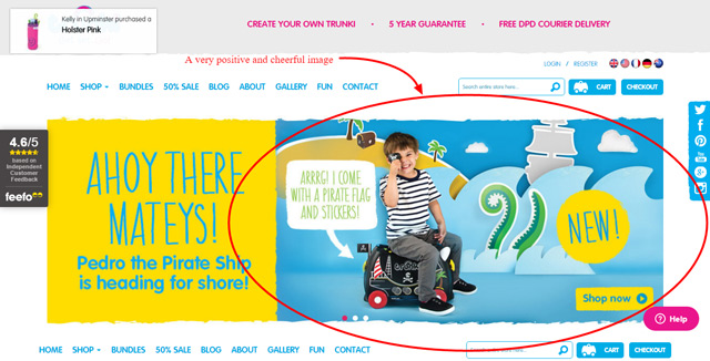
You don’t expect tech jargon, philosophical or political debates here. The image helped you set your expectations to match the content of the store.
An entirely different tone is set by the following image chosen by the Analog Watch Co for their eCommerce store that sells watches made out of natural materials like wood and stone.
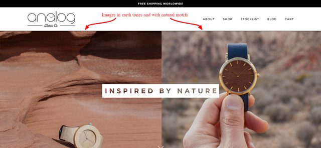
Everything about these images reminds you of natural materials: the colour, light and motifs. The tone is perfectly set. You expect elegant design, natural, earthy colours and clean lines. You don’t go here to find digital watches and flashy, neon colours, do you?
Again, the tone of the images used set your expectations about the products of this eCommerce store and the product themselves are to deliver on that promise.
Then again, there are those eCommerce stores that set the tone with their image that doesn’t seem to match their product. These images and eCommerce stores can be well-designed, but their tone seems to be missing the point.
For example, Mah Ze Dahr Bakery produces and sells tea, cookies, bars, cake and a lot of wonderful treats. These words alone remind people of the warmth of the baked goods, smooth smell of the tea in the air and that crunchy texture of cookies.
Translating these sensations to colours, what would you pick? Warm or cold colours? Cosy or elegant or industrial tone of the image?
It is more likely that tea and cookies remind you of your grandma’s home than a high-end concept store or a factory, but this is the image that is on the front page of this bakery:
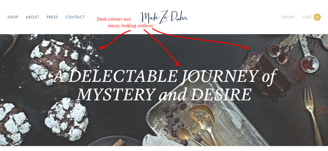
The dark colours don’t seem very inviting, don’t they? You need to take a look or two before you even realise the things on this image are actually eatable. The textures are powdery, messy or metalic – none of which entice appetite.
The tone that is set for this image is more appropriate for an art gallery, concept store or even designer kitchen utensils. However, it is not a place where you’d go to get food.
Images Encourage People to Read and Share Your Content
It is great that good images catch your reader’s attention and make them stay on your page and read the content.
However, it is even better if your website visitors wish to share your content and even turn it viral.
This is another way good images are useful. Research conducted in March 2014 showed that Facebook posts with images had 87% interaction rate from the readers.
Tweets that contained images had the highest rate of retweets.
What fuels a Tweet’s engagement? – a study by Twitter [Hint: it’s rich media!] pic.twitter.com/x4PqgYCrlw
— Dan Thomas (@imdanthomas) September 20, 2016
For this to happen, the photo needs to be well chosen. This type of reader engagement doesn’t happen with just any photo attached to your content. That is another reason why you need to hone your image finding skills.
Images Make Your Content Memorable and Recognisable
When a person is looking for something via the search engines, they type in keywords, take a look at the results and open up several of them, usually in different tabs.
The websites they open are more or less about the same topic.
That’s when readers engage in skimming and scanning of the websites, in search for the information they need. This is where a good image can make your website stand out from all the others.
- Where did you buy that lovely black dress you wore last night?
- I cannot remember…I Googled ‘little black dress’ and there was an image of it. I remember it because the model wore a blue baseball cap with it. It thought it was funny, but the dress looked amazing.
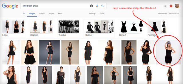
There are so many styles of black dresses on the Internet. It is a very versatile piece of wardrobe. However, wearing it with a blue baseball cap is not your usual style. On the other hand, it definitely makes this image stand out in the sea of other images.
Once you click on it, you are lead to a product page that features this dress from many angles. It’s simple cut makes it pretty ordinary, but it’s product images make it memorable.
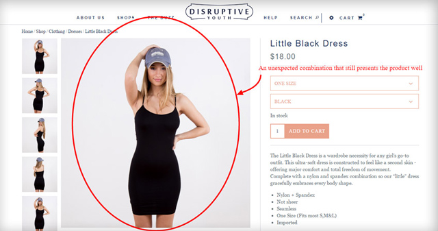
This is just the most obvious and plastic example how a good image makes a post recognisable, but it works on other levels, as well.
In Summary
Finding good images is an intangible skill that a lot of people think they have, but that is not true. This is something to be developed and considered thoroughly. It is a skill that needs to be honed and perfected.
Those that posses this skill are instantly more interesting to the potential employers, because many online workers need to know how to pick a good photo.
Some of the reasons why a good photo is so important are:
- Forming a favorable first impression
- Engaging readers
- Setting the proper tone and atmosphere of the content
- Increasing shareability of the content
- Making the content memorable and recognisable
Frequently Asked Questions
1. Why are images important for the first impression about your content?
a. Because a good image is among the first things a reader sees on a website.
b. They are not that relevant. People read only the titles and text.
2. How does an image help set the tone of the blog post?
a. We respond well to the colours, so we use those colours to set the mood.
b. They help set the tone because they are among the most important factors to form the first impression.
3. How does a good photo influence the shareability of the content?
a. Not much. You can do pretty well without a good photo.
b. Dramatically. Good images can make the content viral.
