The aim of this guide is to help store owners create a Contact Page that provides useful contact information about the company through a warm and positive way. It also provides steps on what exact information to add into the Contact Page so to save both the customers’ and the store owner’s time.
Every aspect of your store site is devoted to cultivating a relationship between you and your visitors, your Contact Page should be no exception.
A good Contact Page allows for further communication between you and your potential customers. In some cases, a good Contact Page provides the final push to transform your store visitors into store customers.
A new customer will want to ask questions. In many cases, these questions could actually be answered by the information that is readily available on the store.
It might be tempting then, to think of a Contact Page as a waste of time, but we can assure you that it’s not.
When a customer asks a question, it’s not so much information they need but reassurance. They want to get a better feel for how responsive you are to their needs. Having a Contact Page reassures them that you’re open to their needs.
Promptly responding to their inquiries through the Contact Page makes them feel more connected to you.
By validating their opinion and providing them with reassurance, you’re establishing yourself as a trustworthy source and increasing the possibility that a casual viewer will become a loyal customer.
Step 1: Write A Short Warm Welcome
Your Contact Page is an attempt to start and sustain a conversation between your store and your customer. They’ve come to your Contact Page with the intention of making contact and you should make that contact warm and welcoming.
Start the conversation first by making them feel welcome. Encourage them to contact you with a few sentences to welcome them and make them feel that you want them to make contact with you.
The text of your welcome doesn’t have to be elaborate or long. A few simple sentences will work fine. What’s important is the tone.
Choose your words in a way that makes it sound like you are really interested in why the viewer wants to connect with you.
Here are a few examples of website contact pages with nicely written short welcomes
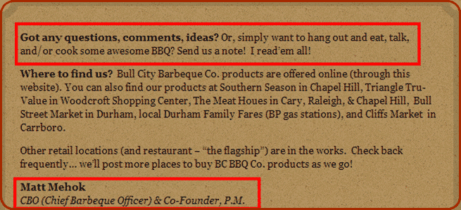
1. The welcome note of Bull City BBQ is short and simple. It invites the viewer to send in their questions, comments, ideas and assures that all of them will be read and considered.
What is notable here though are the personal touches which help tell the viewers a bit more about the personality and brand of the store.
The language used is meant to evoke a freewheeling “cowboy” vibe which is in-line with the store’s theme. Also, take note that the note is “personalized”, signed by the store’s founder.
This helps make the message seem warm and welcoming.
2. The note for Cow and Co is very short and basic. But take note that it is still very welcoming. Just one line that lets the viewer know that contact is welcome can color the entire message.

3. Shoon also has another short and sweet one. The take away here is, they provide the viewer with a time frame for when they will receive a response. This helps reassure viewers that you are there for them.

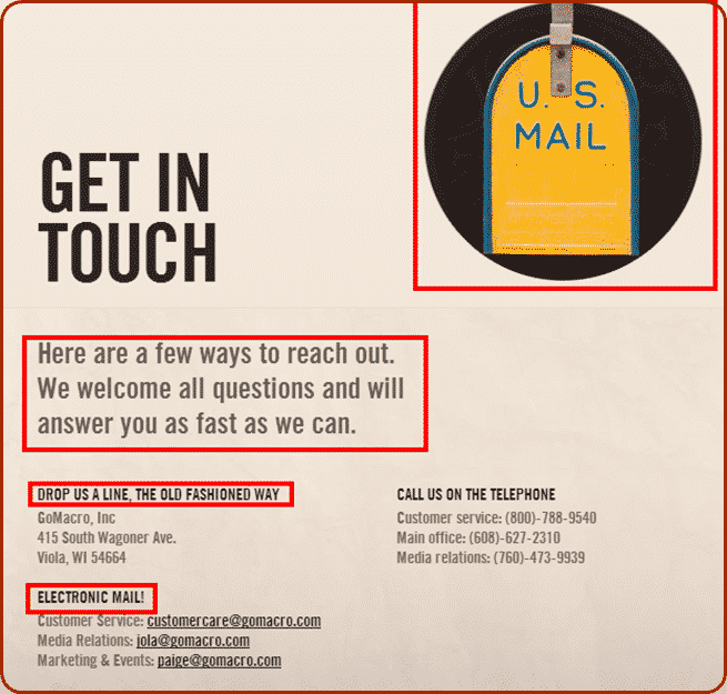
4. The Contact Page and welcome message at Go Macro is cute and fun. The use of an old-timey image of a mailbox matches nicely with their entreaty to contact them “the old fashioned way” and gives the entire page a quirky “personality”.
The welcome makes sure that the viewer knows that there are many ways to communicate with the store which makes them sound accommodating and friendly.
While they don’t provide a definite time frame for a response, the cheery wording can be all the reassurance a customer needs to encourage them to reach out.
5. The welcome note for Little Flowers is also short and to the point. Once again, it’s the tone of the note that sets it apart. It’s light and friendly, assuring the viewers that their questions are welcome and that they will be accommodated.
It also encourages viewers to connect through the “friendlier” social media mediums of Facebook and Twitter.

Step 2: List The Ways They Can Contact You
- Include all your phone numbers.
Many people still prefer to hear a human voice. Having one or two phone numbers listed in your Contact Page will encourage them to make contact.
Even if you have a free call number it’s still a good idea to list a local number. These days, a lot of people have “all you can eat” mobile phone plans which allow them to pay a set fee for unlimited calls.

However, there is a catch. In Australia, there is a cost for telephoning a 1300 or 1800 number.
Customers can use the local number if they are overseas, or have an “all you can eat” cell phone plan.
Make sure you include area code and an international dialing number, even if you believe you are just a local business.
You never know when a customer has bought an item from you and then traveled overseas with it, or just wants to call you from a non-local area.
If you have a fax number, it would also be a good idea to list it. You never know just what will be the most comfortable medium for your customer to reach you.
- Include an e-mail address.
Some people may find it more convenient to send in their questions via e-mail. This option is especially important if the customer is making their inquiries at “odd hours” when there might not be someone around to answer their phone.
Make sure to add a sentence or two assuring them that you will get back to them. Something as simple as “we’ll get back to you within the day/couple of hours”, can be enough to reassure them that you will be responsive to their needs.
- Include a postal address.
You never know, some people are still more comfortable using post, especially if their inquiries are not that urgent.
- Include a contact form.
A contact form is basically a set of questions that can be filled out on the website. The contact form is automatically sent to your e-mail when it is sent out.
A contact form is a way to simplify the inquiry process and makes everything easier and more organized.
Using a contact form can reduce spam and can also help you better capture the exact information you want from your customers.
- Add social media links.
Encourage your customers to connect with you or learn more through various social media sites. Give a list of all ways they can connect with you via social media.

The most basic sort of contact information list would be: Phone, fax, e-mail and mail. An example of this can be found at Saucy Spice.

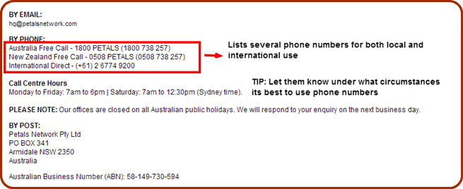
A more elaborate example of contact listings would be something like that on the contact page of the Pretty Petals Network. The page also includes a contact form.
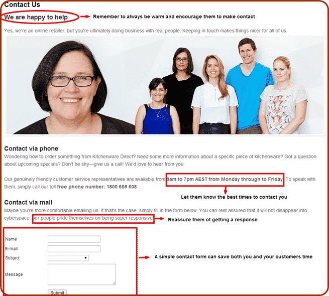
Another good example is the Contact Page of Kitchenware Direct. In a warm and friendly tone, it lists several ways that potential customers can use to contact the store.
It also gives the best times to contact the store via different mediums – in this case, phone and e-mail as well as a contact form. It also reassures the visitor of a response.
Step 3: Include Your Opening Hours
Prompt responses to their queries are something that many customers value and by giving them a time frame in which they can expect an answer, you can manage their expectations.
Including store opening hours will help set expectations for when a customer will get a response.
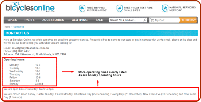
You should also include holiday times. Including holiday times is especially important around stressful shopping days such as Christmas or Mother’s Day.
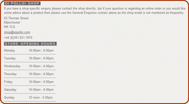
The contact page of Oi Polloi provides a simple table of all its operating times.
The contact page of Bicycles Online lists both their store opening hours and holiday operation hours clearly.
Step 4: Add Your Store Locations
If your eCommerce store has an actual store location that people can go and visit, make sure to add their locations. While online shopping is gaining a considerable market share, many customers still just use an e-Store to do research before heading towards the actual store location.
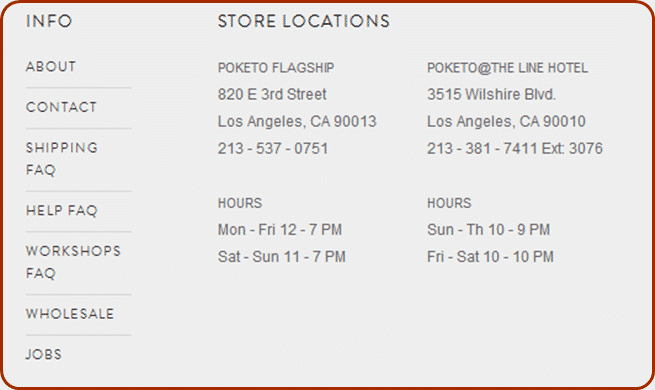
Poketo’s Contact Page is a simple and clear example of how your store locations should be added to your Contact Page.
Take note that, aside from listing its stores, it also lists the appropriate contact details and opening times for each location.
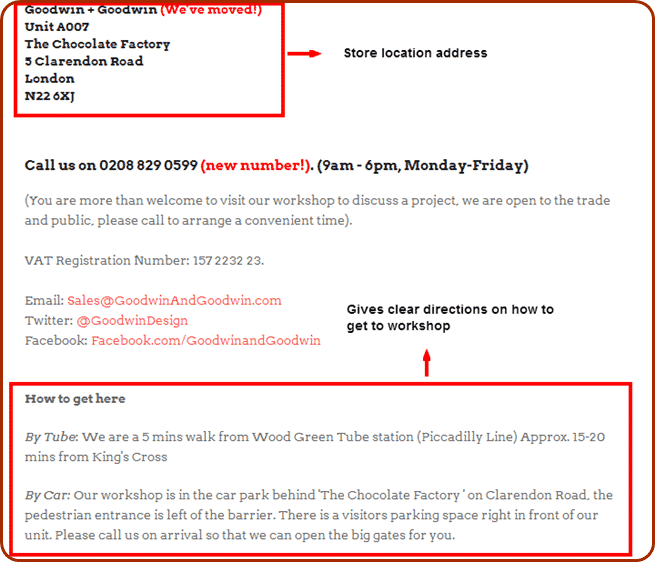
Goodwin + Goodwin just has one location for their workshop but they make sure that interested persons know how to get there, including directions for commuting or driving there.
Step 5: Add A FAQ Section Or A Link To A FAQ Section
There will always be some customers who visit the Contact Page because they really just need a quick answer to their questions.
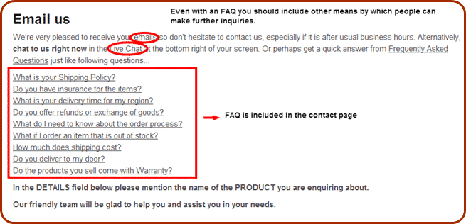
Figure out what some of the most common questions that visitors to your store have and post a list of these – and their answers – on your Contact Page.
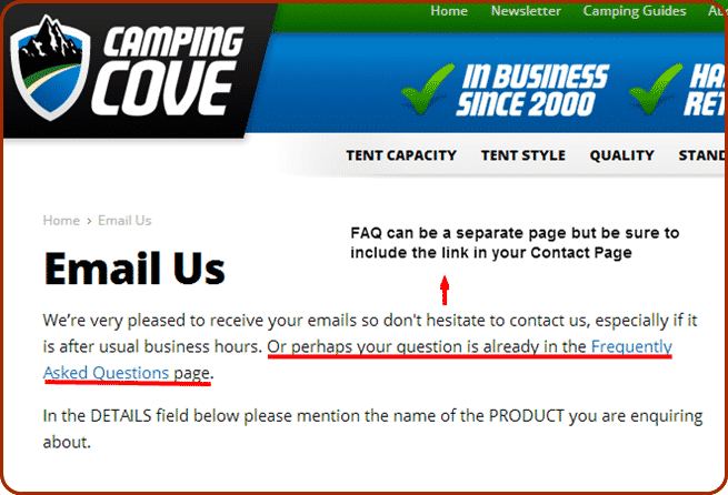
You can also make your FAQ page a separate page on your store but its best to link this to your Contact Page and vice versa.
Assure your viewers that if the FAQ’s don’t answer their questions they can always contact you for further inquiries or assistance.
The Contact Page for Camping Cove greets visitors warmly and encourages e-mail inquiries, but it also redirects the visitor to a detailed FAQ section.
Meanwhile, the Contact Page for The Shade Centre includes an FAQ that the viewer can look at before directing them to other channels (contact form, live chat, email) in which they can make additional inquiries.
Step 6: Consider Adding Live Chat
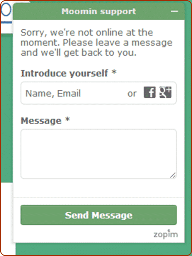
Adding Live Chat will allow you to have more interaction with visitors and answer their questions quickly.
Live Chat provides website viewers with immediate access to help and will allow you to provide answers to queries right away. This responsiveness can help persuade a viewer to become a customer.
Live Chat can also save you time and phone expenses. Compared to answering a phone query, taking part in a chat conversation allows for multitasking.
Also, chat allows you to interact with several customers at once, unlike a phone line which can only handle one call at a time.
If you have the time or personnel available to monitor the live chat for the majority of the day, it can be an invaluable communication tool between you and your customers.
Final Checklist
Make sure to encourage visitors to your site to engage in a conversation with you by including the following in your contact page.
- A short message welcoming visitors to your site and encouraging them to make contact.
- Several ways those visitors can contact you (phone, e-mail, post, contact form, social media, live chat). You may choose all of these or only a few but, make sure what you chose are listed in your contact page.
- All your store locations, including all their opening hours.
- A FAQ with frequently asked questions and the answers to them. Include this FAQ or a link to the FAQ page in your Contact Page.

