
An inspiration gallery is a page where an eCommerce store can add photos of products that are similar to its own, if not entirely the same. It is a gallery of images, with the aim of inspiring the reader with new ideas for using the product.
For example, if a store is selling a specific brand of gazebos, like Gazebos Australia, it can search for photos of them on the web and in its own store and add them onto the store’s inspiration gallery by way of an article.
This example below gives you a title, short introduction and then three photos of gazebos. In reality, the gallery is 27 images, but we have shortened it to show just 3 examples so you can get an idea about the format of the page.
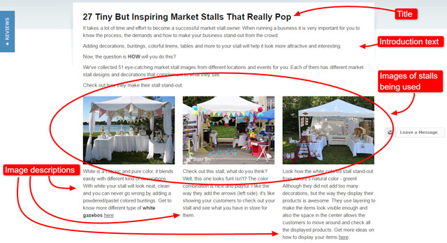
The inspiration gallery should always have many, many photos. Ideally you need to collect between 30 and 100 photos as this creates the effect of a ‘gallery’.
Need more photos? You can also ask some of the store’s customers for photos of products they bought from an eCommerce store.
If they have enough photos from customers to fill a whole page, it is possible to treat this specific inspiration gallery as a testimonials page that can help the store gain more customers in the long run.
In the following lesson you’ll learn how to build a good inspiration gallery and how it can boost an eCommerce store’s business.
Why do you need this? We already mentioned that an inspiration gallery is a great way to provide would-be customers with inspiration and ideas on how to use a product, but that’s not all.
It also becomes a strategy for improving an eCommerce store’s visibility on the search engines because of the photos and text that you use on this particular page.
In other words, inspiration gallery works well with people AND search engines and that’s an opportunity that you should not miss out on.
How an Inspiration Gallery Can Influence an eCommerce Business
An inspiration gallery showcased on an eCommerce store helps increase organic traffic – growing the number of one’s prospective customers and possible sales. That’s why it is important to learn how to create one.
You wonder what this means? Keep reading and you’ll find out.
Typically when running an eCommerce store, almost everyone starts off with blogging an 800-word article which usually has two subheadings, three outbound links, a bit of bold, and a picture in its post.
That’s the lowest i.e. most basic form of online marketing. Everyone blogs!
After they’ve done that for about fifty times and realised that it’s NOT working for them, that is to say NOT getting organic traffic, they either give up and close their store OR they think to themselves: “What else can I do to attract search engines to my store to send me more customers i.e. grow the volume of organic traffic?“
Organic traffic means free visitors! Yes, they’re still paying for the creation of the content but more of it is coming through because it grows, since Google’s got this huge volume of traffic which it can send them.
The more customers one gets, the more opportunity they have to increase their sales, because if one’s got e.g. a 1% conversion rate, they’ve got an opportunity to get more of those customers to convert since there are more coming in.
The main question is HOW to attract more visitors.
The truth is that it’s a very competitive world, so you’ve got to do things that make you stand out NOT only to customers but to the search engines because they are responsible for sending you a lot of visitors/customers/traffic.
Here’s where you can make full use of inspiration galleries.
Usually, the majority of online marketing pages are actually text and a little bit of images.
Do NOT hesitate to experiment and turn the content upside down (90% media and 10% text) to see what will happen.
Feel free to create this completely unique type of online marketing, which is just blogging but an upside down article with more images instead of text.
Why? Because you’ll realise how much Google LOOOVES it.
By creating an inspiration gallery (e.g. more images than text) you are providing Google with more variety from your marketing pieces.
Remember – everyone, including your competitors, will be writing a typical 800-word blog with a few images scattered around. But, you’re going to turn this idea upside down and create a marketing piece with more images than words!
That is the key idea to keep in mind – Google and your customers love variety!
How to Build an Inspiration Gallery
The proper way of building an inspiration gallery includes optimising your photos and text, as well as adding links to other pages within your store. It’s a win-win strategy that will benefit both the eCommerce store you work for and the customers, as well.
Make sure your photos are optimised really well to find a balance between image clarity and file size. You can use the JPG compression settings in your photo editing software when you save a file to find this balance.
Make sure they’re easy and very fast to open and/or download, NOT media ‘heavy’. You might need an expert to help you with this.
Optimising text means NOT using too many joining words or too much marketing fluff.
Examples of ‘joining words’ include: the, a, and, &. These are small words that could, in some cases, be replaced by simply ending the sentence and starting a new sentence.
Moreover, it means using very specific words especially adjectives that a human would use (e.g. cosy, stylish, serene). It means you put a keyword in and link to the product page(s) like in the example below.

Keep reading and you’ll find out more details on how to deal with photos, their descriptions, keywords, and links in the corresponding subheadings below.
What Theme Will You Use in the Inspiration Gallery?
Among the good practices that many stores employ for their inspiration galleries is the use of concepts or themes.
This is just one way of presenting the gallery to the customers, so they will NOT just see a collection of random photos on one of the eCommerce store’s pages.
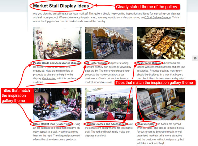
On Gazebos Australia website, the concept ‘Market Stall Display Ideas’ was used because it showcases various ideas for improving market stall displays and sales, and it also provides more opportunities to optimise the page.
Below is an example of this concept in action:
Another concept you can use is the ‘by real customers’ concept which is like a testimonials page from real people who bought products from a specific store. Usually, you will find those products in use and being featured on their photos.
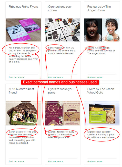
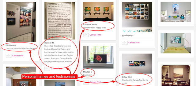
Below are two variations of ‘by real customers’ concept:
Variation #1 MOO Inspiration Gallery and their business cards, postcards, stickers and similar products.
Variation #2 CanvasPop makes custom ordered prints on canvas. Their customers can create their own design that they happily share with others later.
You can search the web for more ideas on how to present your collection of photos.
As long as you present your gallery in an organised manner, you can be sure your customers will appreciate it no matter the concept.
Set up the Inspiration Gallery Page
On your eCommerce website, set up a page that’s dedicated to your inspiration gallery.
Start with a well-written summary that will encourage customers to get inspiration from the photos of products.
This summary could be from 100 to 300 words, and you should include why the inspiration gallery was built and what the customers will learn after browsing through the photos.
You can discuss the top functions and/or benefits of the products you are showcasing in the summary.
In addition, make sure to include a few links to other pages on the eCommerce store you’re writing for. This aids Google and other search engines to easily navigate the entire website.
Choose a Layout for the Inspiration Gallery
There are no rules when it comes to the layout of inspiration galleries. But for an eCommerce store, you’d want a clean, organised and informative layout that not only inspires customers, but also provides them with ideas in the form of text.
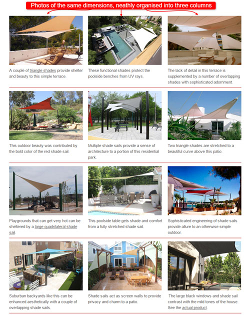
Look For Similar Product Photos/Images
Even if you write for an owner of a specific line of products, it is a good idea to use similar ones in the inspiration gallery. It is also good to mix and match theirs with photos you’ve collected from around the web.
If the eCommerce store carries specific brands, you can search for these branded products on the web and include them into your gallery.
It is preferable to pick photos with the products being used by real people to make the gallery more interesting and relatable for the customers.
Furthermore, do NOT forget to optimise your images properly.
Each image should be no bigger than 20kb in file size and yet when you look at the image it should still appear crisp and vibrant.
A small file size means that the total page load time will be lower, and of course Google and your customers prefer webpages which load quickly.
If you over-optimise, forcing each image to be just a few kb (e.g. 5kb) then you will notice that the sharpness of the photo is lost. Fine details will be lost and the photo will no longer look attractive.
Consider: If you have 100 images in your inspiration gallery and each one is 20kb in file size, then you have 2,000kb which equates to 2mb. A 2mb page is ‘heavy’ page and will load slower than a ‘lighter’ page. Google can sometimes penalise a slow loading page.
This, of course, is the opposite effect of what you’re striving to achieve!
Every kb of file size that you can save is a win for both Google and your customers.
Concentrate on ensuring that every image is optimised for a low file size, yet still retains its clarity and brightness.
Upload Photos Onto the Inspiration Gallery Page
When you upload the photos, it is a must that you add a good ALT attribute on each. ALT attribute is used as alternate text for images on a web page that cannot be displayed.
ALT attributes are HTML commands that are specified within the IMG tag.
For most websites, the ALT attribute of an image can be easily added via the media library upon uploading the image.
Here’s the HTML code that you can use for ALT attributes in case you want to add it manually:
< img alt=”“image” description”=”” scr=”“yourecommstore.jpg”” >
Just a few tips when using ALT attributes for your images:
- Make ALT attributes short.
- It doesn’t have to be a long description of the image, but just a few exact words that contextualise your image.
- A clear and concise ALT text helps improve a website’s search engine rankings.
Add Short Descriptions to Your Photos
A short description underneath each photo simply tells customers what the photo is about. If a photo says a thousand words, a witty and fun description makes it more interesting, inspiring, and never boring, as you can see from the following example.
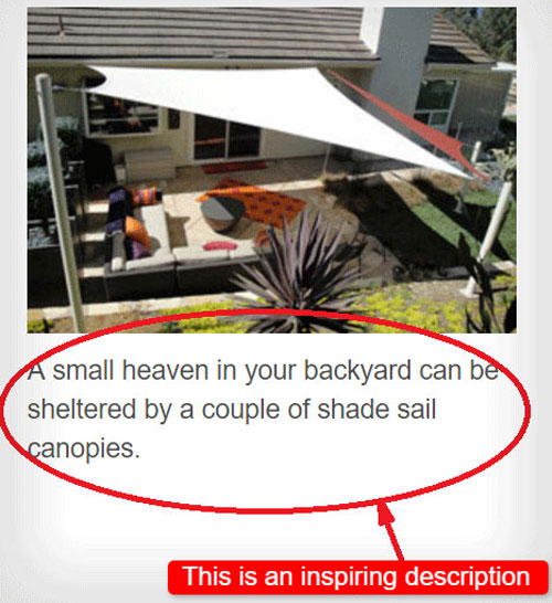
Try to describe the products and images in real human terms and use emotions. Does the product image evoke feelings of coziness, warmth, style, comfort etc?
Using words that evoke feelings when you describe the images helps provide context for Google and customers.
Every description should have at least one important keyword that helps to describe your product, but be careful of over-stuffing.
Bad example: ‘Relish the portable umbrella shelter moment with your family out on the beach with your portable gazebo umbrella shade shelter.’
Good example: ‘Relish happy family times on the beach with a portable gazebo that shades you from the sun.‘
In the examples above the keywords are highlighted. These words would typically be highlight in bold linked through to a product page.
You can see how over-stuffing keywords doesn’t help. It makes the sentence convoluted and difficult to read. This is especially bad if you over-stuff every description. Neither Google nor your customers like keywords being repeated too many times.
Link Relevant Keywords in the Descriptions
Imagine if you’re looking at a description of a lovely gazebo on a beach and you think to yourself ‘I love the look of the gazebo. I would like to buy one too.’
It would be handy if you could simply click on a link within the description and be taken to a page where that product, or something reasonably similar, is available for sale.
Place a few links in the inspiration gallery to products in your store and also to other blog articles.
Only put in highly relevant links and don’t over-stuff the document with links. A few links here and there is good; a link on every description is bad.
Adding links to useful keywords within some of the descriptions can help the customers even further. This allows them to navigate other pages on an eCommerce website with just a click on a link.
However, the point here is to provide deep links to the product pages, which means we have to skip the Category and the Home page and link right to the product page which is where we make our conversions.
We really want Google to look at one’s product pages because it’s what they sell – their products, but we can’t force it to do so because they don’t have thousands of words and images on their product page. Thus, Google sometimes has trouble indexing our product pages.
Still, there’s something we CAN do. Since Google likes this type of content, we can add the above mentioned deep links to our product pages as shown in the following examples from ‘101 Ways To Create Shade’.
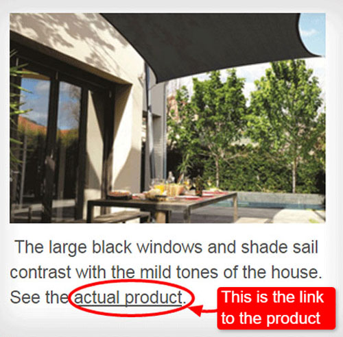
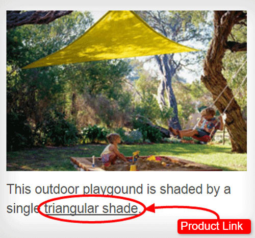
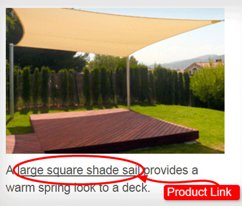
This practice is also favored by the search engines since it allows them to navigate different pages on your website.
Remember that search engines and your customers both like to follow links to other interesting pages!
Note: Do NOT link to products on your competitors’ websites.
Learn From Others
Inspiration galleries ought to become a requisite blog article type for eCommerce stores.
It is more than just collecting inspiring photos; it has become a useful marketing tool that encourages new customers to stick around and perhaps buy from a specific store in the near future.
Somehow, there are those who build their inspiration galleries haphazardly and without putting enough thought into the themes, their customers, and how to satisfy the search engines. As a copywriter for eCommerce store owners, you need to satisfy both human (customer) and search engine in order to thrive together as a business online.
Your collections of inspiring product photos can only be very useful and close to the ideal if you apply all of the steps previously mentioned.
Below are samples of not-so-ideal inspiration galleries on the web.
These examples are graded as poor because they’re essentially just category pages and NOT actually inspiration galleries since they don’t serve the real purpose of inspiration galleries.
By providing these examples we hope you’ll learn the difference between a marketing tool such as an inspiration gallery and a typical store category page.
Example #1
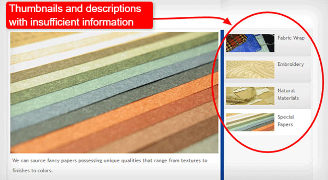
Leo.com.hk has very few products being showcased here in what they call their inspiration gallery. They did not lay them out in uniform-sized thumbnails to populate the page.
They’ve categorized these particular products and used smaller thumbnails on the right side of the bigger thumbnails.
The descriptions are of no help either. They don’t contain any formatting such as bold to highlight keywords, nor do they contain human-elements such as descriptive words, nor do they contain links to other webpages.
Example #2
TheInviteHub.com may be colorful and have utilised their former inspiration gallery’s page quite well with bigger thumbnails. However, there’s no summary or introduction to their invitations and no descriptions as well.
Despite the beautifully designed invitations, it will still be a challenge for some customers especially if they want to know the details of the images.
For products such as invitations, it is essential to add a piece of text to give customers an idea of what is written inside, for example.
In Summary
eCommerce stores can either be inspiring or boring in the eyes of customers. The secret to winning a customer’s attention is to provide them with something that will spark their interest and imagination.
An inspiration gallery will be able to do that work for you especially when executed properly and with a little help from the search engines.
- Conceptualise or at least categorise your inspiration gallery for organisation and a clean look and feel.
- Link other pages on the eCommerce store – on the summary and relevant keywords/phrases on the photo descriptions.
- Use a good layout of at least 3 columns and populate the page to draw in more visitors, and for them to spend a little more time on the page.
