You’ve probably worked with several writers on short-form content, and now you’re wondering why some articles rank better than others.
Is it because of their different writing styles?
Not exactly.
Your well-written content must feature user-friendly elements that Google loves in order to achieve high rankings on search results pages. These include alternative text, compelling introductions, and visual elements.
We’ve narrowed down three key elements to help explain Google’s interests and how to build them into your short-form content. As we delve into each, you’ll learn:
- How alternative text improves digital accessibility
- Why Google monitors bounce rates
- How visuals affect Google’s search programs
- Where to find more information on short-form content
1: Alternative Text Makes Your Content More Accessible
Google loves alternative text because it makes your article more accessible to persons with disabilities.
Alternative text can be used to describe visual elements in an article. Screen readers pick up on the descriptions in alternative text and, therefore, translate any visuals into speech along with the rest of your written content.
As such, persons with a complete lack of sight or visual impairment can easily listen to your entire blog article without missing out on crucial visual aspects, such as graphs, pie charts, maps, and tables.
This process improves digital accessibility, an important goal for Google and part of the company’s mission statement which reads:
“To organize the world’s information and make it universally accessible and useful.”
Google also loves alternative text since it facilitates search tools like Google Images, boosting user experience.
Alternative text makes it easier for Google’s search programs to identify, index, and present relevant images on the search result page.
Alternative Text in Action
The best alternative text is short and succinct. This feature avoids awkward cut-offs by screen readers (which are limited to 140 characters) and boosts user experience for better conversions.
As such, alternative text shouldn’t include phrases like “photo of” or “image of,” which use up characters without adding value to your readers.
Alternative text should also relate to the topic of your article to help Google’s search programs understand why you chose a certain image.
So, a stock image of people typing included in a blog about online classes could be described as, “students learning about blogging on their laptops.”
This understanding helps Google index your content more accurately, improving the chances of discovery by users and conversions.
2: A Compelling Introduction That Curbs Bounce Rates
A compelling introduction helps your content stand out and limits bounce rates.
It holds the attention of internet users and encourages them to read through your entire article despite the overwhelming number of options on the search results page.
As more and more users read through your article, Google notices this dwell time and places your content higher in the search results, improving your chances of lead generation and conversions.
Compelling Introductions in Action
The most compelling introductions speak directly to the audience and talk about their challenges specifically.
This approach builds credibility and a personal connection with your audience, encouraging them to go through all of your content for better conversion chances.
Below are some of our favorite examples from CopySmiths.
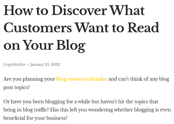
Notice how the introduction poses a question directly to the reader and then proceeds to describe their exact challenges and experiences.
This approach makes the content more relatable and instills confidence in the reader, motivating them to read through the entire article to learn what customers want in a blog.
As the reader makes their way through the article, they’re exposed to more conversion triggers, including social proof and testimonials.
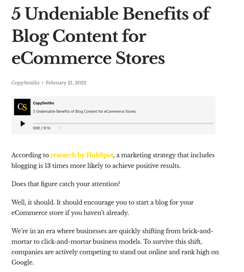
This second example also has a catchy intro that keeps users reading.
It starts with a striking statistic about blogging that creates interest, and then proceeds to question the reader directly, making it personal.
These aspects encourage read-through, which exposes the reader to more elements within the article that trigger conversions.
3: Visuals That Make Your Content Easy to Digest
Google loves visuals in your written content because they simplify information and improve user experience.
Visuals make it easy to go through long and complex data. Think of how simple it is to analyze a year’s worth of statistics presented in a table, or a scientific concept explained using diagrams.
Now imagine going through the same type of content without these visual elements.
Chances are you wouldn’t read through them without visuals, and Google knows this. Negative user experience means fewer users, which impacts the bottom line.
Visuals also enable Google’s indexing programs—crawlers—to go through your website and classify it appropriately on the search results page. This improves the relevance of their search engine and user experience.
Visuals in Action
The best use of visuals is to use them to break up large chunks of text. These breaks serve as natural resting points for your readers, enabling them to comfortably go through your entire article without tiring.
It’s also important to ensure that visual elements are varied to keep your content exciting for higher read-through rates. The better the read-through rates, the higher the chance of conversions.
Below are screenshots from a CopySmiths blog that demonstrates this concept.
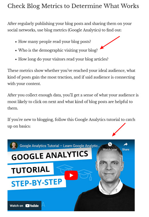
Under the “Check Blog Metrics” subheading, two visual elements (highlighted by the red arrows) serve as natural resting points. These breaks help the reader pace themselves as they read through the entire blog post and meet conversion triggers.
The visuals are also diverse to keep readers engaged and motivate them to finish the article.
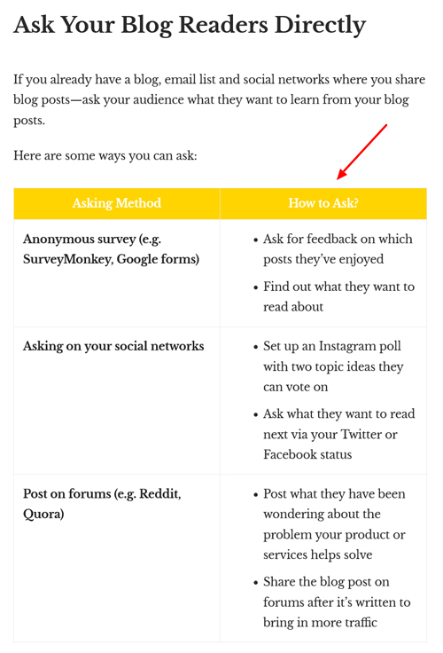
Under this subheading, a simple table makes it easy to compare and analyze the ideas just presented. This improves user experience and encourages readers to complete the article for better chances of conversions.
Conducting a similar analysis from a long paragraph alone would have been much harder and less engaging for readers, triggering bounce rates and lower conversions.
The following table compares the benefits that each key element has for your short-form content.
| Key Elements | Benefits |
| Alternatives text |
|
| Compelling introduction |
|
| Visual elements |
|
Work With CopySmiths for Your Short-Form Content
We’ve just looked at three key elements in short-form content that Google loves, but why not take it a notch higher with a first-hand demonstration from CopySmiths.
We’ve worked with over 100 clients in various industries and published over 4,000 informative and high-quality blog posts.
“I’m really impressed at the quality of content CopySmiths produces. They consistently come up with unique angles for my niche, knowing that each reader consumes content differently.” — Alan Marek, PartCatalog
Subscribe to CopyZine today to get notified when we publish new articles and to learn more about short-form content.
Share on LinkedIn:

