For a long time, pillar pages have been frontrunners in digital marketing.
The content marketing power of a well-researched pillar page is undeniable.
Here are a few reasons why:
- With a pillar page, you can distill the most complex topics into more digestible reading. This newfound accessibility to informational content means digital readership is at an all-time high.
- Potential consumers, who form most of the digital audience, gravitate towards informational content.
- Brands sharing comprehensive content have a stronger online presence. And it gains people’s trust. Trust is the foundation of customer loyalty.
- Clustered topics organized into pillar pages earn high rankings on Google search. An organized website makes it easier for a search engine to crawl.
How can you make sure that the pillar pages you create become Google’s favorite?
Follow these best practices and watch your content scale upwards:
Contents
- Audience Awareness: Accessibility Is Key
- Show Your Cards: Provide a Table of Contents
- Content Presentation: Take People on a Journey
- Maintain SEO Relevance: Be Smart About Link Equity
- Upgrade Your Pillar Page Content
1. Audience Awareness: Accessibility Is Key
Your pillar page should not resemble a landing page. Keep the text above the fold. This is one simple but effective way to draw people into reading more.
The digital user experience has to embody two things. Accessibility and convenience.
A pillar page should be one click away from your homepage.
Make it as easy as possible for the reader to find the information that they need.
Improving your user experience won’t negate your SEO positioning. In fact, it will boost it.
Educational content that offers stress-free browsing encourages repeat visits.
How to Improve Accessibility
- Always define your topic immediately after the H1 tag.
- Use an introductory video as a creative opener.
- The core topic should reflect in the main URL, the page title, and both the H1 and alt tags.
- Incorporate different, but subtle, call to actions throughout the page.
- Include top-of-page navigation on your pillar page.
- State when your pillar page was last updated to establish instant credibility.
- Give the readers a timeline to track their pace with a progress bar.
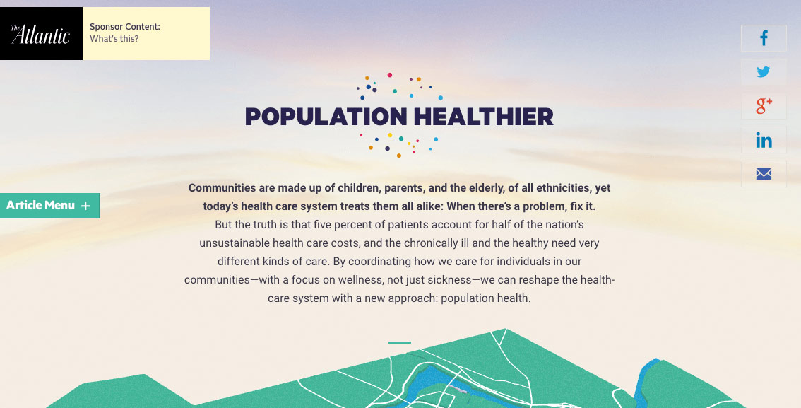
In the example below by The Atlantic we can see:
- How “clean” the page is at first glance. There is no clutter. The absence of a footer and navigation prompts means readers can only focus on one thing.
- The header provides the right amount of information. Follow this up with the smart use of white space.
- They created interactive features that made scrolling a breeze.
- Their choice of visuals was not purely aesthetic. They made the topic – population health – far more interesting.
- The featured article menu on the side points readers towards other similar articles. This is another excellent “hook” to keep the audience engaged.
2. Show Your Cards: Provide a Table of Contents
A table of contents on your pillar page improves the digital user experience.
Take note to hyperlink each heading to its relevant section. That ties the whole series in your pillar content together.
Visitors enjoy switching around to different sections and subtopics. But pointless scrolling can dissuade them. Think about using sticky navigation instead.
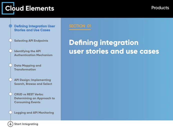
Look at the example below by Cloud Elements. For this pillar page, they used a creative concept: a floating table of contents on the left side.
Not only does it attract attention, but it also makes it easier for the user to decide how long they want to stay on the page.
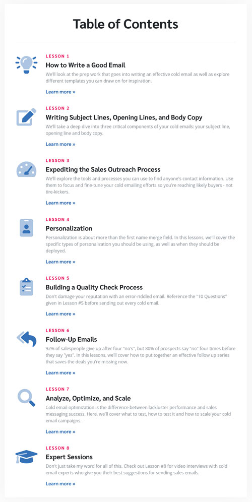
This example from Mailshake, deserves reference, owing to how effective its reach became.
The resource pillar page Milkshake created received 28,000 plus new visitors. They were able to convert 20% of those people into customers.
It all began with providing a users with a resource, without making them “work too hard” for it.
3. Content Presentation: Take People on a Journey
People have a lot going on. Give them a map and take them on an uncomplicated journey through your content.
Visualize your pillar page as you would an average buyer’s journey. This consists of:
- The awareness stage. This is part one of your pillar page. It is your opportunity to introduce your given topic. Share some definitions and why the topic matters.
- The consideration stage. Where you get into the details and discuss your subtopics to give more value.
- The decision stage. Here you may introduce readers to various options to solve their needs. This is when you plug in a relevant call to action. There’s no shame in positioning your company as a top choice in this case.
One way of supporting this framework is by making the content scannable, i.e.:
- Writing catchy headlines
- Using shorter paragraphs. Make them three sentences long at most.
- Writing simple sentences, not beyond 16 words.
- Using blockquotes, bullets, and subheadings.
- Cleverly inserting images, lists, tables, and links to provide depth.
How to Increase Your Chances of Getting to Position Zero on Google
- Under your H1 or H2, provide a definition of your subject.
- Aim for a 45-word description – the average length for featured snippets. Then you can optimize this section for that sought after top search engine position.
- Make sure this content provides consumer value to your customers. Don’t use a pillar page to make sales and marketing pitches.
- All pillar page content should be ungated. Another way to provide value and convenience is by offering a downloadable version.
- Keep keyword research in mind when writing anchor text or headings. Do the same within the interlinked pages.
- Provide a separate resource list at the bottom of the pillar page.
- Make use of pull quotes to highlight information. This also makes social sharing easier.
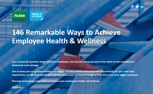
We created this pillar page for Alsco New Zealand on employee wellness.
The pillar page captures all the tips above, including:
- A free downloadable PDF
- Top page access to social sharing buttons
- The use of subsections, headings, and varied media illustrations
- Blockquotes, pull quotes and formating tweaks
- Good use of CTA insertion throughout the page
4. Maintain SEO Relevance: Be Smart About Link Equity
To maintain link equity, your pillar page needs to stand out as the top resource for a specific topic. Search engines pick up on such characteristics such as authority, expertise, and trust.
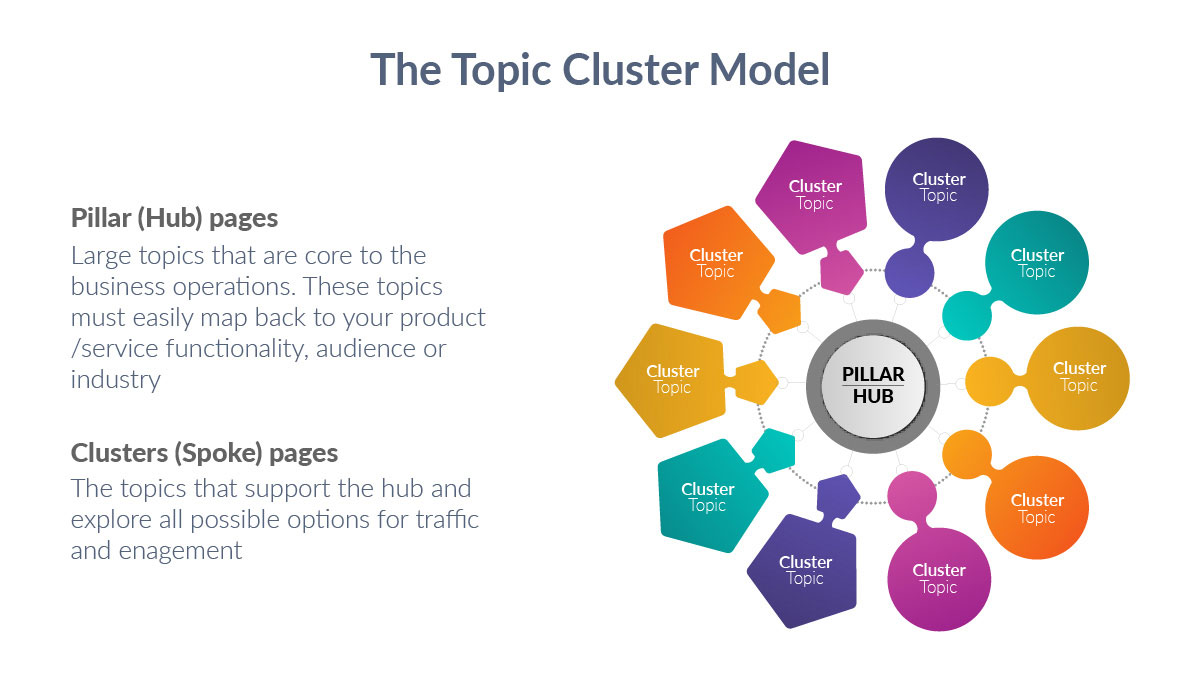
Your pillar page ties different blog posts together under an umbrella topic.
Use both internal and external links. Reference relevant statistics or guide readers to separate sections of the website. These actions strengthen page authority.
Even as you make good use of links and hyperlinking, there are considerations. Cutting off or interrupting your visitor’s browsing intention can have counterproductive results.
Be careful with external links. They have their benefits but you don’t want to end up losing your visitor to another unexpected page.
For example, a case of three links on a pillar page pointing on external pages. There should be more than three links redirecting interest back to the pillar.
There should be more links coming to your pillar page. Your page needs fewer links going out. This signals to search engines that your page is the authority on this subject.
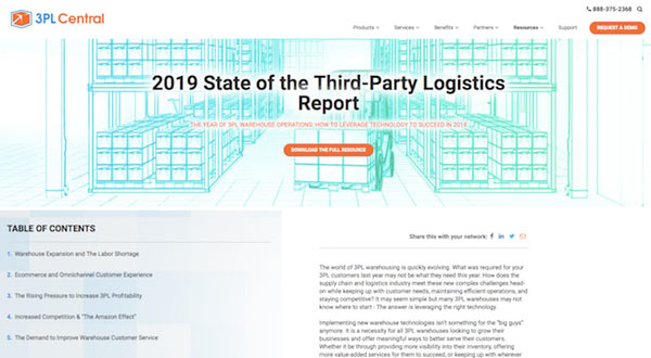
This pillar page from 3PL increased the company’s website traffic by 867%. And increased the conversion rate by 179%.
The page links out to different pages on other parts of the company’s website. Each link provided a different resource.
Remember that all the content on your pillar page is part of a wider topic cluster network.
Upgrade Your Pillar Page Content
You already know that pillar pages will optimize your current SEO efforts.
As a digital marketing strategy, their main function is to bring organic traffic to your website.
