The aim of this guide is as a document you can provide to a graphic designer. This document sets out your minimum expectations for the logo quality and the files that you need provided at the end of the job.
A logo is an essential part of the branding process for a business or company. It is a visual representation of the business and as such, businesses are looking for a logo that is unique and instantly recognizable.
A professionally designed logo does not just have to be attractive, it also has to seem professional – it must inspire confidence and a feeling of trust in those that see it.
When you are hired to design a logo, it is not just the logo that needs to look professional but you yourself. You need to make sure that your logo design best represents the image your client wants to present to the world at large.
By doing so, you also grow your own reputation as a trustworthy and talented graphic designer.
Step 1: Assess Whether The Logo Meets The Brief
The first step when designing a logo is to get a good logo brief from the client. A good logo brief should contain the information you need to better grasp what the client needs to see but what they want to see in your design.
Do not ignore the brief. By following the brief you can ensure that your client is happy with your work and that any revisions that might need to be made are minimal. This saves both you and your client time.
Before you submit your logo design, look over the original brief. Read through everything and tick off everything in the brief that has been met.
In general, here are the essential questions you need to tick off to make sure that your logo design meets the brief:
- Your design represents what industry your client is in
- Your design represents what products and services you client offers
- Your design is unique and doesn’t call to mind your clients competitors
- Your design is appropriate to attract your clients target market
- Your design incorporates or can work in tandem with your clients other branding materials
- Your design takes into consideration your clients stated likes and dislikes. Including color and font preferences
Step 2: Assess Whether The Logo Is Future Proof
A company logo is the face of its brand; it should be recognizable and memorable. As such, most companies are looking for a logo that is timeless.
Longstanding brands may redesign their logo but this should only happen after decades have passed.
A. Does it have classic or timeless elements?
Your logo should have elements that are recognizable and distinctive and can still be retained even if the logo undergoes a revision.
It should have attributes that will forever be able to “speak” and touch its target audience.
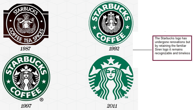
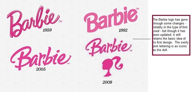
More logo images found here:
- http://www.complex.com/art-design/2013/03/the-50-most-iconic-brand-logos-of-all-time/
- http://www.britishlogodesign.co.uk/business-startup-help/logo-design/history-logo-design-infographic/#sthash.Te7Mgt1I.dpuf
B. Is it versatile?
A good question to have asked the client before you started conceptualization would be: Where and how do you intend to use the logo? A follow up question to that would be: Where and how do you see the logo being used in the future?
A logo is just the start of how a company decides to brand itself. It’s often the first point of contact – the first thing a potential customer sees, but it’s not the end.
When assessing the logo’s versatility, think about:
1. How can the logo be used?
A company will go through many marketing campaigns throughout the years and these campaigns will produce materials such as business cards, website, stationary, posters, presentations adverts, e-mail signatures and templates, company clothing, packaging, signage, vehicles and other equipment.
For example, look at the Nike logo. It’s not just used in the company’s marketing materials but even on the company’s products itself.
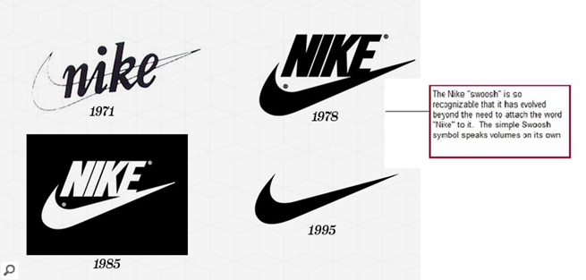
It’s a good example of a versatile logo that looks good in many mediums. What works printed on a billboard or poster, also works stitched into clothing or footwear.
2. Does the size of the logo matter?
How big will the logo be most of the time? How big can it get? How small can it get? Does it still remain clear and legible when shrunk or enlarged?
A logo should be able to be used in material as small as a business card or as large as a store sign.
This requirement leads us to the next question you should ask when considering if your logo is future proof.
3. Does the logo have any layout restrictions?
A long logo might work in some cases, such as on signage, but look bad in others such as letterhead paper. The best thing to do to make sure your logo answers this particular requirement is to make sure to ask the client where they plan to use the logo.
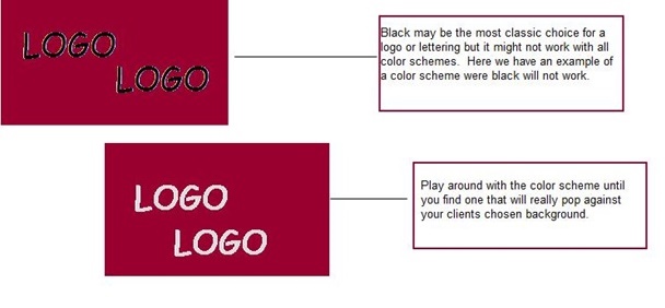
4. Does the color scheme of the logo work?
Here again, it is important to have asked beforehand where and how the logo will be used. You need to know what kind of background you logo will be against most of the time. Some colors pop more when used against a white background while some stand out better against a black.
Step 3: Ensure That Copyright Hasn’t Been Breached
When you are hired as a professional graphic designer to come up with the logo for a company, your client expects your work to not just be attractive but also unique and original.
If you want to establish a reputation as a professional and trustworthy graphic designer, you need to assure your client that the design you came up with is wholly of your making and, to the best of your knowledge, does not infringe on a copyright.
Your client will want you to produce a unique design – that uses no elements under copyright to another party – because it the only way that they themselves can copyright their logo.
By hiring you, a professional graphic designer, they are trusting that you can come up with a creative, custom, designed-from scratch, logo.
Tips to check to protect your design from copyright problems
- Be careful where you get inspiration, characters are protected by copyright too so you can’t use a figure from literature or film for your logo. It’s alright to use the same basic idea, but you need to change it enough so that you can say its “yours” and the client can say it’s original.
- Taglines and slogans may also be protected by copyright, so resist the temptation to create or use one that doesn’t explicitly belong to your client. Asking your client about their tagline or slogan is something you should have asked during the logo brief discussion.
- Nothing screams “amateur” more than using stock art or images. Downloading art, images or photo’s on the web is not only a potential breach of copyright, but is also very unprofessional.
Step 4: Provide A Logo Pack
This goes back to Step 2, regarding the importance of versatility to ensure your logo is future proof.
Like we said, there are many different ways a logo can be used – on business cards, on websites, in advertisements, on clothing, on packaging, on signs.
A good logo can be used in many different ways but it will also need to be on many different platforms and this would require the logo to be in many different file formats.
You should provide your client with a logo pack. This logo pack will have the same logo in three different color formats (CMYK color mode, RGB color mode and black and white) for different uses.
A logo pack should contain the following image files in all three color formats:
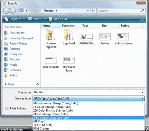
Click on Save as, then go down to the “Save as type” drop down menu and click on the file format you need
- JPG or JPEG format. Joint Photographic Experts Group files are the most basic, well-know and common image file type. A logo saved in this format can be used for most on-screen needs such as on websites, and can be used with programs such as Word or Powerpoint. It cannot, however, be used for print as it is of low quality.
- EPS format. Encapsulated PostScript is the type that most professional printers will ask for. If your client will want the logo printed out on a sign or other marketing tool, the printer is likely to ask for the .EPS file. The .EPS file will allow the printer to reduce and increase the size of the image without any loss of quality.
- AI format. This means a file saved in Adobe Illustrator. This file is also one of the bests to give to printers and designers, and some may ask your client for this instead of an .EPS file. It allows them to increase the size of the image without loss of quality.
- PDF format. Portable Document Files include texts, fonts, graphics and other information. It may also be requested by printers.
- GIF format. Graphics Interchange Format is the logo design on a transparent background. This will allow the client to put it into colored backgrounds such as websites or for presentations.
- PNG format. Portable Network Graphics are similar to .GIF’s in the sense that they are also set on a transparent background but they are of a higher resolution quality.
- TTF files. True Type Fonts are the files of the fonts that you used in the logo design.
Step 5: Deliver The Logo Designs And Files Neatly And In A Timely Manner
Make sure that your logo package is complete and neatly labeled so your client knows what they’re getting, at a glance.
Also, make sure you make the agreed deadline. You should also set a deadline for your client to review the materials and make comments. Follow up on the deadline.
The sooner you get your client’s review, the sooner you can make corrections and the sooner the both of you can conclude that it was a professional and well done job.
Final Checklist
It’s a very useful to create a document that you can provide to a graphic designer where you can add your expectations and quality of output that you desire. Make sure that this will:
- Assess whether the logo meets the brief
- Assess whether the logo is future proof
- Ensure that copyright hasn’t been breached
- The logo provides a logo pack
- And that the logo designs and files are delivered in a timely manner

