The aim of this guide is to teach you, step-by-step, how to create a product inspiration gallery to provide inspiration and ideas to your customers.
An inspiration gallery showcased on your eCommerce store also helps improve organic traffic – increasing the number of your prospective clients and possible sales.
An inspiration gallery is a page where you can add photos of products that are similar, if not entirely the same, to yours. For example, if you’re selling a specific brand of gazebos and sail shades, you can search for photos of them on the web and add them onto your inspiration gallery.
It is also possible to ask some of your customers for photos of products they bought from your eCommerce store. If you have enough photos from customers to fill a whole page, it is possible to treat this specific inspiration gallery as a testimonials page that can help you gain more customers in the long run.
You need to know this guide because an inspiration gallery is a great way to provide would-be customers inspiration and ideas on how to use your products.
It also becomes a strategy for improving your eCommerce store’s visibility on Google’s search engines because of the photos and texts that your use on this particular page.
You will need to know the proper way of building your inspiration gallery which includes optimizing your photos and texts, as well as adding links to other pages of your e-store. It’s a win-win strategy that will both benefit your eCommerce store and your customers as well.
Step 1: Determine A Concept To Use On Your Inspiration Gallery
Among the good practices that many websites employ for their inspiration galleries is the use of concepts. This is just one way of presenting the gallery to your customers, so they won’t just see a collection of random photos on one of your eCommerce store’s pages.
Another concept you can use is the “by real customers” concept which is like a testimonials cum ideas page from real people who bought products from you. Usually, you will find your products in use and being featured on their photos.
Below are two variations of ‘by real customers’ concept:
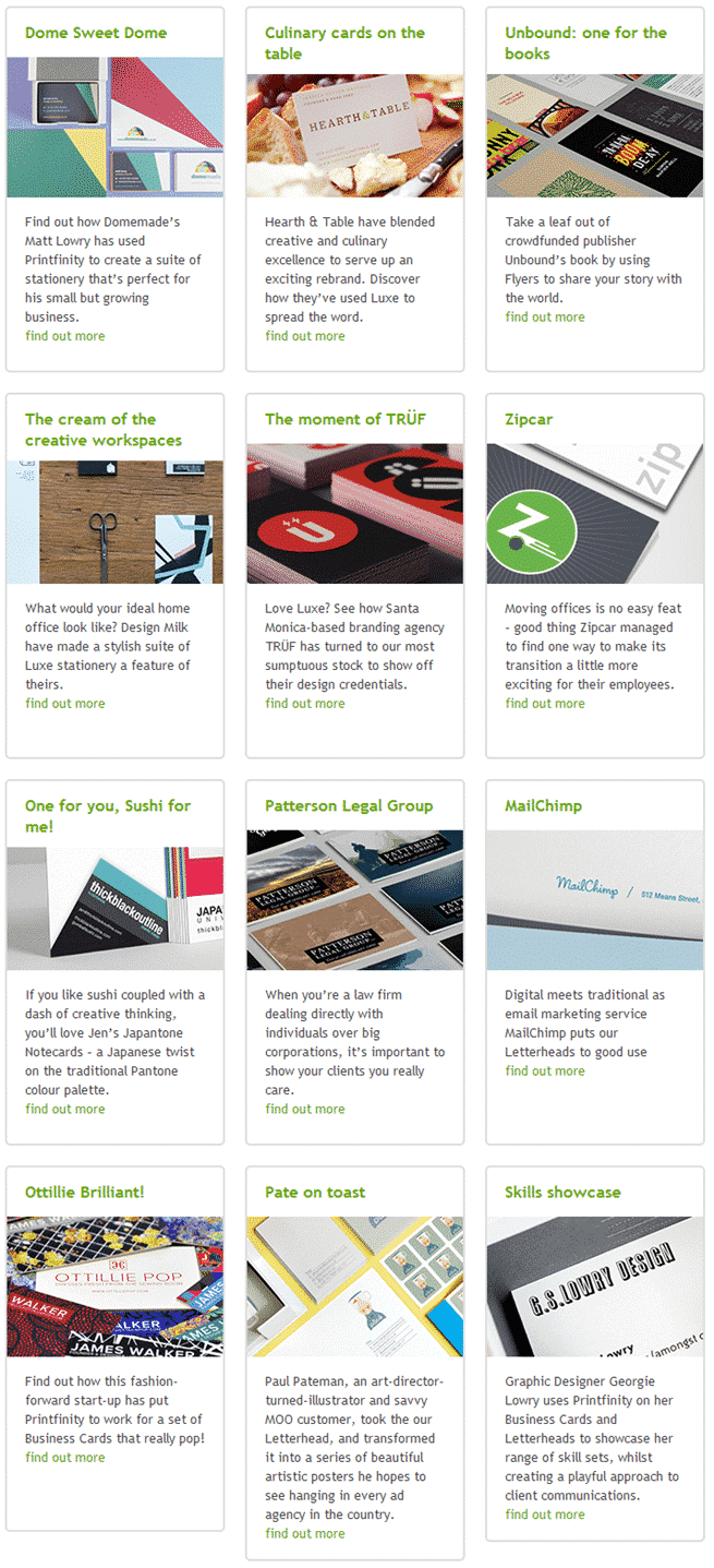
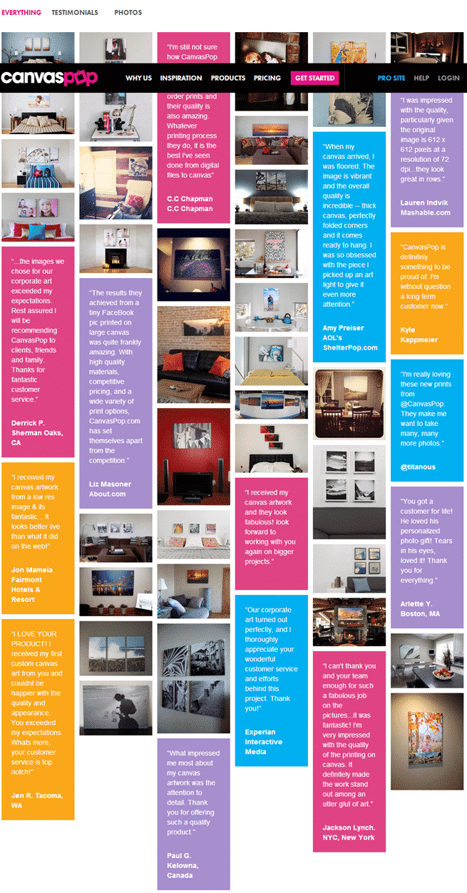
You can search the web for more ideas on how to present your collection of photos. As long as you present your gallery in an organized manner, you can be sure your customers will appreciate it no matter the concept.
Step 2: Set Up Your Inspiration Gallery Page
On your eCommerce website, set up a page that’s dedicated to your inspiration gallery. Start with a well-written summary that will encourage customers to get inspiration from the photos of products.
This summary could be from 100 to 300 words, and you should include why the inspiration gallery was built and what the customers will get in return.
You can discuss the top functions and/or benefits of the products you are showcasing in the summary.
Also, make sure to include a few links to other pages on your eCommerce store. This aids Google and other search engines to easily navigate your entire website.
Step 3: Choose A Layout For Your Inspiration Gallery
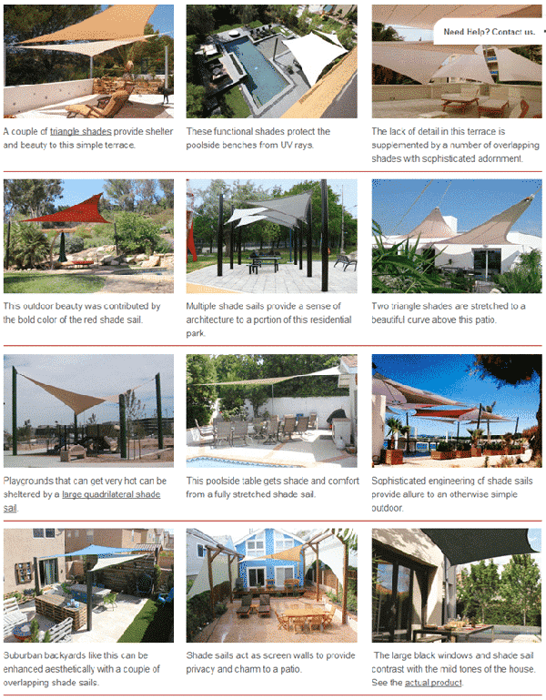
There are no rules when it comes to the layout of inspiration galleries. But for an eCommerce website, you’d want a clean, organized and informative layout that will not just inspire customers, but also provide them with ideas in the form of texts.
Underneath each photo is a short description that tells something about the product on the photo.
Step 4: Look For Product Photos/Images That Are Similar To What You Are Selling
Even if you have your own line of products, it is a good idea to use similar ones in your inspiration gallery. It is also good to mix and match yours with photos you’ve collected from around the web.
If your e-store carries specific brands, you can search for these branded products on the web and include them onto your gallery. It would be better if you pick photos with the products being used by real people to make the gallery more interesting and inspiring to your customers.
Step 5: Upload Photos Onto Your Inspiration Gallery Page
When you upload your photos, it is a must that you add a good ALT tag on each. ALT tags are alternate texts for images on a web page that cannot be displayed.
ALT tags are HTML attributes that are specified within the IMG tag. For most websites, the ALT tag of an image can be easily added via the media library upon uploading the image.
Here’s the HTML code that you can use for ALT tags in case you want to add it manually:
<img alt= “image description (ALT tag)” scr= “yourecommstore.jpg”>
Just a few tips when using ALT tags for your images:
- Make ALT tags short.
- It doesn’t have to be a long description of the image, but just a few exact words that contextualize your image.
- A clear and concise ALT text helps improve your website’s search engine rankings.
Step 6: Add Short Descriptions To Your Photos
A short description underneath each photo simply tells customers what the photo is about. If a photo says a thousand words, a witty and fun description makes it more interesting, inspiring, and never boring.
Step 7: Link Appropriate Words In The Descriptions
Adding links to appropriate words within some of the descriptions can help your customers even further. This allows them to navigate other pages on your eCommerce website with just a click on a link.
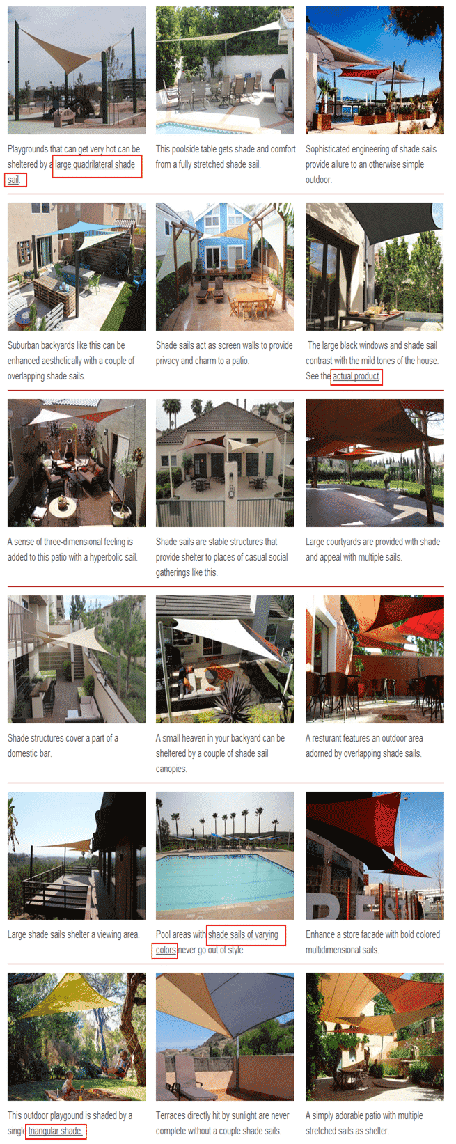
This practice is also favored by the search engines since it allows them to navigate different pages on your website.
Note: Do not link to products on your competitors’ websites.
Learn From Others
Inspiration galleries have become a requisite among website owners of various types. It is more than just collecting inspiring photos, but it has become a great tool to encourage new customers to stick around and perhaps buy from your store in the near future.
Somehow, there are those who build their inspiration galleries haphazardly and without even putting enough thought about their customers and search engines.
As eCommerce store owners, you need to satisfy both human (customer) and search engine in order to thrive as a business online.
The examples on Steps 1, 3 and 7 showcases the ideal types of inspiration galleries. Your collections of inspiring product photos can only be very useful if you apply all of the steps mentioned in this how-to guide.
Below are samples of not-so-ideal inspiration galleries on the web:
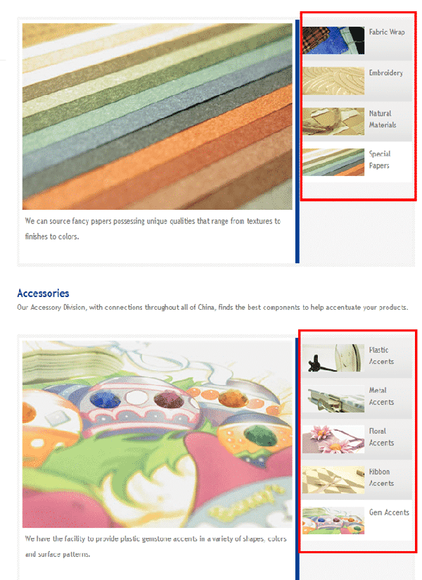
Leo.com.hk has very few products being showcased here on their inspiration gallery. And yet they did not lay them out in uniform-sized thumbnails to populate the page.
They’ve categorized these particular products and used smaller thumbnails on the right side of the bigger thumbnails. The descriptions are of no help either.
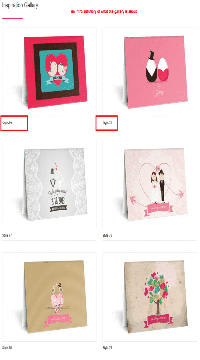
TheInviteHub.com may be colorful and have utilized their inspiration gallery’s page quite well with bigger thumbnails. But there’s no summary or introduction to their invitations and no descriptions as well.
Despite the beautifully designed invitations, it will still be a challenge for some customers especially if they want to know the details of the images. For products such as invitations, it is essential to add a piece of text to give customers an idea of what is written inside, for example.
Final Checklist
eCommerce stores can either be inspiring or boring in the eyes of customers. The secret to winning customers’ attention is to provide them with something that will spark their interest and imagination. An inspiration gallery will be able to that work for you especially when executed properly and with a little help from the search engines.
- Conceptualize or at least categorize your inspiration gallery for organization and a clean look and feel.
- Link other pages on your eCommerce store – on the summary and relevant keywords/phrases on the photo descriptions.
- Use a good layout of at least 3 columns and populate the page to draw in more visitors, and for them to spend a little more time on the page.
- Use ALT tags on your photos for search engine optimization.
Photo by peoplecreations / CC BY

