
Sooner or later, customers and visitors of an online store web page will run into some issues and have plenty of questions that need to be answered.
Since no store owner is able to answer emails 24/7 or afford someone to do this task for them, it’s necessary to set up their own Help Center or Help Section page for every online store.
Here’s where copywriters will learn how to make it and discover how it makes life easier for store owners and allows their customers to find the help they are looking for.
In addition to showing you how to structure a good Help Center, how to choose topics for it, and what information to include, we’ll also teach you how to get the most of your Help Center page so that it actually serves its real purpose – boost the store in the search engines, apart from simply helping customers.
However, before we do that, we have to show you what a Help Center is. So, here’s what it represents in most cases. Later on, we’ll show you how it can be used in a much smarter way.
What Is a Help Center?
Instead of trying to define the term precisely and accurately, don’t you agree it’s better to start with some good visual examples? Here are some of them. Please, first take a closer look at these and then we’ll analyze them briefly.
Example #1
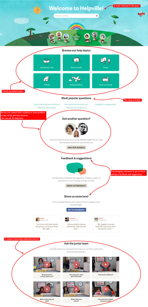
Check ‘Helpville’, the Help page of Wonderbly (former LostMyName), a company that makes and sells personalized books for children.
Example #2
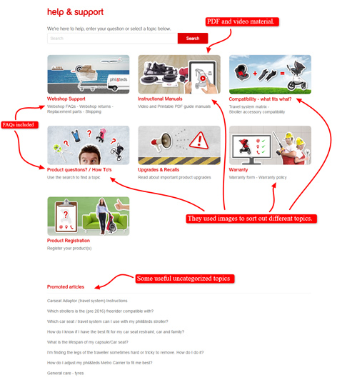
Here’s phil&teds help and support page. They sell products for children such as strollers, high chairs, portable cots, baby carriers, and car seats.
Example #3
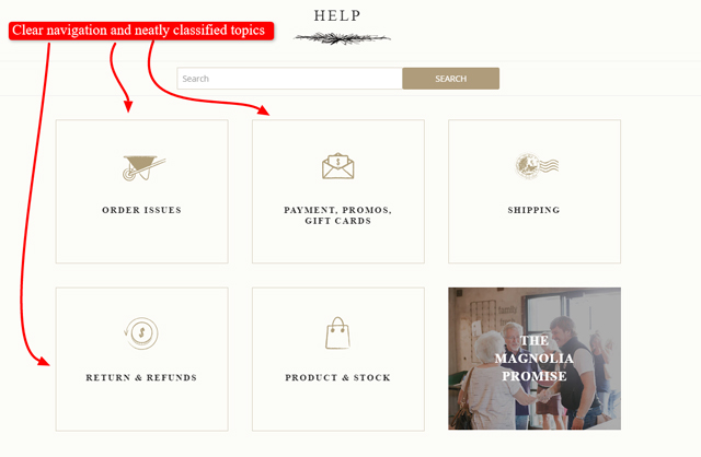
Magnolia Market sells various things for home: rugs, pillows, vases, mirrors, garden kits, and many other home decorations, as well as books, boardgames, clothes, jewellery, perfumes, bags, purses and the like.
Now let’s see what our example Help Centers have in common.
They don’t rely on words only, but use images/icons/videos to present the topics clearly and attractively instead. This is good because customers prefer visual presentation of information over words or blocks of text. In this way, they’ll find your Help Center more appealing and easy to navigate.
However, it’s where all of them stopped developing this great idea further and trying to use it in a better way. Apart from a good first impression, you’ve probably noticed that there’s little praiseworthy content included in each of those sections.
You’ll mostly find endless lists of various questions and answers, presented mainly as big blocks of text.
Customers usually ask the same things and have similar problems you can anticipate, so all these examples have more or less the same topics. The most common issues are related to:
- Ordering a product
- Pricing
- Payment
- Delivery
- Shipping
- Warranty or
- Returns and refunds
Therefore, every eCommerce store always needs e.g. a Shipping page, an FAQ page, a Contact page, or an About Us page.
You CAN link out to those pages from the Help Center, but they’re NOT part of the Help Center because it operates a little differently. This means that NOT every eCommerce store needs a Help Center just because they need the other pages mentioned above.
Now, let’s analyze a great example of how a Help Center can be used in a completely different way.
How Can a Help Center Serve a More Practical Purpose?
The following example will teach you not only how to help customers but how to include more good quality customer-oriented content into the store’s website.
Why would you do that? Because both customers and Google love it and it will boost the store in the search engines.
Follow the link to the CheapSheds online store to see how well-organized and content abundant their Help Center is.

Let’s take a brief look at what happens when you click some of those resources:

You see? NOT only do they briefly answer their customers common questions (mostly in the FAQs section included here), but provide a lot of valuable content to educate their customers about many things related to the topic.
Actually, they simply could have called this a blog because it consists of:
- Blog articles (Articles section)
- Videos about the sheds (in their Video Library and CheapSheds TV sections)
- Photos of their customers (in the Wall of Fame section)
- The latest media clippings and recordings about them (In The News section)
- Various new tools and fun things for customers (such as contests, apps, games, ebooks, wind calculator etc. in their What’s New section)
- Content showing the company is a good corporate citizen which helps animals or people in need and saves the nature (Save The World section), and the like
They’ve also included some basic categories here (other stores often include in their Help section):
- They linked out to an FAQ page (again with a lot of videos) included here as a navigation element to make that page look a bit more full
- Delivery and Depot Map, which is basically the same as Shipping (again just the link out to another page)
- IT Center, in case customers have a problem with their website
So why didn’t they just call it a blog like any other online store, but they called it a Help Center? Well, if they did it, no one would want to read it!
Instead, they’ve done a clever thing!
They’ve compiled all that into the Help Center and created the subsections. So, instead of a blog everyone would probably find boring, they’ve created the Help Center and presented their content as part of it in a more organized way.
In other words, they wanted to get as much valuable content as possible into their website because search engines love that. So, this is how they’ve found ideas for what to write about!
For instance, Save The World section could have also appeared in the About Us category but they included it here to point out their corporate citizenship responsibility.
Who can resist a company that puts pictures of baby animals on their web page?
Moreover, having the big RSPCA logo (an animal welfare organization in Australia) included on their website looks great to both customers and search engines.
Google likes to know that a company is connected with the rest of the world because it gives Google a clue it’s a real company which really helps its customers.
What’s more, Google looks for words/phrases such as ‘good corporate citizen’ or ‘we help animals’ and then it ‘says’ it’s a good business.
Furthermore, In The News section consists of press releases and links out to pdf documents of articles that have been written about them, which is just another opportunity to write about their products in a different way.
Search engines appreciate it!
When structured in this way, you can say that the Help Center is NOT necessarily helping customers but just adding in some more varied content.
Google loves all the content presented here: a lot of videos, images, text! Google loves customer oriented and service-oriented content like this.
In a nutshell, it’s a win-win situation if your Help Center is a little bit like a blog (but NOT a blog) that allows you to put in a lot more content but in quite a structured way. You see?
The original idea is to help store owners to gain that edge over competitors and a self service like this allows them to do so in addition to saving time and money. Isn’t that brilliant?
This should be the real purpose of a Help Center!
Now, let’s summarize what a Help Center is and how it can improve someone’s business.
The Benefits of a Help Center
Basically, a Help Center is a completely self-service support feature that will enable one’s customers to find the answers to their questions and problems regarding a store and its products and solve them by themselves or with a little bit of help from the community.
You may notice that most Help Center pages look more or less like FAQ sections/pages, but the main difference is that a Help Center encompasses everything and anything related to a store and not just the shipping details, payment options and the like.
Here are the main reasons why a Help Center is a great tool for online store owners:
- It helps increase customer satisfaction because of the accomplishment of self-service problem solving
- It also helps a business community grow and build a strong relationship with the customers
- It allows store owners to reduce the cost of hiring staff that will engage in customer service duties and use that money for other aspects of their business instead
- Besides saving time and money (because 90% of the questions customers ask are repetitive), it also helps boost the store in the search engines (we explained how in the previous example)
- It also helps you get more good quality customer-oriented content into the website, which Google likes
However, there are undoubtedly a lot of things to consider before making a Help Center. This is why we’re here to help with our guide on how to create a Help Center that helps customers help themselves.
First we’re going to talk about a good structure of a Help Center, and then we’re going to show you how to choose topics and categories for it.
So, let’s get right to it!
Structure Your Help Center Properly
The Help Center page needs to be well-structured and organized so that the customers can easily navigate through it and find what they’re looking for.
Do NOT think it’s enough only to write the text that goes on the Help Center page.
A copywriter that is valuable to any eCommerce owner needs to be able to structure a page and get the job done. Probably in collaboration with other members of the team, you will be the one to organize and make the page from scratch.
Here are some ideas and examples of default categories that you can use.
Make Obvious Categories
Categories are the most general or broad division of a Help Center. They can be further split down into smaller articles, notes, help topics, and answers to the queries on how to solve problems.
You want to structure your Help Center page as follows:
- Categories
- Articles, Notes, help topics, etc.
Below is a structure of an old Help Center page that belonged to Eventbrite.
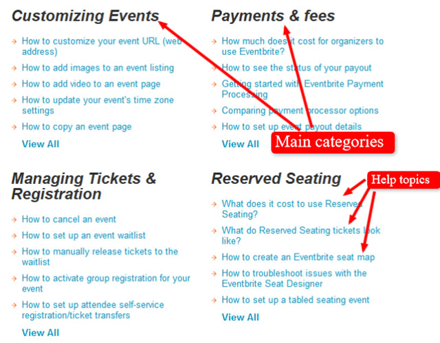
Remember that the aim of the Help Center page is to encourage self-service and you don’t want your customers to have a hard time helping themselves. Using this structure will certainly help customers to save time and effort when trying to navigate through a large Help center page.
Use Images in Combination With the Text
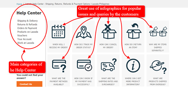
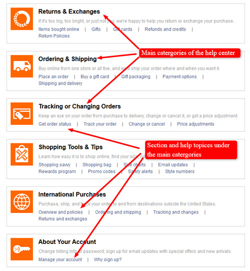
A great way to make your Help Center page easier to navigate through and nicer to look at is using images, icons, or infographics together with text, as shown in the examples below.
Example #1 Lazada Help Center page
Example #2 This used to be the layout of the Gap Customer Service page.
Here are a few sources where you can find free high quality eCommerce icons:
- 25 Latest Free eCommerce Icon Sets
- 25+ Free eCommerce Icon Sets to Download in 2017
- The 32 Best Free Design Icon Sets for eCommerce Sites
- Simpleicon eCommerce
Since ‘a picture is worth a thousand words’, cherry-pick those that will best fit and enhance the design of the whole online store you’re working for.
Choose Your Help Center Topics
This step is the foundation of the Help Center. Depending on how well you choose your topics, your Help Center will be successful or not.
In a certain number of cases, copywriters will be asked to figure out the Help Center topics, as well. That’s why they should know how to write useful and concise answers to the issues users are having.
There are two ways you can use to set up useful Help Center topics. You can set the topics by giving your own opinion, or you can use the feedback from the customers.
Look at the Store From the Eyes of a Customer
If an eCommerce store is brand new, there will be no emails or comments to analyze. This is where a shrewd copywriter needs to put their imagination and experience as a shopper to good use.
You or your friends have probably had some not-so-good experiences when trying to purchase something online. Remember what went wrong, sort those problems into categories and use them as your Help Center topics.
Some issues will be the same for all eCommerce stores like, let’s say, issues with the website (e.g. broken links). On the other hand, you need to think about the product itself and predict some issues there (e.g. customers don’t know how to set it up, or it’s faulty).
Your employer will be able to help you with this because the product must have been tested somehow and somebody must have had something to say about it.
Analyze Feedback From Actual Customers
When one launches a store, they need to offer some way for their customers to contact them: add some sort of Contact Us page or at least put their contact details somewhere on the site.
With that in mind, very soon almost every store account will have a couple of emails, questions and complaints about the store, products, services, coming in. Ask the eCommerce owner to pay attention to these – they are a precious source of feedback and writing topic ideas.
When you get access to those emails, read and analyze them. Think if the issues expressed impact a lot of the customers, and how many of them are actually unique enough to warrant their own section or topic.
You will probably have emails that can be categorized as follows:
- Common issues (customers are struggling with X, customers need help with X, etc.)
- Frequently Asked Questions (FAQs/customers always ask about X)
- Issues related to the workings of the website (site not working on certain browsers, broken links, etc.)
- Issues related to the product itself (product is defective or not working properly, customer doesn’t know how to use or setup product, etc.)
- Issues related to the purchase process (payments not accepted, payment option not supported, etc.)
- Time-consuming problems (product taking too much time to setup, site loads too slow, etc.)
- Good corporate citizen, knowledge base, PR etc.
Once you’ve analyzed all the emails, you will have a good idea if they are in the priority list of what needs to be in the Help Center and if so, record the queries and issues.
Categorize All the Data From the Customer Support Emails
When you’ve gathered all the data from the customers’ emails, the next step is to categorize each query and issue you find important.
This is helpful in many ways and not just with your work on the Help Center page. Once you categorize the customer emails, you can:
- Improve the Help Center categories
- Improve website content to be more useful and informative for the customers
- Get new ideas for your blog posts (and possibly try to sneak it into the Help Center – remember the CheapSheds great example?)
- Find areas for further business improvement of the eCommerce store you work for
The Help Center page can either be very minimalistic or a very large library depending on the store site, so there is a lot of work to be done on how you can categorize, narrowing it down to specific help topics, answers, and links. This is, of course, done manually to make sure that you correctly place the help topics and answers.
If you take a look at the other eCommerce stores, you will probably find the following most commonly used categories you can also start with:
- Frequently Asked Questions (FAQ)
- Contact Us
- About Us
- Terms and Policies
- Shipping
- Purchases
Here are a couple of advanced categories and sections that aren’t actually required but show the real purpose of the Help Center, so you can use them if you are thinking of having them later down the line.
- Account
- Archives
- Sitemap
- Credit Center
- Product Help
- Website Troubleshooting
- Community Help
- Partnership and Licensing Opportunities
- Promotions and Events
- Testimonials
These are some suggestions of the usual categories that can be applied to many eCommerce stores, so you are safe to start with something similar. However, the specifics of the eCommerce store you’re working for may inspire you to make more categories.
As we already mentioned, remember the great example of CheapShed’s Help Center and try to follow their steps as much as you can. We doubt we should repeat why.
Here’s some more detailed information on how to gather and sort out all the necessary data more easily.
How to Collect and Sort Out Data From Customer Support Emails
Sorting out data from customer support emails is a precious source of ideas for different types of your writing. To be able to obtain this data, you have to collaborate with whoever deals with customer support. To prove yourself valuable and knowledgeable, it is advisable for you to know a bit or two about ways to gather and analyse this type of data.
Every eCommerce store will have their own way to deal with customer support feedback. Some use feedback gathered from the social media, others have a contact form. Some surveys show that people still prefer using email to social media.
There are several ways of extracting the data you need from the customer support feedback. You’ll find more details in the following three subsections.
While you may not be the one to make the choice how to handle customer support, you can still make some suggestions.
Sorting Data Using Contact Form
You have already seen many different contact forms on different websites. They require your email address, title and your message. It’s a good way to gather feedback, especially when it comes to sorting emails.
Easy – you need to pick the form that has a drop down menu in the title, so that people need to pick a category of their query themselves. That makes it so simple to sort those emails in the company inbox.
This also saves you from a certain amount of spam mail, and that is always a good thing.
The bad side is that people don’t really like using contact forms. They give away the feeling that the query submitted in this way ends up on some pile that nobody ever reads.
If your eCommerce store uses this way for their communication with clients, make sure that the store owner always includes their company email underneath the contact form for all those queries that do not belong to any of the offered categories.
Sorting Data Using Semantic Search Options
Another way of sorting data can be to use semantic search options. It means that you are able to go through the emails by searching keywords and the search engine takes into account the context in which that keyword is found.
For instance, the word ‘follow’ has a completely different meaning in everyday life and when you talk about social media. Similar happens with other keywords that you search and that occur in client emails.
Let’s just briefly show how it works in Google search and how Google recognizes the appropriate context for e.g. the search phrase ‘cat food’. It presents the phrase in bold every time it occurs in the results.
It also recognizes broad context into which the search term fits, so it also suggests e.g. ‘pet food’ in our search results (recognizing that cats belong to the category of pets).
In other words, it understands the user intent behind the customer’s search.
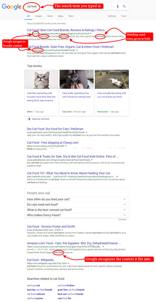
Similarly, semantic search makes it easy and fast to browse emails in any way you need. Consequently, it makes it easier for you to sort them.
Sorting Data Using Email Management Software
Our last suggestion, which is probably the fastest and the most time-efficient way to deal with customer support emails, is to use email management software.
Your customer support colleagues and your employer are probably aware of that fact, so, with any luck, they are already using it.
That means you should at least get acquainted with some basic features of those tools. For start, here’s the list of the most commonly used email management software solutions.
After gathering, sorting out, and categorizing the data, you have to decide what information to include in each category of your Help Center, so let’s see.
Know What Information to Include in Each Basic Category
When you have properly categorized all the issues and queries of a store, the next step is to create the help topics or answer stubs for them. Here’s some helpful information on that. We’ll be talking only about some basic most common categories usually included in a Help Center (or linked out to from the Help center).
Learn What to Use in the Frequently Asked Questions Category
The FAQ category will contain a lot of topics for your customers to go through and this is why you need to set it up in a way that they can find the questions and answers quickly and easily.
So, always remember to think like your customers as you make the Help Center. People nowadays don’t have enough time or patience to sit through an entire library of help topics to find the specific one they need to resolve their issue or query.
Thus, what you need to do is have three smaller sections which are:
- Most viewed topics
- Popular topics
- View all FAQs
The most viewed topics and popular topics can be condensed into one section or have other alternative sections such as most recent questions and topics as shown in the examples below.
Example #1 Tom Ford online store Help Center (FAQ section)
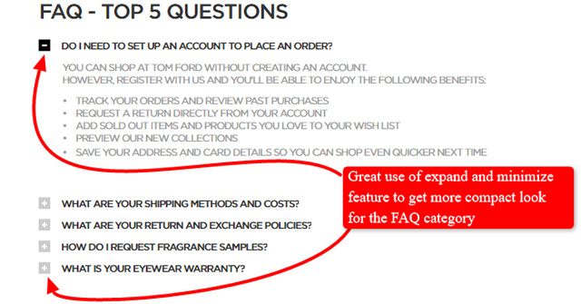
Example #2 Vistaprint Help Center (FAQ section)
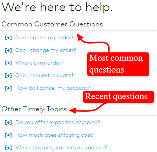
The important thing here is that your customers can view these issues and topics that they are frequently having problems with.
And having the ‘View all FAQs’, they have the option to go through the entire FAQs library if their issue or query isn’t located in the popular or most viewed topics section.
To get more details on this topic, refer to our lecture about FAQ section.
Add Help Topics and Links to the Contact Category
The Contact Us category is one of the most integral parts of the Help Center and should be considered the last resort for the customers when using the Help Center.
As we mentioned earlier, the entire concept of the Help Center is self-service. But you should always keep in mind that there will always be people who will get frustrated when trying to use the Help Center.
This is why they will opt for using the contact information or links to talk with a representative of the store to solve their issues and queries.
Most online stores have three main options for their Contact Us category which are:
- Telephone number
- Email address or contact form
- Live chat
Let’s take a quick look at the example of Contact us section within Vistaprint Help page again.
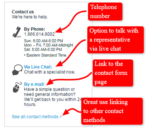
The telephone number is essential for store owners that do the good half of their business locally to give local customers the chance to contact them and inquire about their store hours, product information, business location, etc.
The email address will be simply displayed meanwhile the ‘contact us form’ will be linked to the page where customers are able to fill out a simple form where they can ask a store owner about anything and everything in regards to their business and products.
The live chat is an optional method for how the customers can contact them since it takes a great deal of time and effort on their part.
If you want to know more details on how to write a Contact page properly, refer to our lecture Write a Contact page that saves time.
Add Help Topics to the Terms and Policies Category
Another important category to include in a Help Center page is the Terms and Policies category which simply has links to the pages of the store’s terms and policies, as shown below on an example of Security & Privacy Policy Section by Kohls.
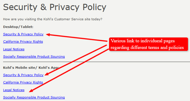
They will include links and maybe snippets or excerpts to the pages such as:
- Refund and Return Policy
- Privacy Policy
- Terms of Sale
- Terms of Use
- Warranty Policy
If you want to know more about how to make these pages simply visit our lectures below:
- Write a Refund Policy for your store
- Write a Site Terms of Use for your store
- Write a Privacy Policy for your store
Add an About Category in Your Help Center
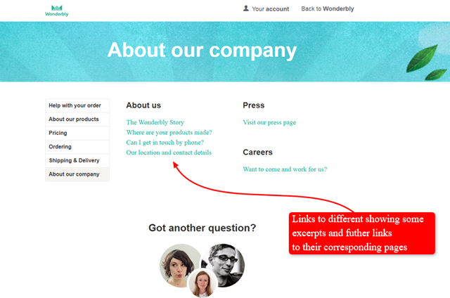
When adding the About Us category in the Help Center page, you can either put a small excerpt or snippet of the About Us page or just simply put a link to the page itself, as shown in the example below. You can also combine both with a small excerpt, then a link saying ‘read more’ or ‘click here to view more’.
Here’s what a link to the About Us page within Wonderbly Help Center looks like.
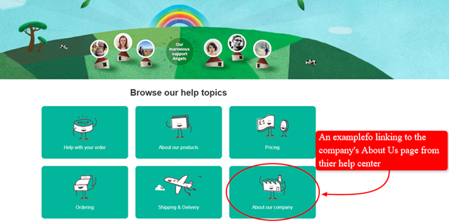
And here’s what you see when you click on it: more links to different subcategories about the company, presenting some excerpts and further links to the corresponding pages. Go ahead – explore them and learn.
Check out the section: Write an About page that makes your store shine if you want to know more about what to put in your About Us page and category.
Add Help Topics to the Shipping Category
Shipping is one of the main concerns of any customer purchasing products through an online store. With that in mind, you should have a very broad and concise shipping category in the Help Center, as shown in the example below.
Remember the old Help Center page by Gap?

If you follow the link to the Help Center above, you’ll notice that there are no icons and images in the new version of the page. However, there’s still Ordering & Shipping category we’re now interested in.
Let’s take a closer look at one of the subcategories – the section which used to be Shipping and delivery and is now called Shipping and handling information. Although its name has been changed, the content remained the same. Here’s what it looks like and what the point is:
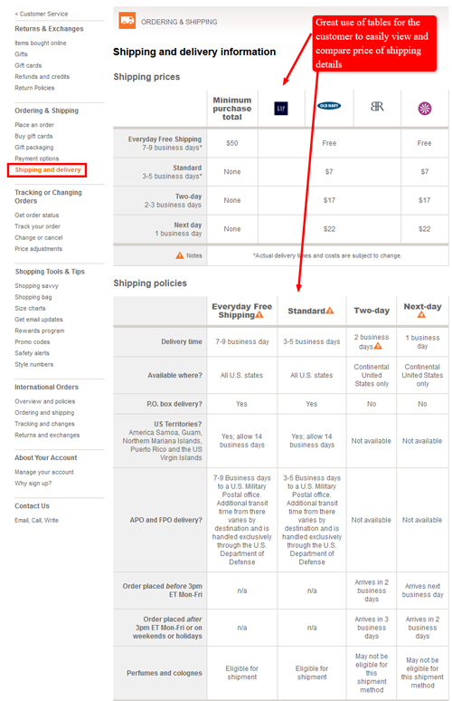
In this category you should add various links to the shipping details and questions that your customers might ask or have problems with, such as:
- Shipping policies and availability
- How to check if their region has free shipping available
- How to change their shipping address
- How to check the shipping or delivery status of their order
- How to check the shipping rates for each region
- What delivery services are available when shipping the orders
These are only a few of the help topics that you will encounter when dealing with the shipping category of a store and its Help Center.
There will be more specific shipping help topics depending on what the store offers and what products they actually sell.
Add Help Topics to the Purchases Category
The ‘Purchases’ and ‘Shipping’ categories have a lot of similarities, but the purchases category primarily consists of help topics regarding items that have already been bought and how you can check and manage them.
Here are the most common help topics that should be included but not limited to the purchases category:
- How to manage orders (change and cancel them)
- Check your order status (whether it has been already shipped or still pending payment verification, etc.)
- Check and print online receipts for orders
- Check the tax and exemptions of the products and purchases
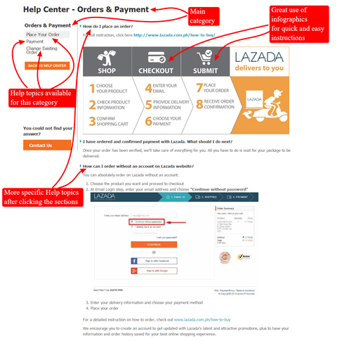
Below is an example of Lazada’s former Purchases category which has been renamed into Orders and Payment category.
In Summary
Now that we’ve discussed all the basic elements that an average Help Center needs, as well as its purposes, here is the final checklist of how to create a Help Center to help customers help themselves so you don’t have to.
- Check your emails regularly and analyze which topic, question, issue, and problem keeps showing up and is unique enough to warrant itself its own stub on the Help Center page.
- Remember to have all the basic categories with the appropriate content in the Help Center but also keep updating it with new categories when needed.
- Some of the advanced categories might be required depending on the design, layout, and plugins the store is using
- The core function of the Help Center is to encourage customers and visitors to help themselves with the help of the knowledge base that is the Help section itself.
- However, don’t rely on it too much and always have the Contact Us page present to keep your bases covered in case people can’t solve their problems using the Help Center.
- The structure of the Help Center page is very basic but you can still go into more complex structures depending on the design of the page itself.
- You can have main categories that split into different sections which then lead to the help topics and answers themselves.
- Also adding infographics is a great way to reduce clutter and not make your Help Center look like an intimidating “wall of text” that visitors tend to skip instead of going through the content.
- You need to learn a bit about how to collect and sort out all the data you gather from customers, so communicate closely with the customer support.
And last but not least, always tend to incorporate as much valuable customer-oriented (blog-like) content as you can into your Help Center. Not only will this help customers, but its search engines and store owners will also like it.
Frequently Asked Questions
1. Is it advisable to add as much valuable content (images, videos, text) to the Help Center page?
a. No. It doesn’t matter at all
b. Yes. All the mentioned makes it more visually appealing and boost the store page in the search engines
2. Semantic search is used ONLY for Internet searches.
a. Yes. That is its only use
b. No. Some app allow you to use this type of search to deal with large email inboxes
3. Email management software is…
a. Pointless. You have to read all those emails anyway
b. Precious when it comes to categorization of the incoming messages
4. flexzfitness.com is an example of an eCommerce online store with a very well-organized Help Center.
a. True
b. False
5. Email communication is a thing of past.
a. Yes. Everybody text these days
b. No. Most business get many emails every day
