The aim of this guide is to teach you how to create – via good and bad examples and a list of guidelines – Call to Action banners specifically for eCommerce store blog posts.
You need to know this guide because your blog posts are gateways to some (if not all) of your other e-store pages through CTAs (calls to action) included at the end of each post.
A CTA can either be an image or an inline text (contextual) that prompts customers or leads to take action.
Blog posts are now used as a marketing tool by many websites of different types. Websites with blogs have more opportunities of gaining audiences or customers since they can attract 55% more visitors than websites without blogs.
If you try searching for e-Commerce stores that sell similar products as yours, you’d be surprised to see that many of them don’t have blogs. And even if they do, their posts lack CTA or have CTAs that are not attracting visitors to ‘click’.
This is the best time to put your creativity into good use especially when writing blog posts that pertain to your products.
If you have announcements, tips and tricks, or updates that you publish on regularly your blog, make sure to add relevant CTA that will encourage your visitors to click through the contextual links or banners you use.
Examples Of eCommerce Store Blog Posts With CTAs
Good CTAs

Example 1: Gazebos Australia provides lots of useful information about products and tips on their blog.
The sample above is a post with contextual CTA which links to a guide, and it has a heading that’s relevant to the blog post.
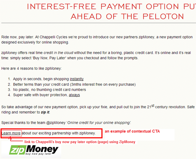
Example 2: Chappelli‘s contextual CTA at the end of this short post has a link to their ‘buy now pay later’ page.
They use their blog to promote and encourage customers to use this payment method by citing benefits/reasons and the CTA that tells visitors to ‘learn more’ through the contextual link.
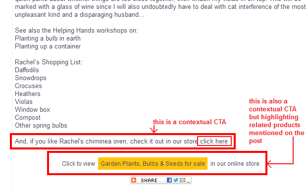
Example 3: The above example shows a combination of contextual CTAs used by Green Fingers to showcase a specific product shown as an image (chiminea oven) on the post and recommended relevant products (garden plants, bulbs, etc).
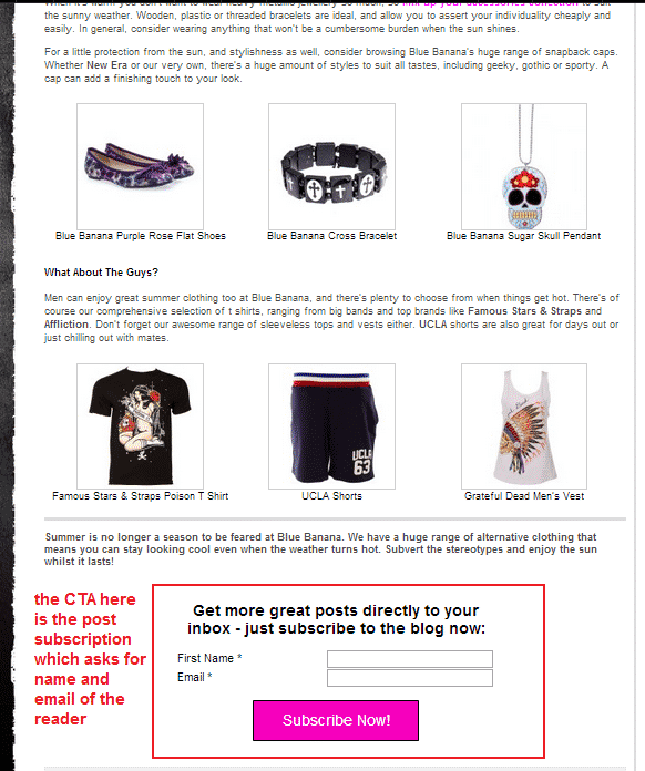
Example 4: Blue Banana published this ‘alternative summer clothing’ blog post to showcase the right outfits for summer.
Their CTA is a subscription to their blog in exchange of the visitor’s name and email.
Blog posts that are non-promotional and meant to be helpful are ideal for subscription CTAs since you don’t have anything particular to offer.
Best of all, you’ll be able to get your visitors’ email addresses which you can use for sending updates and promos.
If you wish to use this type of CTA, it is best to also mention that signing up or subscribing will include them to your regular newsletter updates (aside from blog posts).
This way, your visitors won’t be surprised to receive emails other than your blog post updates.
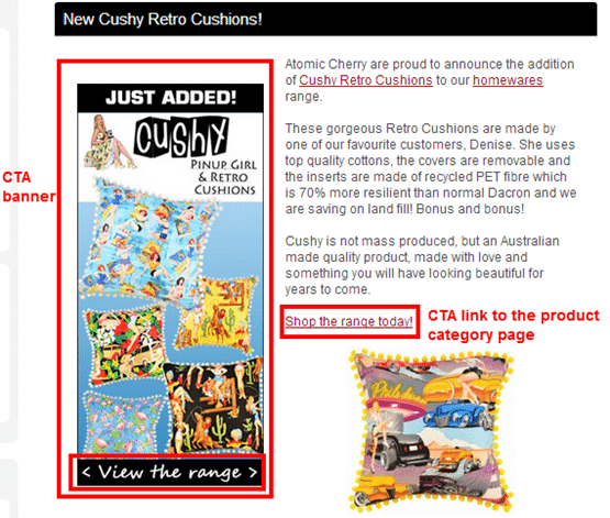
Example 5: Like many other eCommerce stores, using blogs to post updates on new products is a normal practice. Atomic Cherry is just one of the many e-stores that do this and they do it in a creative and visual way.
Using a CTA banner that they’ve created just for this new product line can be an effective way of getting more customers to visit the specific product page.
This banner is accompanied by a CTA text link to the same product page.
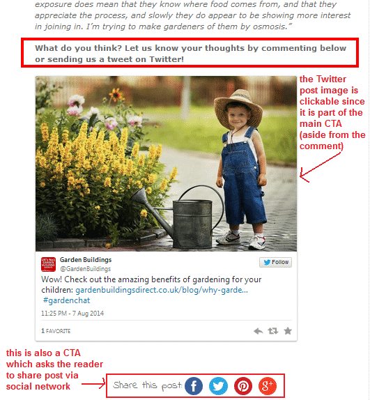
Example 6: Social sharing is ‘the thing’ right now. So, this is what Garden Buildings Direct used on this blog post. The post itself is non-promotional since it’s about the benefits of gardening for children.
Their CTAs encourage visitors to click and share the post via different social sharing icons.
The Twitter post image here is clickable and sends visitors to GBD’s Twitter post where they can directly share, re-tweet, and favorite the tweet.

Example 7: It is normal to find CTAs on eCommerce blog posts that tell customers to call via phone number.
Lush USA‘s post does exactly just that as part of their customer service in case visitors cannot find the right product listed on the above promotional post.
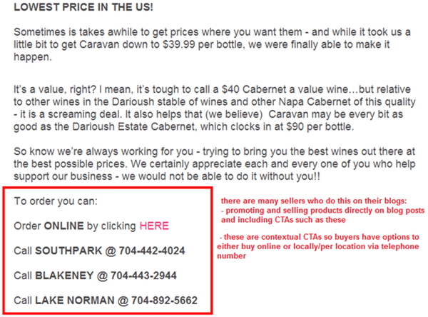
Example 8: Here’s another example of combined contextual CTAs with options of buying a specific product.
Wine Store Online provides the above CTAs to visitors in case they want to try the brand of wine mentioned (Caravan brand) on the post. Visitors can either order/buy online or by calling the local offline store near them.
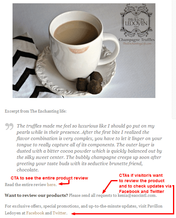
Example 9: Blogs are also great to use as gateways to third-party product reviews. On the above example, Pavillon Ledoyen extracted an excerpt from a review of one of their products, and posted it on their blog.
They used three contextual CTAs on this post:
- a CTA to link to the product review
- a CTA for contacting their staff if a visitor wants to review their product/s
- a CTA for visiting their Facebook/Twitter for updates
Bad CTAs/CTA Combo
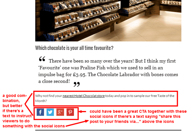
Example 10: Hotel Chocolat‘s blog post is an interview of their Watford store manager. Here, she mentioned her fond memories and favorite chocolates from their branch.
The above sample is a combination of contextual and social sharing CTAs. However, while there is a link to the page of their offline/local store listing, there’s no ‘call to action’ that asks/tells the visitor what to do with the social icons.
It’s not good to assume that any visitor can just click away on your social icons. It’s a much better practice to add a CTA for sharing the post on social networks that you specify.
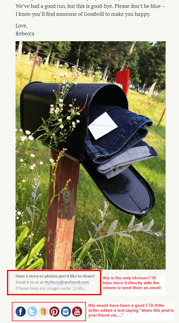
Example 11: The above example from Lands End is similar to Hotel Chocolat – there’s no CTA for social sharing icons, but there’s a CTA for visitors who want to send in via email their personal stories about the products they purchased.
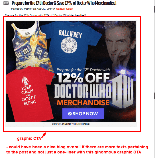
Example 12: While we like this ginormous CTA banner from Stylin Online, this blog post is only a promotional one-liner.
We do not encourage you to do the same with your blog posts because content and substance are essential, no matter what type of post it is.
If you want to use a banner CTA such as this one for a specific line of products, it is a good example in terms of the creative content as it is catchy and timely.
However, without any content on the blog post this, CTA only comes off as a promotional banner and may discourage visitors to click since there’s not enough reason (cited on the content) to do so.
What Makes A Good CTA For eCommerce Blog Posts?
There are so many calls to action that you can specifically create for every blog post you publish. Even if you don’t have anything to promote on a post, a simple CTA will help you expose and boost other pages on your eCommerce store.
Writing practical tips for leads and long-time customers is just one type of post you can publish. But it can be more worthwhile if you include a relevant CTA that may link to a product page, another post, or your store’s FAQ, for example.
The following are types of CTAs you can use on your blog posts:
1. CTA that asks a question
Asking a question after a post is one way to invite your visitors to comment and give their opinions on what you have discussed.
In some of the examples earlier, there were questions specifically written for such posts and they were not generic ones that only ask visitors to comment or click on a link or button.
Visitors come back to blogs that are actively engaged even though they are not yet ready to order anything.
Giving free information through your posts is one way to gain their trust and gives them a reason to visit more often and act on your recommendations (via CTA), which increases the chance of them buying from you eventually.
2. CTA as a subtle hyperlink
A contextual or inline text link is an example of a subtle call to action. You can create your subtle CTA uniquely based on specific posts if you do not want them to look generic or redundant.
You can tell visitors to “click here for more info” or “get to know more about this product line” at the bottom of a specific post to encourage them to check out the relevant page you want them to visit.
3. CTA using simple buttons
Most of the eCommerce store blogs that we’ve seen do not use buttons for CTAs. There may be others out there such as ‘big name’ brands that usually hire marketing teams to do these for them.
If you are just discovering the many types, benefits and uses of a call to action on a blog post, it is best to use simple buttons that are bold and colorful to encourage visitors to click.
You can use PowerPoint to create these button images with your CTA and upload them as images. You can link button images to specific pages you want visitors to check out.
4.Banner CTAs
Banners usually look like ads you see online. These are creatively designed with graphics and texts to match the websites they are promoting.
Banner CTAs usually have more information such as discounts, promos, announcement, sale date/s, or contest details.
Atomic Cherry (example 5) and Stylin Online (example 12) are perfect examples of banner CTAs on a blog post.
5. CTA with social proof
This type of CTA is best for testimonials and product reviews.
If you are publishing these types of posts on your blog, you can incorporate a screenshot of your customers and their testimonials if your post is about a specific product that many customers love, for example.
If your post is about a product review by a customer or by another website/blog, it is good to screen capture an excerpt and the photo of the customer/reviewer.
One of our examples, Pavillon Ledoyen (example 8), could have used a screen cap of the excerpt plus the photo of the reviewer instead of just adding a contextual CTA.
6. Supplemental CTAs
A supplemental CTA could be as simple as adding an action phrase to a set of social sharing buttons, like in some of our examples above. Don’t leave social buttons on their own assuming that your visitors know what to do.
Tell visitors to ‘share this post’ or ‘follow our blog updates via…” next to the social sharing icons you’ve provided.
Telling visitors to call your number or send inquiries to your email address are samples of supplemental CTAs you can include on specific blog posts.
This will highly depend on the topic you discuss on a post such as sending a contest entry or opening your customer service number for inquiries about a new product.
Final Checklist
Here’s a checklist of CTA best practices for your blog posts:
- Use right-sized CTA buttons that will capture visitors’ attention
- Use contrasting colors for smaller buttons to make them stand out
- CTA buttons should command attention without overwhelming your blog post
- Use simple, straightforward language (e.g. visit this page to know more, check out our new product line, etc.)
- Use large, bold font for the main text
- Ensure the text/language is clear and calls for specific action
- Use verbs or action words to clearly state what you want visitors to do after reading your post (e.g. visit…, check out…, browse, shop, order here, sign up, subscribe to us, etc.)
- Avoid misleading visitors with your CTA (e.g. leading visitors to a product page that’s irrelevant to the post)
- Create urgency that encourages visitors to act now (e.g. get 15% off on all items while supplies last, save $25 on all (name of brand) items ’til midnight, etc.)
- Use easily recognizable icons on your visual CTAs that trigger visitors’ attention and action
- Use icons that clarify your CTA button’s meaning
- Use secondary CTAs – we have a couple of examples earlier with secondary CTAs to give visitors options on what to do next (e.g. signing up to newsletters and/or sharing the post via social icons, visiting another page and/or Liking a Facebook page, sending an email as a reviewer and/or following social networks for updates, etc.)
- Have some white space around your CTA banner/button/text for a clean post
Photo by Pixabay / CC BY


1 Comment
I regard something truly special in this site.