The aim of this guide is to help you communicate clearly and professionally with your designers so they can give you the best output in a cost-effective way. While at the same time, gaining satisfaction for both your designers and you.
At a minimum, your online store should have a professionally designed logo and a store template that matches. But how do you communicate what you want to a designer?
The quickest way to blow your store design budget is to miscommunicate with a graphic designer. A designer will typically charge by the hour for their time, and might even charge in minimum half hour increments.
Every time you change your mind, they will charge for their time. If they are charging $50/hour for their time and you want to tweak one little thing, you can end up paying $25. Make 20 ‘tweaks’ and you will end up with a result that is not necessarily reflected in the money spent.
Considering the above point it is tempting to pay a graphic designer on a fixed rate for the project. This could save money, but it might not save it for you!
Freelancers like to be paid for their time. When a client gets close to the maximum time that the freelancer has allowed, they will naturally start to cut corners so they don’t lose money.
If the designer expected the job to take 10 hours, and they are offering a fixed rate for those 10 hours, and you want to make hundreds of tweaks you’ll find that as you get closer to the designer’s quoted budget they will get less happy about making more changes.
You are eating into their profit margin. You can’t expect a designer to keep working on your logo until you are 100% satisfied if this means going over their budget by 20 hours.
You need to communicate very clearly and succinctly with freelance professionals to ensure that your budget stays in check.
Pay freelancers their hourly rate, and make sure you take responsibility for ensuring that your instructions have been correctly communicated, and the designer understands your requirements.
If you break your requirements into smaller tasks then you can head off any problems earlier on.
Step 1: Manage Your Communications Closely
It would seem good logic to conclude that graphic designers are, by their nature, visual communicators and learners. Communicating with a graphic designer in a visual way can be easy for you, and even easier on them.
In addition, documenting your instructions, rather than communicating verbally, gives you a history of requests and changes. If you verbally communicate your instructions, and the graphic designer misinterprets what you wanted, it is not necessarily their fault.
You can then become embroiled in a “He said. She said.” tit for tat game, back and forth. But a distinct, documented path of requests and responses provides you with clues as to where the communication process may have failed and whose fault an issue lie with.
You may also find it easier and faster to visually communicate. Some designers will ask you to fill in a project brief. This means lots of writing and trying to find the right words to express a look and feel that only exists as an abstract concept in your head.
The best way to get a visual idea out of your head is to either draw it or to find similar examples. We’ll focus on the latter solution.
Step 2: Create A Visual Logo Guide For Your Graphic Designer
You want an online store with a particular look and feel. How to communicate this to a graphic designer? It can be difficult at the best of times to communicate your aesthetic preferences but can be made even more difficult if you are working with an overseas freelancer, not in your timezone and not in their native language.
This leads to complications and this, in turn, can increase costs.
A great way of communicating what you do and don’t like is to use visual examples and write your reasons next to each example.
In this tutorial, we’ll work through how to gather examples of logos that you do and don’t like, and how to add them to a document.
The graphic designer you choose to work with will use this as a reference guide when they create your logo.
Step 3: Search for Logos
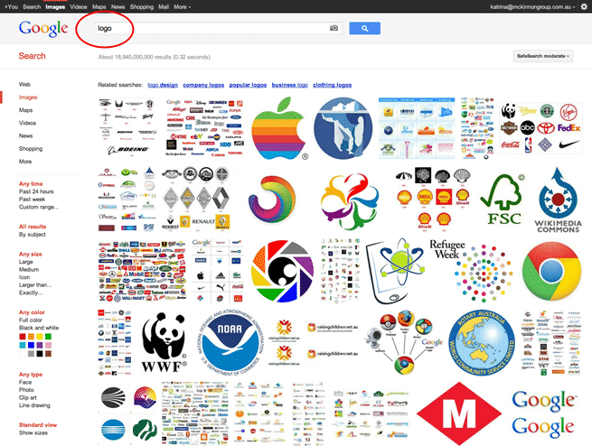
Go to google.com/images and search for “logo”. Make sure you are in the IMAGES search, and not the default Google search. The results page will look something like the below screenshot.
Step 4: Pick Best Images
- Scroll down the page, and keep looking at images. Pick out images that you like, keeping in mind your own store and its customers.
If you are running a store that sells fishing gear you would want to steer clear of funky, modern, flashy logos and instead choose more conservative, down-to-earth sporty styles.
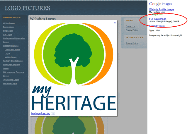
However, there are styles that you can borrow from some logos to create a whole new look for your store. - Click on an image that you like or dislike, anything that you feel quite strongly toward. This will open a new window with the option to view the larger image.
- Click on the link in the right side column “Full-size image”. This will remove the website underneath and allow you to view just the logo you were interested in.
- Right-click on the image and save it to a folder on your computer.
- Keep repeating this process – saving logos that you like and dislike – until you have at least 20 to 30 different examples. This will give your graphic designer plenty of fodder to get a good feeling for what you want in your own logo design.
Step 5: Find More Logos From Logo Pond
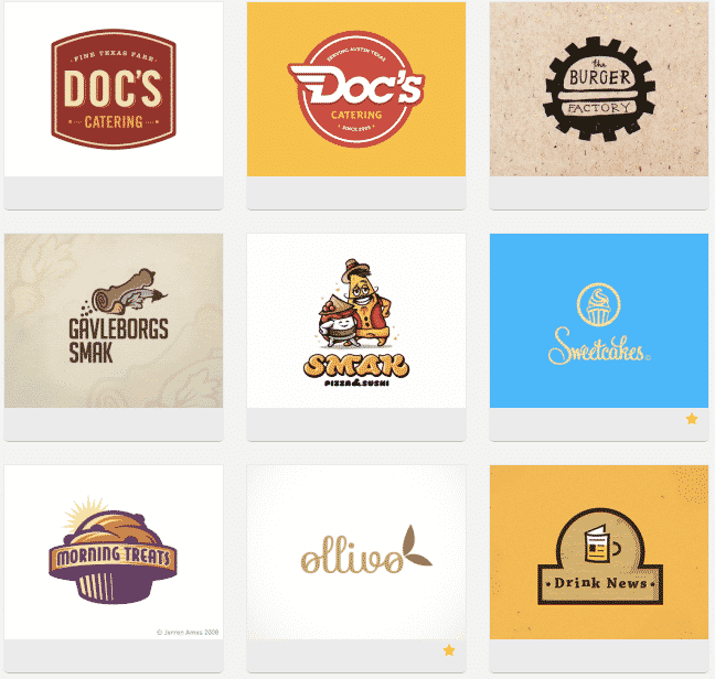
- Google Images is easy and convenient, but it does tend to feature corporate and well-known logos. You can use logopond to find more logos that are a little different.
If there is a particular style that you really love, you can sometimes even engage that designer to work on your project.
Keep in mind however that Logo Pond is a design showcase, and not all the designers are available for hire.
Step 6: Search For More Appropriate Logo For Your Industry
- After you have a good collection of generic logos, you can now search for logos that are more appropriate to your industry.
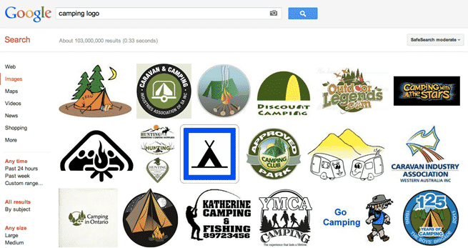
For example, if we were creating a camping supplies store then we would search in Google Images for “camping logos”.
This will then provide you with ideas from your nearest competitors, and provide more fodder for the graphic designer to understand your specific industry. - Go through the same process and save a bunch of logos that you have strong feelings towards, negative and positive, into a folder on your computer.
Step 7: Save Your Finds In A Document
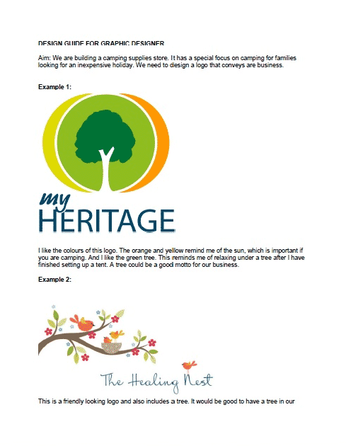
- When you have a good number of logos that touch on elements that you do and don’t like, stop searching. Assemble the logos you have gathered into a simple document, and add your thoughts and opinions on each logo. Be descriptive and verbose rather than obtuse and succinct.
- You can use any Word processing software you like to create the document. The point is to provide good size images that a graphic designer can easily view and to provide detailed commentary.
- “I like this.” is next to useless. Add your reasoning as to why you like it. This will help your graphic designer to create a logo more closely connected to your preferences.
- Below is a short example document which will give you some ideas.
- Download PDF Example (You will need to create your own document, not a PDF.)
Pro Tip: If your graphic designer’s first language is not English he/she may often use an online translator to convert your communication into their own language, to try to get a better understanding for what you want.
This is why it’s important to provide detailed commentary for each logo. More detail means there are more instances of nuanced words being interpreted correctly by the translator.
Step 8: Create A Visual Store Guide For Your Graphic Designer
While you’re in the mood for thinking about your store branding you can also work out your store design templates. We will follow a similar process – finding examples that you like and dislike, saving the image to your computer, and then creating a guide for a designer to work from.
There is one key point of difference between the store templates and the logo design, however. With the logo design, you can create whatever you like.
It will rarely cost significantly more if you want a more complex logo design compared with a simpler design. The sky is the limit for your logo.
However, your store design template is a far more complex piece and if you want an elaborate design with many custom touches this will increase your costs considerably.
In this next process, we will walk through how to provide suggestions to your designer that won’t blow your budget.
Step 9: Look Through Templates And Designs
- The first step is to look through the BigCommerce template showcase to find a basic structure that you like.
- Login to your Administration panel and click on the “Design” link in the top of the screen. You’ll now be looking at all the free BigCommerce templates available to you.
- Each template installs at the click of the button, and will also overwrite any other design changes you have made. Choosing a template will not overwrite content changes.
Step 10: Search For Branding Ideas
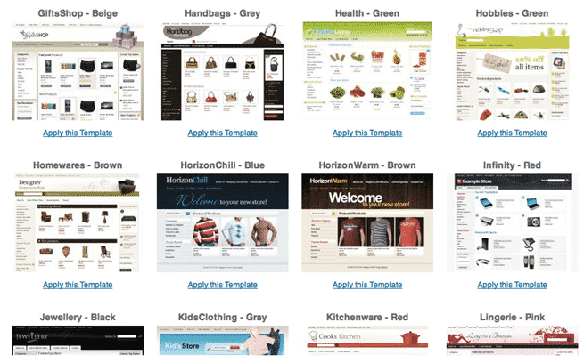
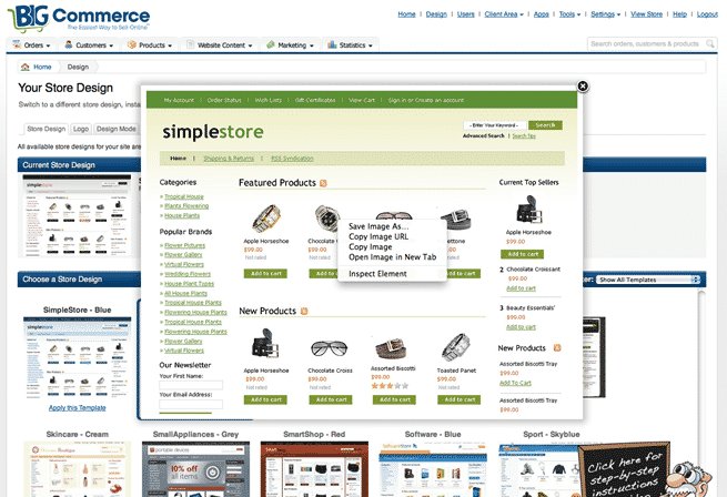
- Look through the templates. Click on the thumbnail images to magnify the view. This will open a screen overlay with a much larger image.
- You’ll soon notice that they all follow roughly the same layout.
- Each template has a banner at the top, with a logo on the left, and an illustrative image on the right.
- Many of the templates will have the core product categories running down the left side of the screen. In the top center area will usually be a promotional image, or simply images and descriptions of products.
- Each template not only has a similar structure, but the layout of all the components is close to an ideal online store. We could also refer to this as each template having “good bones.”
The BigCommerce templates follow a similar pattern because over the years online stores have become more formulaic in their content and layout. BigCommerce is providing a good set of bones to which you can add your own branding.
Step 11: Select A Template
- After you’ve looked through all the dazzling options choose around 3 to 5 templates that you prefer most. Remember, they don’t have to be perfect. The graphic designer will alter the designs slightly so you will have something relatively unique looking.
- Click on the thumbnail image. This opens a larger view. Then right-click on the image and save the file to your computer.
Step 12: Add Ideas From Other Online Stores
- You may want to add some more ideas from other online stores you have seen in the past. If you stick with BigCommerce websites as your examples these sites will be technically (HTML/CSS structure) closer to what you will also end up with. If you particularly love a layout or idea you’ve seen elsewhere and it ends up being a significant departure from BigCommerce’s core template structure, then be prepared to shoulder the additional costs and time.
- Have a look through the BigCommerce showcase of Live Stores. These provide some good quality examples of stores that have been built with BigCommerce software.
- Click on a thumbnail image to reveal the larger view. Right-click on the image to save it to your computer. You can then add it to your Visual Store Template guide.
Step 13: Provide A Visual Reference For Your Graphic Designer To Follow
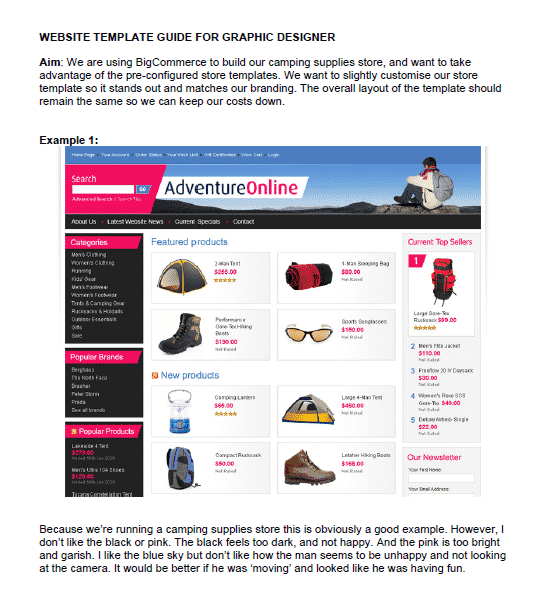
- Again, we need to create a visual reference guide for a graphic designer to follow. Create a new document and insert each of the screenshots into the document. Provide as much detailed commentary as you can to really give the graphic designer a flavor of what you want.
- It is more useful for the graphic designer if you focus on website designs that you like. This provides them with a better starting point.
- Below is a short example document which will give you some ideas.
- Download PDF example (You will need to create your own document, not a PDF.)
Learn From Others
Keen to see what else is out there? Go to www.google.com and search for “Powered by BigCommerce”.
You’ll be presented with a number of websites which still have the default message “Powered by BigCommerce” in their templates. These templates are more likely to have had only minor alterations made to them.
When designing from scratch a designer will tend not to include brand links from BigCommerce.
For example, here are a few stores that still have their “powered by” text included in their footer area:
Final Checklist
To come up with a cost-effective way of communication with your designers, make sure you:
- Manage your communications closely
- Create a visual logo guide for your graphic designer
- Search for logos, pick the best images and save them in a document
- Create a visual store guide for your graphic designer
- Look through templates and designs
- Search for templates and branding ideas
- And, provide a visual reference for your graphic designer to follow


