The aim of this guide is to help you understand and apply the concept of adding an ‘upsell’ into an Order Confirmation Email to increase sales.
You need to know this guide because there is an opportunity to generate additional income through post-sales via order confirmation emails.
These emails are categorized as ‘transactional emails’ and they have high response rates. According to conventional wisdom, the best time to sell to a customer is right after a successful purchase.
Taking advantage of post-sales can lead to 1% to 3% increase in revenue, according to Opportunities Planet. This is also a good opportunity to spend ample amount of time on crafting your order confirmation emails to trigger customer interest and, ultimately, a strong ‘buying mood’.
According to Shopify, 30% of customers will make an additional or last-minute purchase when an item that complements what they’ve already ordered or bought is offered to them.
Think of this concept as an ‘after-sales sale’ if the customer decides to purchase what you’re offering on the order confirmation email.
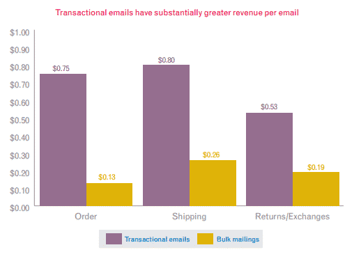
Experian’s Transactional Email Report mentions that transactional emails have higher revenue per email, opens, click and transaction rates compared to bulk email averages.
If you’ll look at the graph below, the average revenue of transactional emails is up to six times higher than that of bulk emails.
Here are a few upselling techniques you can use on your order confirmation emails:
- Consider your upsell as a form of help to your customers’ needs or solutions to their problems. Try to boost the amount of each sale by providing a helpful upsell.
- Suggest available options and/or accessories that complement your customer’s current order.
- Ensure that what you’re offering as an upsell is adding value to your customer’s original purchase.
- Put your top/popular products and link them back to your eCommerce store.
- Offer bundles, kits, or package products that are relevant to your customer’s original purchase.
Best Practices You Should Adhere
Here are some best practices that you should adhere to when sending out customer order confirmation emails:
- Don’t forget to thank your customers when sending out their order confirmation emails – this makes your customers feel that they are valued. If possible, make sure the “Thank you for your order” is in a large, visible font.
- Provide detailed order information which should include the item, a short description (may include the size, dimensions, weight, color, etc.), quantity, price, shipping fee and other details, subtotal, total, date ordered, date of shipping, and other pertinent info.
- Make sure your eCommerce name, contact details, logo, and other identifying elements of your store are present.
- You can also add your social network icons at the foot of your order confirmation emails. This is also another way to get connected with customers and possibly get more customers if they share your info to their own social networks (a.k.a. referrals).
- Make sure to use your eCommerce store’s email address and not a NO-REPLY address where customers cannot contact you.
- Personalize your email by including the first name of your customer.
- If you sell entertaining, fun, and quirky products, reflect that on your order confirmation emails.
- Make the content of your email a little less boring, more fun and light-hearted.
- Be creative with your upsell and offers because you’ll never know when a customer is truly up and ready to buy again.
- Use your order confirmation email as a platform for your creative writing by providing thoughtful, interesting, funny, entertaining, but very helpful offers and deals that can trigger another sale. This is applicable especially to order confirmation emails with minimal banners or graphics.
What we suggest…
While we always strive to provide step-by-step guides to specific types of activities and tasks you can implement on your own eCommerce stores, our concern is the difference in cart technology that each owner is using.
It will be difficult to write a universal guide for inserting these types of marketing devices into the email template.
We suggest that you learn from the examples below and ask your web developer if you can customize the order confirmation email by adding texts and images, or if you can only have text links added.
But do take note that customization usually takes time and money to implement, so be prepared and discuss it with your web developer to ensure a smooth-sailing process.
However, in order for you to get started, you can add a bit of text and simple text links to your best-selling products. This is quite simple to do and it has the potential to drive customers back to your eCommerce store for a few more purchases.
Learn From Others
Below are some examples of good and not so good order confirmation emails. A few of them follow the best practices, while others are just plain and boring in general.
Our aim is to provide you with these samples, so you can learn from them – both the good and bad – so you’ll know what to implement on your own order confirmation emails after you’ve read this guide.
The NOT So Good List
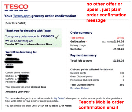
It’s such a surprise that a huge company like Tesco is sending out mobile order confirmation emails such as the one above. Mobile devices are high-tech and capable of handling graphics in almost all types of applications.
This email may have every pertinent detail about the grocery order, but it sure doesn’t show any upsell to the customer.
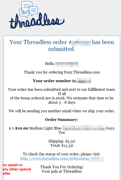
Same as Tesco’s order confirmation email; Threadless doesn’t seem to care about upselling to customers.
When you check their website, they have a New Design section, Clearance items for sale, as well as badges to girly, guys, and kiddie shirts. Those would have been nice to add as upsell to their order confirmation emails.
The OKAY List
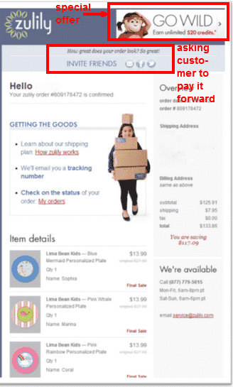
Zulily’s order confirmation email doesn’t offer much. It has a $20 credit offer (special offer) and nothing else.
Their email and social media icons were there for ‘paying it forward’, and not for the customer to join their networks – these are not helping the customer, but the other way around.
The DONE RIGHT and ROCKIN’ List
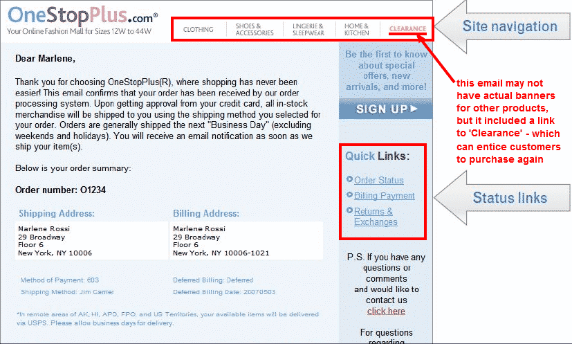
One Stop Plus’ order confirmation email is simple and without any graphics at all. But they provide links to their product categories and with ‘Clearance’ indicating there’s an ongoing clearance sale.
It also provides ‘quick links’ and a link to contact the site that are helpful to the customer. The signup box is a subscription to newsletters which include regular offers and deals.
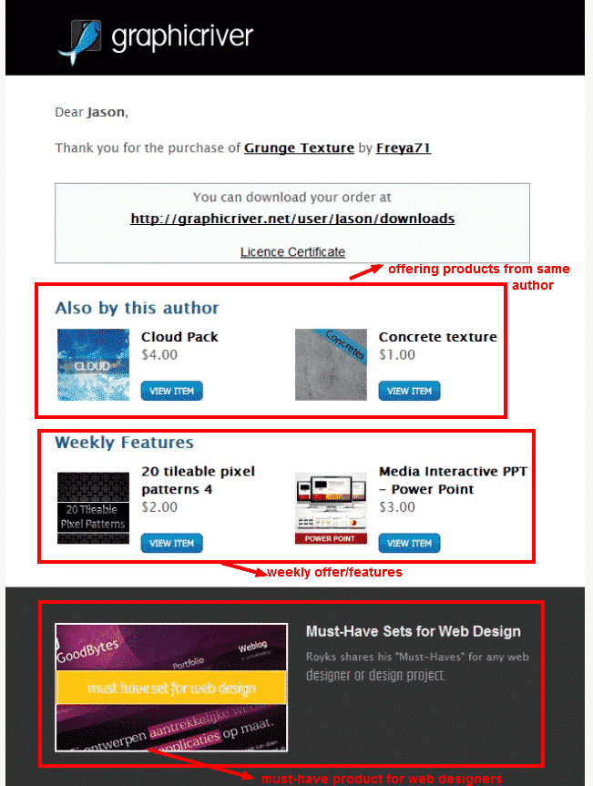
Although Graphic River is not selling physical products, their order confirmation email is a good example to follow. They are strategic in offering an upsell by including products from the same author, complete with graphics and prices.
They also provide weekly featured items and must-have sets for web designers.
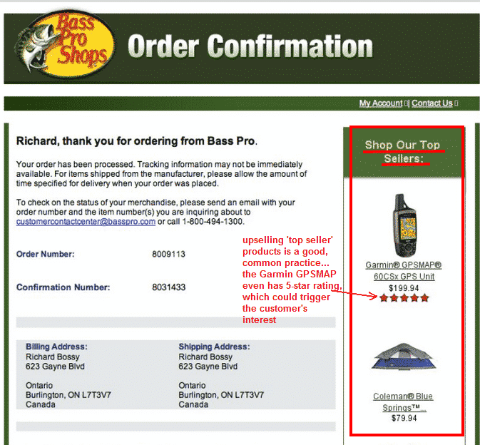
If you have top-selling products, why not flaunt them? Bass Pro Shops did this by showcasing top-sellers complete with price, graphics, and a 5-star rating on other products.
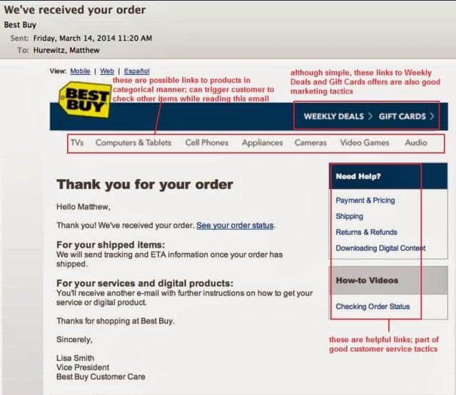
Best Buy has a clean and straightforward order confirmation email like One Stop Plus. No banners or badges, but there are links to weekly deals, gift cards, categorized product links, and helpful links to other pages.
Customers can also view their emails via mobile and in Spanish.
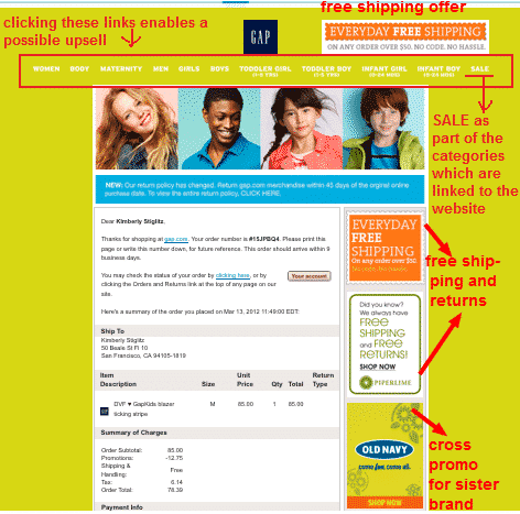
Gap’s order confirmation email really shows personality. It is colorful and has images of people who are wearing their products, indicating that their business caters to men, women, and children.
Their FREE offers and shipping are very pronounced, enticing customers to check them out.
There’s also a cross-promo for Old Navy, which is their sister company. Also, the category links to their products pages include a SALE.
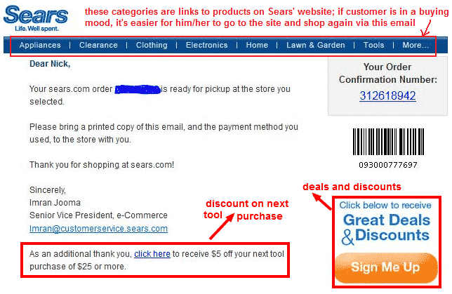
Sears provides three essential elements that you can apply to your own order confirmation email – whether with or without the banners/graphics.
There’s a signup banner for deals and discounts (subscription) and a link on another discount offer if customers want to purchase another tool.
There’s also the product category links on the header which are easy to click, especially if the customer is still in the buying mood.
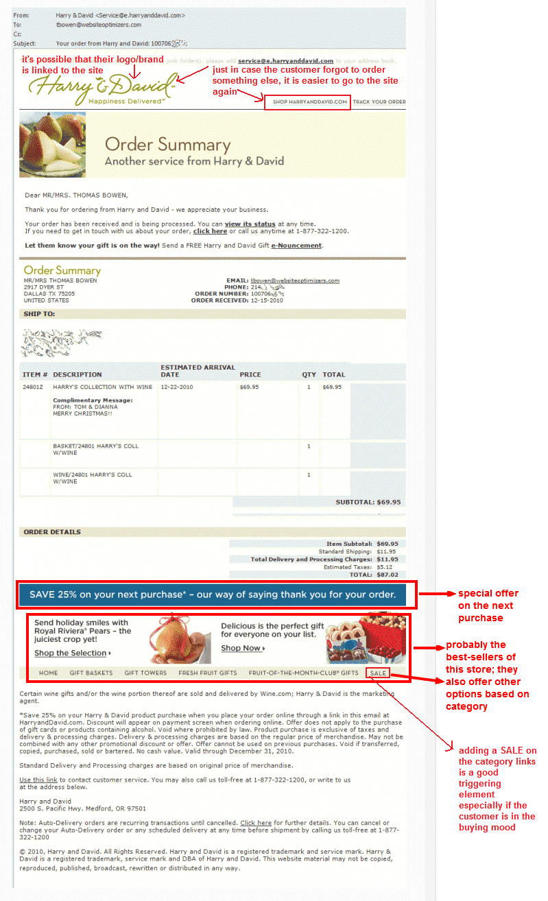
Harry and David made sure that their ‘next purchase’ offer and product category links are non-obstructive by placing them below the order details. They are also very helpful with (email, tracking, and homepage) links strategically placed on the header.
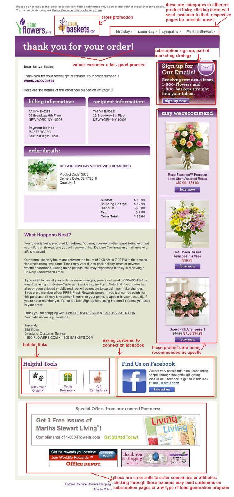
We saved the ultimate example for last. In our opinion, the majority of the best practices are presented on 1-800Flowers’ order confirmation email. They offer a good explanation of the customer’s order just below the order details.
They have a cross-promotion for their sister company, 1-800Baskets, complete with graphics. They also have product category links on the header. Their ‘Thank You for your Order!’ is screaming and with background color – a great indication that they value the customer.
They also have a signup badge for subscription and a ‘may we recommend’ banner for some of their top products. Banner links to ‘helpful tools’, as well as their Facebook page are also provided.
At the footer, they have Special Offers from their partner companies. Those banner links may be linked to subscription or lead generation programs.
The only thing we do not like about 1-800Flowers’ order confirmation email is that it came from a notification-only email address (same as a no-reply email). But they have provided an email contact link which goes to a customer service form/page.
Probably the reason behind this is to possibly provide customers with quick answers using the customer service form.
Maybe they’re getting a lot of orders and it is more convenient to send order confirmation emails this way. Whatever their reason is, it’s still a good practice to use the company’s email address that can be replied to by the customer.
Final Checklist
It is essential that you begin planning for your upsell on order confirmation emails. No matter how simple and practical they look, the best thing you can do today is to start.
You have the examples to reference yours in the near future. But you should also do your best to customize the texts that you add if ever you don’t have the capacity to add graphic banners yet.
The idea here is to start providing upsell and other offers that are valuable to your customers and because this is one of the best ways to grow your eCommerce business at the same time.
- Always thank your customers and make the ‘Thank You’ large and visible.
- Provide helpful and valuable upsell and offers to your customers.
- Make suggestions on available options that you offer such as complementary products, packages, kits, sets, and others.
- Use your top sellers as upsell.
- Include sale, discount offers, coupons, freebies, free shipping if applicable.
- Make sure your branding is in place – visible logo, company name, and contact info.
- Make sure the order details are clear and more visible than the offers.
- Use your eCommerce store’s email address, not the no-reply or notification-only type.
- Add your social network icons if applicable. You can also use text links as an alternative.
- Personalize by using the first name of the customer.
- Be creative in crafting your order confirmation form. It should have personality and it should be personable.
Photo by rawpixel / CC BY

