Product photography plays an important role in sales conversions. If your customer can’t get a clear picture of the product, they won’t know what they’re buying, and are therefore less likely to buy.
Make sure your product photos are presented beautifully and you might just get a few more sales.
Example 1: Style With Packaging
Imagine a photo of just the knives! The predominant colours would be silver, black and a touch of red. These are quite harsh colours.
So, Crate and Barrel have softened the photo through the use of natural elements such as wood and marble.
If you have a product that is highly manufactured and you want to soften the look, then juxtapose the product with natural backgrounds.
The knives are packaged in a wooden box so this acts both as a perfect pedestal for the product and softens the look.
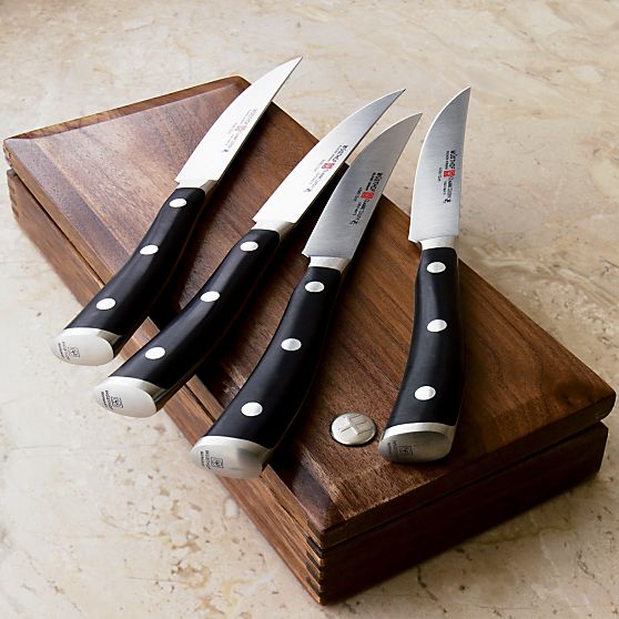
Product photography on Crate and Barrel. A stylist has carefully laid these knives on their wooden box. This makes a ‘premium’ statement.
Example 2: Use Lighting To Show Fine Details
With tens of thousands of products from hundreds of manufacturers, this memorabilia and collectibles website is a giant among online stores.
A clear white background serves as a base on which consistency in product photos is built, and the photos themselves are given ample space and attention – large, sharp, cut out and retouched to perfection.
This look can be achieved by following the lighting directions in How To Create A DIY Photography Studio.
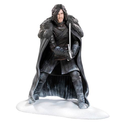
Large images, well lit photographs show product detail, which is important to fan-type customers.
Example 3: Create A Mood
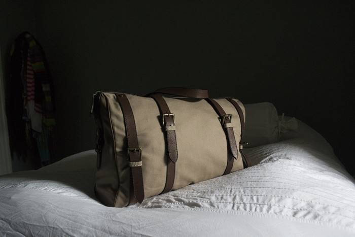
You know you want to touch this bag, and you almost feel like you can. Gazel have traditional shots of their bags (i.e. product on white background) but also add in some softer looking photos to help the customer ‘feel’ that they are already using the product.
The product is probably lit simply by using the natural sunlight from a window situation on the left.
Example 4: Godiva
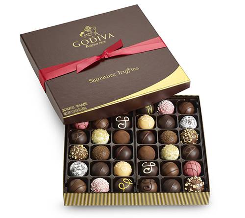
These tasty photos of sweet treats are likely to make you water at the mouth. Notice how the creamy colors used in the design complement the colors of the products themselves.
Food photography is difficult because not only do you need to be able to take good quality photography, but you’ll also need to style the food in an aesthetically pleasing manner.
Example 5: Heartbreaker
Brilliant photos made by someone who knew what they were doing. Nothing was left to chance when it comes to product photos found on this vintage inspired fashion store.
From the careful selection of models to the custom hair-dos and fitting footwear, these photographs build upon the website design and its core philosophy – the 1950’s are back and they are just a few mouse clicks away.
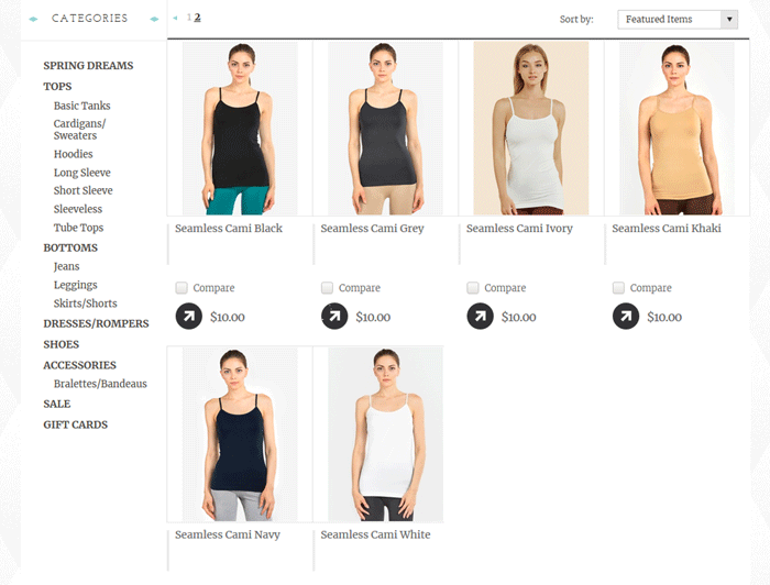
In this particular example multiple products have been collated into a single photo. This allows them to show off the entire colour range rather than relying on the customer to click through the colour options.
This is a great shortcut if you don’t have the ability to setup colour options in your cart.
Example 6: Hereitself
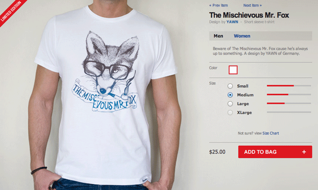
Selling a variety of designer shirts, Hereitself is happy to minimize the website eye candy and let the shirt designs speak for themselves with large, clear photographs.
Notice how the photos are cropped so that the model’s head isn’t showing, and not much below the waist.
It’s important to crop at just right the spot, if you’re not going to include a person’s head. The right spot, is just on the chin.
Example 7: Bicyclesonline
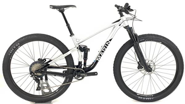
Bicyclesonline features large photos, shot specifically for the website to provide consistency in the presentation of many different manufacturers.
Retouched and cut out with care, these are scaled down to leave room on the product page for elaborate product information, but a zoom function lets you take a look at the full size versions which look sharp, professional and clean.
Manufacturers would have provided photos of the bicycles but each manufacturer would have their own style, lighting and retouching technique.
Presenting your products consistently is important for conveying a sense of trust to buyers.
Example 8: Caviar
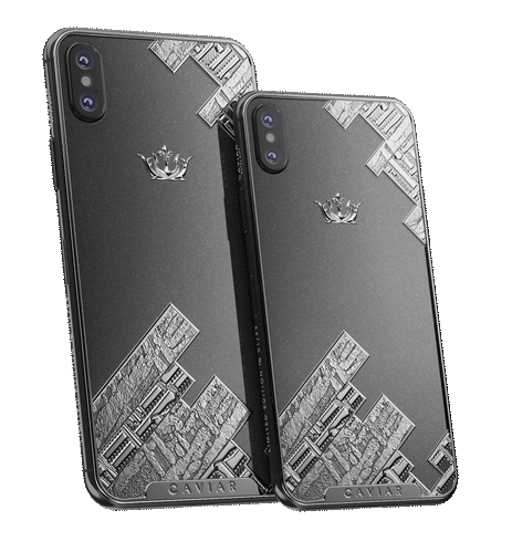
With a very small assortment of designer handmade titanium back-covers for the iPhone, Caviar is designed to build upon the exquisite product photos.
Each product is represented by three to four images that showcase color and texture beautifully, and can be zoomed in for even finer detail.
Because their packaging is so beautiful they have been able to use it as a feature shot.
Example 9: Orvis
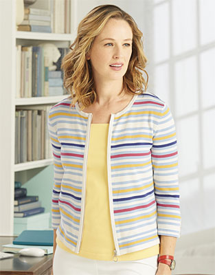
Orvis product shows crisp, clean photos, with a touch of the drop shadow effect to avoid sterility and swatch buttons that allow you to quickly and easily preview the different color combinations available for each item of clothing.
The soft lighting works well in this product photo – the muted colour palette suits the older audience.
Example 10: Shop Bop
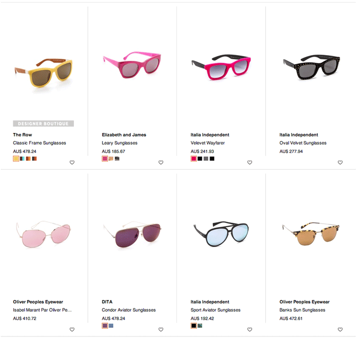
This is arguably the top dog on this list. Professional photography and retouching similar to that found on Loft; a detail-zoom function that tops the one found on Gazel; swatch presets found in several of the sites above.
Shop Bop combines them all seamlessly and graciously to bring you an online store that is hard to top when it comes to beautiful product photography presented with style.
Example 11: Running Shoe Guru
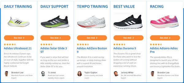
Running Shoe Guru shows unconventional design that sacrifices no functionality to form, and makes heavy use of some excellent professional photography.
The web developers and designers had their work cut out of them to create this highly customised layout, but it works brilliantly.
Customers experience a virtual reality store and this would help lift sales.
Example 12: Tiffany & Co.
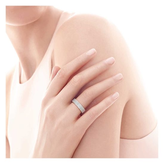
Stunning jewelry, photographed by top professionals in ideal studio conditions, retouched to the most minute detail, presented in an absolutely perfect manner.
Someone should do some research and figure out who boosted Tiffany & Co.’s sales more: Audrey Hepburn or these beautiful photographs.
Example 13: Faucet Face
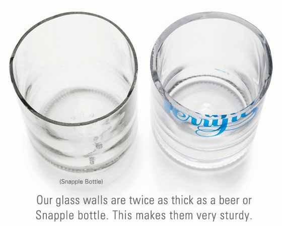
FaucetFace use comparison to show that their product is better than a competitor. In this case, customers are reusing Snapple containers to carry water.
I imagine that a thinner glass wall would break more easily, and being glass this presents a problem. FaucetFace show that customers can still carry around a glass bottle as their preference but one that is thicker and presumably safer.
Example 14: Tinkering Monkey
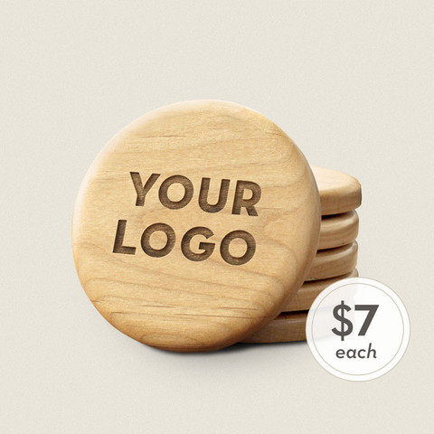
The designer behind Tinkering Monkey has Photoshopped the text onto the button. If you have a fantastic photo retoucher then you can save time and money by digitally enhancing your products.
In How To Find Photo Processing & Retouching Experts we provide recommendations for a few freelance photo retouchers who we have used in our own stores.
Example 15: Upon A Fold
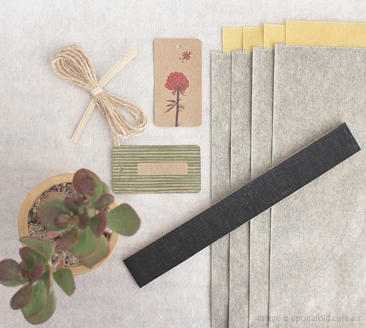
This is one of my favourite stores for buying gifts. Justine presents her products in such an imaginative and attractive way.
A little bit of creativity helps to sell the product. UponaFold show the products both in their original packaging and in use.
This helps customers imagine how they might use the products too, and so it virtually sells itself.
Example 16: Jaxon Home
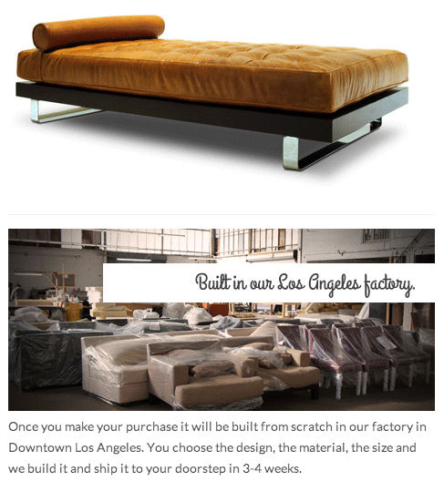
Jaxon Home show where their products are manufactured and this lends credibility to their company. Customers are more likely to buy from a company that they trust.
By showing their warehouse and manufacturing space customers can ‘feel‘ that Jax are a reliable and established business unlikely to fail.
Example 17: Bucarelli
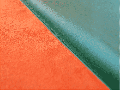
Highly detailed product photos are often overlooked by photographers. Showing the detail in a seam declares that your product have the highest manufacturing standards.
This shot from Bucarelli might have been retouched but either way it shows the perfection in craftmanship – the seam is perfectly created.
Example 18: EstherReneeJewelry (Etsy.com)
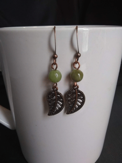
The photos from EstherReneeJewelry have their own individual style. The ‘levels’ are slightly blown out so that the shadows are darker and the light areas are brighter.
This creates a dramatic effect. You can ask your photo retoucher to create a Photoshop Preset and then apply this to all photos in your product range.
A Preset then allows you to have a consistent look across all products for little effort. (You can buy high quality Presets from Photzy.com)
Example 19: Skinny-Teatox
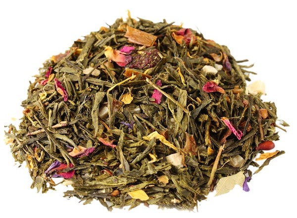
Simple and elegant product photos will help you sell product. Tea is comprised of many small elements.
By taking a close-up shot the photographer has seemingly simplified the product and presented it in a more elegant frame.
However, the tea won’t have just been dumped onto a table. You can be sure that tweezers have been used to add specks of rose petal colour in just the right places.
Example 20: Twelve Saturdays
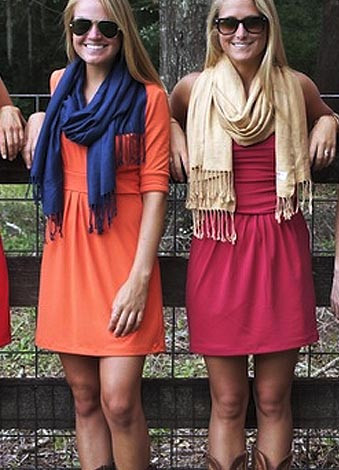
These are real girls showing real clothes. The photo shoot does not have high production qualities, nor costs. Most of the photos have been shot outdoors, using natural light and natural looking models.
Example 21: Studio Neat
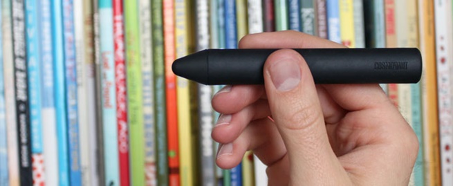
If you have a product that lacks detail and colour you can make up for that by using a detailed and colourful background setting.
Example 22: Holstee
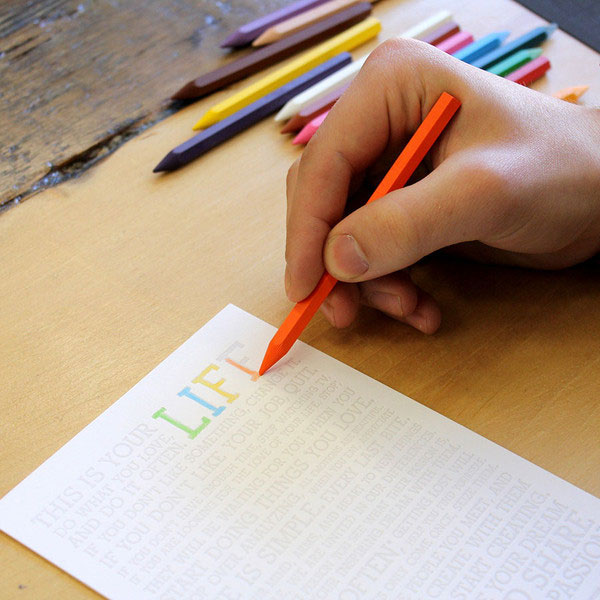
Holstee’s photography shows the product in use. It’s a simple technique – just show the product being used. The customer can imagine themselves in shot, seeing the same view. In this case it’s a relaxing way to spend an afternoon just colouring in peaceful mantras.
Example 23: Shwood Shop
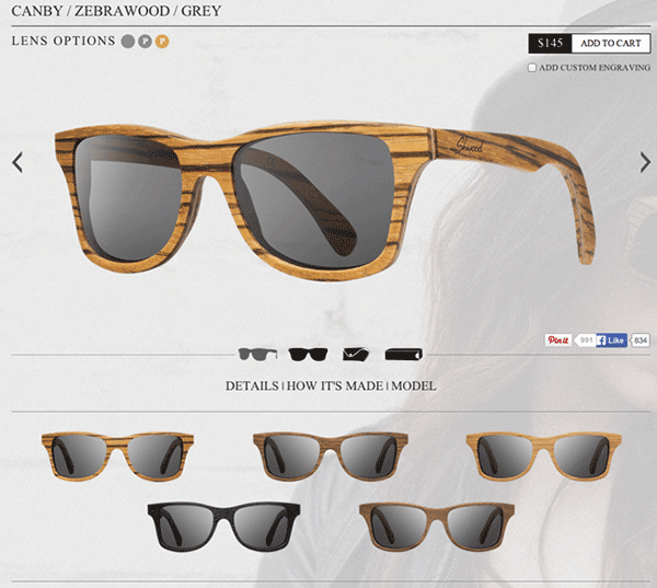
The product photography in Shwood Shop has been retouched. Each product is perfectly lit – no reflections showing in the glass.
And you’ll notice that the sunglasses all have the exact same angle – enough to show the brand name.
This kind of attention to detail with product photography implies that the manufacturing process is also highly controlled.



1 Comment
Great blog! I am loving it!! Will be back later to read some more. I am taking your feeds also.